Category: Advanced

  • Pseudo Classes

    Pseudo-classes in CSS are used to select and style elements based on their state or position within the document tree, without the need for adding extra classes or JavaScript.

    For Example, pseudo-class can be used to change color of element when mouse is hovered over it or Click a button to change color.

    Hover over me!Click me!

    Table of Contents

    • What is Pseudo-class?
    • Pseudo-Class Hover
    • Pseudo-Class Active
    • Pseudo-Class Focus
    • Pseudo-Class nth Child
    • Pseudo-Class First-Child
    • Pseudo-Class Last-Child
    • Pseudo-Class Lang
    • Pseudo-Class not
    • List of CSS Pseudo Classes

    What is Pseudo-class?

    • Pseudo-classes often used along with CSS Selectors by inserting a colon (:) after selector. For example a : hover{}, Here selector a will selects all the anchor tags in document.
    • A functional pseudo-class contains a pair of parentheses to define the arguments. For example: :lang(en).
    • The element to which a pseudo-class is attached, is termed as an anchor element. For example: button:hover, a:focus, etc. Here button and a elements are called the anchor elements.
    • Pseudo-classes apply style to an element as per the content of the document tree.
    • Pseudo-classes also apply a style to an element in relation to the external factors, such as history of the navigation of the element (:visited), status of the content (:checked), or position of mouse (:hover)

    Syntax

    selector:pseudo-class{property: value;}

    Pseudo-Class Hover

    In CSS, pseudo-class :hover is used to specify mouse hovering state of an element. This used to style element while users mouse passes through an element in document.

    Syntax

    tag:hover{property: value;}

    Example

    Following example shows how this can be applied.

    <!DOCTYPE html><html lang="en"><head><style>
    
      a{
         background-color: lightgrey;
         padding: 10px;
      }
      a:hover {
         color: red;
      }
      
      div{
         padding: 10px;
         border: solid 3px;
         background-color: aqua;
      }
      div:hover{
         background-color: lightgreen;
      }
    </style></head><body><h3>Anchor Tag Hovering</h3><a href="#">Hover over me!</a><h3>Div Hovering</h3><div>Hover me</div></body></html>

    Pseudo-Class Active

    The pseudo-class :active will apply style to an element when user activates the element by clicking or tapping on it. This is most commonly used with interactive elements like button and anchor tag, but all the HTML elements can use this pseudo-class.

    Syntax

    tag:active{property: value;}

    Example

    Here is an example that shows different usage of pseudo-class active.

    <!DOCTYPE html><html lang="en"><head><style>
    
      a, p, li {
         color: black;
         background-color: lightgrey;
         padding: 7px;
         border: 3px solid;      
      }
      a:active {
         color: red;
      }
      p:active {
         background-color: gold;
      }
      
      li:active {
         background-color: darkred;
      }
    &lt;/style&gt;&lt;/head&gt;&lt;body&gt;&lt;h2&gt;Active Pseudo-Class Example&lt;/h2&gt;&lt;h3&gt;For Button:&lt;/h3&gt;&lt;a href="#"&gt;Click Me&lt;/a&gt;&lt;h3&gt;For paragraph:&lt;/h3&gt;&lt;p&gt;Click me to see the effect.&lt;/p&gt;&lt;h3&gt;For list:&lt;/h3&gt;&lt;ul&gt;&lt;li&gt;Item 1&lt;/li&gt;&lt;li&gt;Item 2&lt;/li&gt;&lt;li&gt;Item 3&lt;/li&gt;&lt;/ul&gt;&lt;/body&gt;&lt;/html&gt;</pre>

    Pseudo-Class Focus

    The pseudo-class :focus will apply style to an element when user focused an element like input tag by clicking on it. Before typing text in input element users has to click in input area to enable cursor, this is called focusing.

    Syntax

    tag:focus{property: value;}

    Example

    This example will show how to use pseudo-class focus in HTML.

    <!DOCTYPE html><html lang="en"><head><style>
    
      input{
         padding:3px;
      }
      input:focus {
         border-color: green;
         background-color: lightgrey;
      }
    </style></head><body><h2>Pseudo-Class focus Example</h2><h3>Focus on input text</h3><input type="text"
           placeholder="Type Something!"&gt;&lt;/body&gt;&lt;/html&gt;</pre>

    Pseudo-Class nth Child

    The pseudo-class :nth-child(n) will apply style to any specified direct child of an element.

    Syntax

    tag:nth-child(number/ expression / odd / even){property: value;}

    The pseudo-class nth-child can take number, mathematical expression or values like odd, even as parameter. To know about values associated with nth child visit our tutorial on Pseudo Class nth-child().

    <!DOCTYPE html><html lang="en"><head><style>
    
      div{
         border: 2px solid;
         margin: 7px;
         padding: 2px;
      }
      /* Apply Style to 2nd child of div */
      div:nth-child(2){
         background-color:red;
      }
      
      /* Apply Style to all odd children of li */
      li:nth-child(odd) {
         background-color: lightgray;
      }
      
      /* Apply Style to all even children of li */
      li:nth-child(even) {
         background-color: lightblue;
      }
    &lt;/style&gt;&lt;/head&gt;&lt;body&gt;&lt;h2&gt;Pseudo-Class nth-child&lt;/h2&gt;&lt;h3&gt;2nd child of Div&lt;/h3&gt;&lt;div&gt;&lt;div&gt;1st div&lt;/div&gt;&lt;div&gt;2nd div&lt;/div&gt;&lt;div&gt;3rd div&lt;/div&gt;&lt;div&gt;4th div&lt;/div&gt;&lt;/div&gt;&lt;h3&gt;Selecting odd and even children&lt;/h3&gt;&lt;ul&gt;&lt;li&gt;First item&lt;/li&gt;&lt;li&gt;Second item&lt;/li&gt;&lt;li&gt;Third item&lt;/li&gt;&lt;li&gt;forth item&lt;/li&gt;&lt;li&gt;Third item&lt;/li&gt;&lt;li&gt;fifth item&lt;/li&gt;&lt;/ul&gt;&lt;/body&gt;&lt;/html&gt;</pre>

    Pseudo-Class First-Child

    The pseudo-class first-child used to select first direct child element.

    Syntax

    tag:first-child{property: value;}

    Example

    Following example show how to use first-child pseudo-class in HTML.

    <!DOCTYPE html><html lang="en"><head><style>
    
      div{
         border: solid;
      }
      /* Selects all first child paragraphs */
      p:first-child {
         color: blue;
      }
    &lt;/style&gt;&lt;/head&gt;&lt;body&gt;&lt;p&gt;
      This paragraph is first child of body 
      element, will be blue.
    </p><p>This paragraph will not be affected.</p><p>Another paragraph that won't be affected.</p><div><p>
         This paragraph is first child of div 
         element will be blue.
      &lt;/p&gt;&lt;p&gt;This paragraph will not be affected.&lt;/p&gt;&lt;p&gt;Another paragraph that won't be affected.&lt;/p&gt;&lt;/div&gt;&lt;/body&gt;&lt;/html&gt;</pre>

    Pseudo-Class Last-Child

    The pseudo-class last-child used to select last direct child element.

    Syntax

    tag:last-child{property: value;}

    Example

    Following example show how to use last-child pseudo-class in HTML.

    <!DOCTYPE html><html lang="en"><head><style>
    
      div{
         border: solid;
      }
      /* Selects all last child paragraphs */
      p:last-child {
         color: blue;
      }
    &lt;/style&gt;&lt;/head&gt;&lt;body&gt;&lt;p&gt;This paragraph will not be affected.&lt;/p&gt;&lt;p&gt;Another paragraph that won't be affected.&lt;/p&gt;&lt;div&gt;&lt;p&gt;This paragraph will not be affected.&lt;/p&gt;&lt;p&gt;Another paragraph that won't be affected.&lt;/p&gt;&lt;p&gt;
         This paragraph is last child of div 
         element will be blue.
      &lt;/p&gt;&lt;/div&gt;&lt;p&gt;
      This paragraph is last child of body 
      element, will be blue.
    </p></body></html>

    Pseudo-Class Lang

    The pseudo-class :lang() will apply style to an element based on value of lang attribute set to the element or it's parent.

    Here is an example of :lang() pseudo-class:

    <html><head><style>
       /* Selects all the tags that set english as language */
       :lang(en) {
    
      quotes: '""';
    } /* Selects all the tags that set french as language */ :lang(fr) {
      quotes: ' ' ' ';
    } </style></head><body><h2>:lang() selector example</h2><q lang="en">
      This language is set as english, Here 
      css use double(" ") quotes
    </q><br><q lang="fr">
      This language is set as French, Here 
      css use guillemet( ) quotes
    </q></body></html>

    Pseudo-Class Not

    The pseudo-class :not(selector) is used to apply style on all the elements expect elements that included in mentioned selectors. To know what is a selector in CSS check out our tutorial on CSS Selectors.

    Syntax

    tag:not(selector){property: value;}

    The selector can be a class, id, or tag in html.

    Example

    Following example shows how to use not pseudo-class in CSS

    <!DOCTYPE html><html lang="en"><head><title>CSS :not() Example</title><style>
    
      /*Style all paragraph except class special*/
      p:not(.special) {
         color: red;
      }
      
      /*Style all special paragraph except id superSpecial*/
      .special:not(#superSpecial){
         background-color: lightgrey;
      }
    &lt;/style&gt;&lt;/head&gt;&lt;body&gt;&lt;p&gt;This is a normal paragraph.&lt;/p&gt;&lt;p class="special" id="superSpecial"&gt;
      This is a super special paragraph.
    </p><p>This is another normal paragraph.</p><p class="special">
      This is special paragraph.
    </p></body></html>

    List of CSS Pseudo Classes

    The table given below lists all the CSS pseudo-classes:

    Pseudo-classDescriptionExample
    :activeRepresents an element that has been activated by the user.Try It
    :any-linkRepresents an element that acts as the source anchor of a hyperlink, independent of whether it has been visited.Try It
    :autofillMatches an element that has its value autofill by the browser.Try It
    :checkedMatches any radio, checkbox or option element that is checked or toggled.Try It
    :defaultSelects form elements that are the default in a group of related elements.Try It
    :definedRepresents any custom element that has been defined.Try It
    :disabledRepresents a disabled element.Try It
    :emptyMatches an element that has no children.Try It
    :enabledRepresents an enabled element, after its has been activated.Try It
    :firstRepresents the first page of a printed document, with the @page at-rule.Try It
    :first-childRepresents the first element among a group of sibling elements.Try It
    :first-of-typeRepresents the first element of its type among a group of sibling elements.Try It
    :fullscreenMatches an element that is currently displayed in fullscreen mode.Try It
    :focusRepresents an element that has received focus.Try It
    :focus-visibleApplies while an element matches the :focus pseudo-class or receives focus.Try It
    :focus-withinMatches an element if the element or any of its descendants are focused.Try It
    :has()This represents an element if any of the relative selectors.Try It
    :hostThis selects the shadow host of the shadow DOM containing the CSS it is used inside.Try It
    :host()This function selects the shadow host of the shadow DOM containing the CSS it is used inside.Try It
    :host-context()This function allows you to style a custom element based on the classes or attributes of its ancestor elements.Try It
    :hoverMatches when the user interacts with an element with a pointing device, like a mouse, but does not necessarily activate it.Try It
    :indeterminateRepresents any form element whose state is indeterminate or unknown.Try It
    :in-rangeRepresents an element whose current value is within the range limits.Try It
    :invalidRepresents any element whose contents fail to validate.Try It
    :is()Takes a selector list as its argument, and selects any element that can be selected by one of the selectors in that list.Try It
    :lang()Matches an element based on the language they are defined to be in.Try It
    :last-childRepresents the last element among a group of sibling elements.Try It
    :last-of-typeRepresents the last element of its type among a group of sibling elements.Try It
    :leftRepresents all left-hand pages of a printed document, used with @page at-rule.Try It
    :linkRepresents an element that has not yet been visited.Try It
    :modalMatches an element that is in a state in which it excludes all interaction with elements outside it until the interaction has been dismissed.Try It
    :not()Represents an element that do not match a list of selectors.Try It
    :nth-child()Selects child elements according to their position among all the sibling elements within a parent element.Try It
    :nth-last-child()Matches elements based on their position among siblings, counting from the last (end)Try It
    :nth-last-of-type()Matches elements based on their position among siblings of the same type, counting from the last (end).Try It
    :nth-of-type()Matches elements based on their position among siblings of the same type.Try It
    :only-childRepresents an element without any siblings.Try It
    :only-of-typeRepresents an element that has no siblings of same type.Try It
    :optionalRepresents an element that does not have a required attribute set on it.Try It
    :out-of-rangeRepresents an element whose current value is outside the range limits.Try It
    :picture-in-pictureMatches an element that is currently in picture-in-picture mode.Try It
    :placeholder-shownRepresents any element that is currently displaying placeholder text.Try It
    :read-onlyRepresents an element that is not editable by the user.Try It
    :read-writeRepresents an element that is editable by the user.Try It
    :requiredRepresents an element that has a required attribute set on it.Try It
    :rightRepresents all right-hand pages of a printed document, used with @page at-rule.Try It
    :rootMatches the root element of a document tree.Try It
    :scopeRepresents elements that are a reference point, or scope, for selectors to match with.Try It
    :targetRepresents the target element with an id matching the URL's fragment.Try It
    :validRepresents any element whose contents validate successfully.Try It
    :visitedApplies once the link has been visited.Try It
    :where()Takes a selector list as its argument and selects any element that matches.Try It

  • Layers

    CSS Layers are a concept that is used to control the stacking order of different DOM elements in a webpage. The z-index property determines the stacking order of elements within a stacking context.

    The elements with a higher z-index are layered above those with a lower z-index and if elements share the same z-index, they stack according to their order in the DOM. We will look more into details and examples of CSS layering in this tutorial.

    Table of Contents

    • CSS Layering With z-index Property
    • Layer Text Above Image
    • Positioning Without z-index Property

    CSS Layering With z-index Property

    As mentioned above the z-index property can be used to decide stacking order of element in a webpage. The following example demonstrates how to create vertically stacked elements using z-index property. The elements with higher z-index value are positioned above the elements of lower z-index value.

    Example

    <html><head><style>
    
        div{
            position: absolute;
            height: 100px;
            width: 100px;
            padding: 5px;
            color: white;
        }
        .box1 {
            background-color: darkred;
            z-index: 1;
            left: 10px;
            top: 10px;
        }
        .box2 {
            background-color: darkblue;
            z-index: 2;
            margin: 10px;
            left: 50px; 
            top: 30px;
        }
        .box3 {
            background-color: darkgreen;
            z-index: 3;
            margin: 20px;
            left: 80px; 
            top: 50px;
        }
    &lt;/style&gt;&lt;/head&gt;&lt;body&gt;&lt;div class="box1"&gt;
        z-index: 1
    &lt;/div&gt;&lt;div class="box2"&gt;
        z-index: 2
    &lt;/div&gt;&lt;div class="box3"&gt;
        z-index: 3
    &lt;/div&gt;&lt;/body&gt;&lt;/html&gt;</pre>

    Layer Text Above Image

    In CSS position property can be used to position text in different locations above an image.

    First we need to set position property for image container as position: relative and position property of text as position: absolute. Now you can position of text elements using CSS inset properties like top, bottom, left and right.

    Example

    <html><head><style>
    
        .container {
            position: relative;
            border: 2px solid #ef2c2c;
        }
        .center {
            position: absolute;
            top: 45%;
            width: 100%;
            text-align: center;
        }
        .top-left {
            position: absolute;
            top: 12px;
            left: 30px;
        }
        .top-right {
            position: absolute;
            top: 12px;
            right: 30px;
        }
        .bottom-left {
            position: absolute;
            bottom: 12px;
            left: 30px;
        }
        .bottom-right {
            position: absolute;
            bottom: 12px;
            right: 30px;
        }
        img {
            width: 100%;
            opacity: 0.7;
        }
    &lt;/style&gt;&lt;/head&gt;&lt;body&gt;&lt;div class="container"&gt;&lt;img src="/css/images/red-flower.jpg" 
                width="1000px" height="350px"&gt;&lt;h3 class="center"&gt;
            Text at Center
        &lt;/h3&gt;&lt;h3 class="top-left"&gt;
            Text at Top Left
        &lt;/h3&gt;&lt;h3 class="top-right"&gt;
            Text at Top Right
        &lt;/h3&gt;&lt;h3 class="bottom-left"&gt;
            Text at Bottom Left&lt;/h3&gt;&lt;h3 class="bottom-right"&gt;
            Text at Bottom Right
        &lt;/h3&gt;&lt;/div&gt;&lt;/body&gt;&lt;/html&gt;</pre>

    Positioning Without z-index Property

    The following example demonstrates how to create layers without using z-index property.

    Example

    <html><head><style>
    
        div{
            position: absolute;
            height: 100px;
            width: 100px;
            padding: 5px;
            color: white;
        }
        .box1 {
            background-color: darkred;
            padding: 10px;
            left: 10px;
            top: 10px;
        }
        .box2 {
            background-color: lightblue;
            padding: 10px;
            margin: 10px;
            left: 30px; 
            top: 30px;
        }
        .box3 {
            background-color: yellow;
            padding: 5px;
            margin: 10px;
            left: 60px; 
            top: 60px;
        }
    &lt;/style&gt;&lt;/head&gt;&lt;body&gt;&lt;div class="box1"&gt;
        Box 1
    &lt;/div&gt;&lt;div class="box2"&gt;
        Box 2
    &lt;/div&gt;&lt;div class="box3"&gt;
        Box 3
    &lt;/div&gt;&lt;/body&gt;&lt;/html&gt;</pre>
  • Positioning

    CSS Positioning helps to manipulate position of any element in a web page. In this tutorial we will learn position property and values associated with it.

    Table of Contents

    • What is CSS Position?
    • Static Positioned Element
    • Relative Positioned Elements
    • Absolutely Positioned Elements
    • Position Fixed Element
    • Sticky Positioned Element
    • Positioning Text in an Image
    • Position Related Properties

    What is CSS Position?

    In CSS position property is used to create floating elements, floating sidebar, and other interactive features by adjusting position of elements in webpage.

    Along with position property, other properties like top, bottom, right, and left are used to control its exact position on the page. They specify the offsets of an element from its edges. We will see examples for those in this tutorial.

    Syntax

    Following are possible values for css position.

    position: static | relative | absolute | fixed | sticky;

    Static Positioned Element

    When you use the position: static property, the element will be positioned normally in the document flow. The leftrighttopbottom, and z-index properties will not affect the element. This is the default value for position property.

    Example

    In this example we defined two static positioned div elements and one relative positioned element. See the difference.

    <!DOCTYPE html><html lang="en"><head><style>
    
      .container {
         padding: 20px;
         border: 1px solid #ccc;
      }
      .static-element {
         position: static;
         background-color: lightblue;
         padding: 10px;
         margin: 10px 0;
      }
      .non-static-element {
         position: relative; 
         top: 20px;
         background-color: lightgreen;
         padding: 10px;
      }
    &lt;/style&gt;&lt;/head&gt;&lt;body&gt;&lt;div class="container"&gt;&lt;div class="static-element"&gt;
         This is a static element (default position).
      &lt;/div&gt;&lt;div class="non-static-element"&gt;
         This element is not static and is moved 
         20px down.
      &lt;/div&gt;&lt;div class="static-element"&gt;
         This is another static element (default 
         position).
      &lt;/div&gt;&lt;/div&gt;&lt;/body&gt;&lt;/html&gt;</pre>

    Relative Positioned Elements

    CSS position: relative property positions the elements relative to their original position in the page. You can use the left, right, top, and bottom properties to move the element around, but it will still take up space in the document flow.

    Example

    In this example we defined one static positioned div element and one relative positioned element. See the difference.

    <!DOCTYPE html><html lang="en"><head><style>
    
      *{
         padding: 15px;
      }
      .container {
         border: 1px solid #ccc;
      }
      .static-element {
         position: static;
         background-color: lightblue;
      }
      .relative-element {
         position: relative;
         top: 20px;  
         left: 30px; 
         background-color: lightgreen;
      }
      .normal-flow {
         background-color: lightcoral;
         margin: 10px 0;
      }
    </style></head><body><div class="container"><div class="static-element">
         This is a static element (default position).
      &lt;/div&gt;&lt;div class="relative-element"&gt;
         This element is relatively positioned 20px 
         down and 30px right.
      &lt;/div&gt;&lt;div class="normal-flow"&gt;
         This element is in the normal document 
         flow, after the relative element.
      &lt;/div&gt;&lt;/div&gt;&lt;/body&gt;&lt;/html&gt;</pre>

    Absolutely Positioned Elements

    An element with position: absolute is taken out of the document flow and positioned relative to its nearest positioned ancestor (if any). If there is no positioned ancestor, then the element is positioned relative to the viewport.

    You can use top, right, bottom, and left properties to specify the position of the element relative to its containing block.

    Example

    This example show use of position absolute

    <!DOCTYPE html><html lang="en"><head><style>
    
      *{
         padding: 15px;
      }
      .container {
       /* This makes container positioned ancestor */
         position: relative;
         width: 70%;
         height: 200px;
         border: 1px solid #ccc;
      }
      .static-element {
         position: static;
         background-color: lightblue;
         padding: 10px;
         margin: 10px 0;
      }
      .absolute-element {
         position: absolute;
      /* 50px from top of nearest positioned ancestor */
         top: 50px;
      /* 30px from left of nearest positioned ancestor */
         left: 30px; 
         background-color: lightgreen;
         padding: 10px;
      }
    &lt;/style&gt;&lt;/head&gt;&lt;body&gt;&lt;div class="container"&gt;&lt;div class="static-element"&gt;
         This is a static element (default position).
      &lt;/div&gt;&lt;div class="absolute-element"&gt;
         This element is absolutely positioned 30px 
         from top and 50px from left.
      &lt;/div&gt;&lt;/div&gt;&lt;/body&gt;&lt;/html&gt;</pre>

    Position Fixed Element

    In CSS position: fixed property is used to make element stay in the same place on the screen even when the user scrolls. You can then use the left, right, top, and bottom properties to position the element where you want it.

    Example

    In this example you can see that paragraph element remain there when you scroll down.

    <html><head><style>
       div {
    
      width: 100%;
      height: 500px;
      background-color: lightgrey;
      overflow: auto;
      padding: 15px;
    } .fixed-position {
      position: fixed;
      top: 50%;
      left: 20%;
      padding: 5px;
      background-color: white;
    } </style></head><body><div><p>You can Scroll down...</p><p class="fixed-position">
         Tutorialspoint CSS Position Fixed
      &lt;/p&gt;&lt;p&gt;
         White screen will remain at 50% 
         height from top 
      &lt;/p&gt;&lt;/div&gt;&lt;/body&gt;&lt;/html&gt;</pre>

    Sticky Positioned Element

    In CSS position: sticky property is used to make any element stay at the top of container even when the user scrolls. You can then use the left, right, top, and bottom properties to position the element where you want it.

    The position: sticky property is a combination of the position: relative and position: fixed properties

    Example

    In this example you can see that when you scroll, fixed move to top

    <html><head><style>
       div {
    
      width: 100%;
      height: 500px;
      background-color: lightgrey;
      overflow: auto;
      padding: 15px;
    } .sticky-position {
      position: sticky;
      top: 50%;
      left: 20%;
      padding: 5px;
      background-color: white;
    } </style></head><body><div><p>You can Scroll down...</p><p class="sticky-position">
         TutorialsPoint CSS Position Fixed
      &lt;/p&gt;&lt;p&gt;
         White screen will stick at top of 
         screen when you scroll down.
      &lt;/p&gt;&lt;/div&gt;&lt;/body&gt;&lt;/html&gt;</pre>

    Positioning Text in an Image

    In following example, you can use the position: absolute property to position text in different directions inside an image. The text elements are positioned at the top left, top right, bottom left, and bottom right corners.

    Example

    In the following example we have positioned text on an image.

    <html><head><style>
       .container {
    
      position: relative;
      border: 2px solid #ef2c2c;
    } .center {
      position: absolute;
      top: 45%;
      width: 100%;
      text-align: center;
    } .top-left {
      position: absolute;
      top: 12px;
      left: 30px;
    } .top-right {
      position: absolute;
      top: 12px;
      right: 30px;
    } .bottom-left {
      position: absolute;
      bottom: 12px;
      left: 30px;
    } .bottom-right {
      position: absolute;
      bottom: 12px;
      right: 30px;
    } img {
      width: 100%;
      opacity: 0.7;
    } </style></head><body><div class="container"><img src="/css/images/red-flower.jpg"
            width="1000px" height="350px"&gt;&lt;h3 class="center"&gt;
         Text at Center
      &lt;/h3&gt;&lt;h3 class="top-left"&gt;
         Text at Top Left
      &lt;/h3&gt;&lt;h3 class="top-right"&gt;
         Text at Top Right
      &lt;/h3&gt;&lt;h3 class="bottom-left"&gt;
         Text at Bottom Left&lt;/h3&gt;&lt;h3 class="bottom-right"&gt;
         Text at Bottom Right
      &lt;/h3&gt;&lt;/div&gt;&lt;/body&gt;&lt;/html&gt;</pre>

    CSS Position Related Properties

    Following is the list of all the CSS properties related to position:

    PropertyDescriptionExample
    bottomUsed with the position property to place the bottom edge of an element.Try It
    clipSets the clipping mask for an element.Try It
    leftUsed with the position property to place the left edge of an element.Try It
    overflowDetermines how overflow content is rendered.Try It
    rightUsed with the position property to place the right edge of an element.Try It
    topSets the positioning model for an element.Try It
    vertical-alignSets the vertical positioning of an element.Try It
    z-indexSets the rendering layer for the current element.Try It
  • visibility Property

    The visibility Property

    CSS visibility property allows you to show or hide an element without changing the layout of a document, while hidden elements take up space.

    The visibility property can be used to create a variety of effects, such as hiding elements that are not yet ready to be displayed, or hiding elements that are only relevant to certain users.

    Syntax

    The syntax for the CSS visibility property is as follows:

    visibility: visible | hidden | collapse | initial | inherit;

    Possible Values

    ValueDescription
    visibleIt is the default value where the elements are visible.
    hiddenIt hides the element, but it still takes up space on the page.
    collapseIt removes the table rows, columns, column groups, and row groups from a table. The collapse has the same meaning as hidden if it is used on non-table elements.
    initialIt sets the visibility of an element to its default value.
    inheritIt inherits the visibility property from its parent element.

    Applies to

    The visibility property can be applied to all the HTML elements.

    CSS visibility – visible Value

    You can use the visibility property with visible to make an element visible.

    Example

    The following example uses the visibility property to make the h2 element visible.

    <html><head><style>
       h2 {
    
      visibility: visible;
    } </style></head><body><h2>Tutorials Point CSS visibility</h2></body></html>

    Hide Elements with CSS visibility Property

    To hide any HTML element, you can use the visibility property with the hidden value. It hides the element, but it does not remove it from the document layout. The element will still be accessible to screen readers and will affect the layout of the page, even though it is not visible.

    Example

    In this example, we have hidden the heading of the web page using ‘visibility: hidden;’.

    <html><head><style>
       h2 {
    
      visibility: hidden;
    } </style></head><body><h2>Tutorials Point CSS visibility hidden</h2><p>The hidden heading is still visible to screen readers and takes up space in the page.</p></body></html>

    Collapse Table Cells with CSS visibility

    To remove a table row, column, or any cell without affecting the layout of the table, you can set the visibility property of the row, column, or cell to collapse. This value is only valid for table elements.

    Example 1

    In this example, we have used the ‘visibility: collapse;’ property to collapse the table cell. You can use it to hide any row or column.

    <html><head><style>
       .collapse {
    
      visibility: collapse;
    } table {
      border-collapse: collapse;
      color: #ffffff;
      width: 100%;
      background-color: #35DC5A;
      border: 2px solid black;
    } th, td {
      border: 2px solid black;
      padding: 8px;
      text-align: left;
      font-size: 20px;
    } </style></head><body><table><tr><td>visible</td><td>hidden</td><td class="collapse">collapse</td></tr><tr><td>initial</td><td>inherit</td><td>revert</td></tr></table></body></html>

    Example 2

    In this example, we have used the ‘visibility: collapse;’ property on a non-table element. On a non-table element, it works as hidden value.

    <html><head><style>
       .collapse {
    
      visibility: collapse;
    } </style></head><body><h2>Collapse on non-table elements</h2><p class="collapse">you cant see me</p><p>the above sentence is hidden</p></body></html>

  • Flexbox

    Flexbox organizes elements within a container along a single dimension, which can be either horizontally or vertically aligned.

    What is CSS Flexbox?

    CSS flexbox is a layout model in CSS that provides an efficient and flexible way to arrange and distribute space between items within a container. It arranges elements in a single dimension, either horizontally or vertically, within a container.

    In this article we will cover all the properties for managing the positioning, alignment, and gaps between elements along both the main and cross axes briefly.

    Table of Contents

    • Elements of Flexbox
    • Basic Flexbox Layout
    • Vertical Flexbox Layout
    • Flexbox Justify Content
    • Flexbox Align Items
    • Centering a Div
    • Flexbox Wrap Property
    • Flexbox Align Self
    • Flexbox Container Properties
    • Flexbox Items Properties

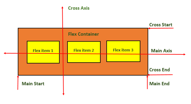
    Elements of Flexbox

    • Flexbox Container: The flex container defines the outer element of flexbox, where all the child elements are present. A flexbox container can be defined by setting ‘display: flex’ or ‘display: inline-flex’.
    • Flexbox items: Flexbox items are direct children of flexbox container. This items can be arranged vertically and horizontally inside flexbox container based on need.
    • Main Axis: Main axis is primary axis along which items arranged in a container. By default this is horizontal axis.
    • Cross Axis: >Cross axis is perpendicular axis to primary axis. By default this is vertical axis.

    Following Diagram will demonstrate the CSS Flexbox:

    CSS Flexbox

    Basic Flexbox Layout

    Flexbox is commonly used to create responsive flexbox layout.

    Example

    <!DOCTYPE html><html lang="en"><head><style>
    
      .container {
         display: flex;
         flex-direction: row;
         justify-content: space-between;
         align-items: center;
         height: 100vh;
      }
      .item {
         background-color: lightcoral;
         padding: 20px;
         margin: 10px;
         border: 3px solid #ccc;
      }
    </style></head><body><div class="container"><div class="item">Item 1</div><div class="item">Item 2</div><div class="item">Item 3</div></div></body></html>

    Vertical Flexbox Layout

    In CSS, we can also define vertical flexbox by setting flex-direction: column.

    Example

    <!DOCTYPE html><html lang="en"><head><style>
    
      .container {
         display: flex;
         flex-direction: column;
         justify-content: center;
         align-items: center;
         height: 100vh;
      }
      .item {
         background-color: lightseagreen;
         padding: 20px;
         margin: 10px;
         border: 3px solid #ccc;
      }
    </style></head><body><div class="container"><div class="item">Item 1</div><div class="item">Item 2</div><div class="item">Item 3</div></div></body></html>

    Flexbox Justify Content Property

    The justify-content property is commonly used inside flexbox containers to align flexbox items inside container. There are several values possible for this property, for a complete reference of justify-content property visit our tutorial on justify-content property.

    Some of the commonly used values of justify-content is noted down below. There are lot more values associated with it.

    // Align Item at center of main axis
    justify-content: center; 
    
    // Align Item at start of main axis
    justify-content: flex-start; 
    
    // Align Item at end of main axis
    justify-content: flex-end; 
    
    // Align Item at left side of main axis
    justify-content: left;
    
    // Align Item at right side of main axis
    justify-content: right;

    Flexbox Align Items Property

    The align-items property in CSS is used to align flex items across cross axis (vertical axis in a row layout, horizontal axis in a column layout) of the container. There are several values associated with this property. To learn more about align-items property visit our tutorial on CSS Align Items.

    // Align items at start of cross axis of container
    align-items: flex-start;
    
    // Align items at end of cross axis of container
    align-items: flex-end;
    
    // Align items at center of cross axis of container
    align-items: center;
    
    // Align baselines of items (For items with variable sizes)align-items: baseline;
    
    // Stretch items along cross axis to fill container
    align-items: stretch;

    Centering a Div using Flexbox

    Centering a div element( or any other elements ) is always a challenging and most discussed problem in CSS. With the help of CSS flexbox we can easily center a div element inside a container. We have to use justify-content and align-items properties to center items, following code shows how this is done.

    Example

    <!DOCTYPE html><html lang="en"><head><style>
    
      .flex-container {
         display: flex;
         /* Center horizontally */
         justify-content: center;
         /* Center Vertically */
         align-items: center;
         border: 1px solid #ccc;
         height: 250px;
         background-color: grey;
      }
      .flex-item {
         background-color: lightblue;
         border: 1px solid #333;
         padding: 5px;
         height: 70px;
         width: 70px;
      }  
    </style></head><body><div class="flex-container"><div class="flex-item">
         This div is in center of container
      &lt;/div&gt;&lt;/div&gt;&lt;/body&gt;&lt;/html&gt;</pre>

    Flexbox Wrap Property

    Flexbox with wrap property allows items within a container to move to next line when there is no enough space in a single line. This helps to maintain a responsive layout.

    Following code demonstrates how to use flexbox to create a responsive layout that centers its items and wraps them to fit within the available space. For a complete guidance on flex wrap, visit our tutorial on CSS flex-wrap.

    .container{display: flex;flex-wrap: wrap;justify-content: center;align-items: center;}.item{padding: 20px;margin: 10px;/* base size 100px */flex: 1 1 100px;}

    Flexbox Align Self Property

    In CSS, we have align-self property which can be used to override align-items property set on container. This helps to dynamically place each items at special locations inside container.

    Following code shows how to use align-self property. Here we can see that align-items: stretch is not applicable to second and third items, this property is override by align-self property of items.

    .container{display: flex;flex-direction: row;justify-content: space-around;align-items: stretch;height: 250px;}.item{background-color: lightpink;padding: 20px;margin: 10px;border: 1px solid #ccc;}.item:nth-child(2){/* Center 2nd item along the cross axis */align-self: center;}.item:nth-child(3){/* Align 3rd item at the end of the cross axis */align-self: flex-end;}

    CSS Flexbox Container Properties

    Following are all the CSS properties that can be applied to flex container.

    PropertyValueExample
    flex-directionSets the flex direction of the flex items.Try It
    flex-wrapSets whether flex items should wrap onto the next lineTry It
    justify-contentSets the alignment of flex items along the main axis.Try It
    align-itemsSets the alignment of flex items along the cross axis.Try It
    align-contentSets the alignment and spacing of flex lines within the flex container.Try It
    flex-flowSets both the flex-direction and flex-wrap properties.Try It

    CSS Flexbox Items Properties

    Following are all the CSS properties that can be applied to flex items.

    PropertyValueExample
    flex-growSets flex item to grow within a flex container.Try It
    flex-shrinkSets flex item to shrink in size to fit the available space.Try It
    flex-basisSets the initial size of a flex item.Try It
    flexShorthand property, combines three flex-related properties: flex-grow, flex-shrink, and flex-basis.Try It
    align-selfSets the alignment of a specific flex item along the cross-axis.Try It
    orderUsed to specify the order in which flex items appear inside their flex container.Try It

  • Grid Layout

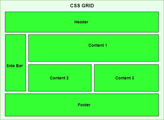
    CSS Grid Layout is a two-dimensional layout system for developing responsive webpages. In this tutorial we will learn how to design a webpage layout using grid systems.

    What is a Grid Layout?

    Grid Layout used to enhance user experience over all the user devices by providing a responsive and flexible arrangement of HTML components over the webpage.

    Grid is ideal for creating overall layout of a webpage, while flexbox is mostly used to align items inside a container.

    Table of Contents

    • Grid Elements
    • Display Grid Property
    • Grid Rows and Columns
    • Grid Gap
    • Grid Lines
    • CSS Grid Properties Reference

    Grid Elements

    In a grid layout system, we have two elements, Grid Container and Grid Item.

    Grid Container

    Grid container defines the outer element of grid, where all the child elements are present. A grid container can be defined by setting display: grid or display: inline-grid

    Grid items

    Grid items are all the direct elements inside grid container. This items can be arranged vertically and horizontally inside flexbox container based on need.

    CSS Grid Layout

    Display Grid Property

    A HTML element become a grid container if we set value of display property as grid or inline-grid. All direct children of the grid container automatically become grid items.

    • grid: This value defines block level grid container, means it behave like a block element taking full width available. ( Similar to div )
    • inline-grid: This value defines inline level grid container, means it behave like a inline element taking as much width as it’s content. ( Similar to span )

    Example

    Following example show the difference between grid and inline-grid

    <!DOCTYPE html><html lang="en"><head><style>
    
      .grid-container {
         display: grid;
         grid-template-columns: 1fr 1fr 1fr;
         gap: 10px;
         width: 100%;
         background-color: lightblue;
      }
      .inline-grid-container {
         display: inline-grid;
         grid-template-columns: 1fr 1fr 1fr;
         gap: 10px;
         background-color: lightgreen;
      }
      .grid-item {
         background-color: lightcoral;
         padding: 20px;
         text-align: center;
      }
    </style></head><body><h3>Inline Grid Example</h3><p>
         Here is an example of 
         &lt;span class="inline-grid-container"&gt;&lt;span class="grid-item"&gt;1&lt;/span&gt;&lt;span class="grid-item"&gt;2&lt;/span&gt;&lt;span class="grid-item"&gt;3&lt;/span&gt;&lt;/span&gt; 
         inline grid.
    </p><h3>Grid Example</h3><div class="grid-container"><div class="grid-item">1</div><div class="grid-item">2</div><div class="grid-item">3</div></div></body></html>

    Grid Rows and Columns

    In CSS, we can define the number of columns and rows required in our layout. Each cell will represent a grid item. Following code shows how to define rows and columns in grid.

    Example

    In this example we will create two grid layout one is for row and another one is for column, each grid has row and column but showing them individually will help you to crack the rows and columns.

    <!DOCTYPE html><html lang="en"><head><style>
    
        .grid-container {
            display: grid;
            gap: 10px;
            padding: 10px;
            width: 75%;
        }
        .grid-item {
            background-color: #4CAF50;
            border: 1px solid #ddd;
            padding: 20px;
            text-align: center;
            font-size: 1.2em;
            color: white;
        }
        .row{
            grid-template-columns: 1fr;
            grid-template-rows: repeat(3, 1fr);
        }
        .column{
            grid-template-columns: repeat(3, 1fr);
            grid-template-rows: 1fr;
        }
    &lt;/style&gt;&lt;/head&gt;&lt;body&gt;&lt;h1&gt;Grid Layout Example&lt;/h1&gt;&lt;h3&gt;Grid Rows - 3 Rows X 1 Column&lt;/h3&gt;&lt;div class="grid-container row"&gt;&lt;div class="grid-item item1"&gt;
         Item 1
      &lt;/div&gt;&lt;div class="grid-item item2"&gt;
         Item 2
      &lt;/div&gt;&lt;div class="grid-item item3"&gt;
         Item 3
      &lt;/div&gt;&lt;/div&gt;&lt;h3&gt;Grid Columns - 1 Row X 3 Columns &lt;/h3&gt;&lt;div class="grid-container column"&gt;&lt;div class="grid-item item1"&gt;
         Item 1
      &lt;/div&gt;&lt;div class="grid-item item2"&gt;
         Item 2
      &lt;/div&gt;&lt;div class="grid-item item3"&gt;
         Item 3
      &lt;/div&gt;&lt;/div&gt;&lt;/body&gt;&lt;/html&gt;</pre>

    Grid Gap

    The grid gap properties are used to add gaps between rows and columns of grid items. We have three properties associated with this, gap, column-gap and row-gap.

    The gap property can set equal gap for both row and column, while row-gap and column-gap can set different gap values for row and column. Row value and column value have more preference over gap value, so if we define all three row value and column value will override over gap value.

    Example

    Here in this example we tried to explain the gap between grid items.

    <!DOCTYPE html><html lang="en"><head><style>
    
      .grid-container {
         display: grid;
         grid-template-columns: 1fr 1fr 1fr;
         grid-template-rows: 100px 100px 100px;
         /* Sets both row and column gaps to 20px */
         gap: 20px; 
         /* Make gap between rows as 10px (override) */
         row-gap: 10px; 
         /* Make gap between columns as 5px (override) */
         column-gap: 5px; 
      }
      .grid-item {
         background-color: #4CAF50;
         border: 1px solid #ddd;
         padding: 20px;
         text-align: center;
         font-size: 1.2em;
         color: white;
      }
    </style></head><body><h1>Grid Gap Example</h1><div class="grid-container"><div class="grid-item">
         Item 1
      &lt;/div&gt;&lt;div class="grid-item"&gt;
         Item 2
      &lt;/div&gt;&lt;div class="grid-item"&gt;
         Item 3
      &lt;/div&gt;&lt;div class="grid-item"&gt;
         Item 4
      &lt;/div&gt;&lt;div class="grid-item"&gt;
         Item 5
      &lt;/div&gt;&lt;div class="grid-item"&gt;
         Item 6
      &lt;/div&gt;&lt;/div&gt;&lt;/body&gt;&lt;/html&gt;</pre>

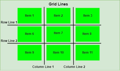
    CSS Grid Lines

    In CSS, Grid items can be placed according to the imaginary ines between grid cell called grid items. The lines between columns are called column lines and lines between rows are called row lines.

    CSS Grid Lines

    CSS Grid Properties Reference

    Following is the list of CSS properties related to grid:

    propertyvalueExample
    displayDefine whether an element is a grid container or an inline grid container.Try It
    gapDefines the gap between rows and columns.Try It
    grid-areaDefines the location and size of the grid item within a grid layout.Try It
    grid-columnControl the placement of a grid item within the grid container in the column direction.Try It
    grid-rowControl the placement of a grid item within the grid container in the row direction.Try It
    grid-templateSpecify the grid columns, grid rows and grid areas.Try It
    grid-auto-columnsDetermines the size of automatically generated grid column tracks or a pattern of such tracks.Try It
    grid-auto-rowsDetermines the size of automatically- generated grid rows tracks or a pattern of such tracks.Try It
    grid-auto-flowSpecifies arrangement of the grid item within the grid.Try It

  • grid Property

    CSS grid property is a shorthand property used to declare all explicit and implicit grid properties in one declaration. It’s a convenient and concise way to define the grid layout of an element. The grid property is a shorthand for the following individual grid-related properties: grid-template-rows, grid-template-columns, grid-template-areas, grid-auto-columns, grid-auto-flow and grid-auto-rows

    Syntax

    grid: none| grid-template-rows / grid-template-columns | grid-template-areas | grid-template-rows / [grid-auto-flow] grid-auto-columns | [grid-auto-flow] grid-auto-rows / grid-template-columns | initial | inherit;

    Property Values

    ValueDescription
    noneIt indicates no specific sizing of rows or columns. Default.
    grid-template-rows / grid-template-columnsIt specifies the number of rows with their heights and the number of columns with their width.
    grid-template-areasIt specifies the grid layout with names.
    grid-template-rows / grid-auto-columnsIt specifies the number of rows with their heights and auto size of the column.
    grid-auto-rows / grid-template-columnsIt specifies the auto size of rows and specifies the number of columns with their width.
    grid-template-rows / grid-auto-flow grid-auto-columnsIt specifies the number of rows with their height, the position of auto-placed items and the auto size of columns.
    grid-auto-flow grid-auto-rows / grid-template-columnsIt specifies how to place auto-placed items, the auto size of the rows, and specifies the number of columns with their width.
    initialIt sets the property to its initial value.
    inheritIt inherits the property from the parent element.

    Examples of CSS Grid Property

    The following examples explain the grid property with different values.

    Grid Property with Row Height and Column Width

    To define rows and columns with their sizes in a grid layout, we specify the height values for rows and width values for columns, separated by a / (e.g. 10px 10px / 20px 20px specifies 2 rows of 10px height and 2 columns of 20px width) to the grid property. This is shown in the following example.

    Example

    <!DOCTYPE html><html><head><style>
    
      .container {
         display: grid;
         grid: 150px 100px/ auto auto auto;
         gap: 10px;
         background-color: lightblue;
      }
      .container&gt;div {
         border: 2px solid gray;
         color: white;
         text-align: center;
         padding: 30px 0px;
         margin: 10px;
         background-color: lightcoral;
      }
    </style></head><body><h2>
      CSS Grid Property
    </h2><p><strong>
         grid: 150px 100px / auto auto auto 
      &lt;/strong&gt;; 
      There are two rows: first row's height is 150px,
      second row's height is 100px. There are three 
      columns: all colums have auto width, meaning
      they will be adjusted according to their 
      content.
    </p><div class="container"><div>
         Item-1
      &lt;/div&gt;&lt;div&gt;
         Item-2
      &lt;/div&gt;&lt;div&gt;
         Item-3
      &lt;/div&gt;&lt;div&gt;
         Item-4
      &lt;/div&gt;&lt;div&gt;
         Item-5
      &lt;/div&gt;&lt;div&gt;
         Item-6
      &lt;/div&gt;&lt;/div&gt;&lt;/body&gt;&lt;/html&gt;</pre>

    Grid Property with Grid Template Area

    To define sizes of certain portion of the grid layout such that elements can be placed in those portions, we provide names to the portions along with their size (e.g. "header header content content " indicates 2 rows and 2 columns) to the grid property. This is shown in the following example.

    Example

    <!DOCTYPE html><html><head><style>
    
      .container {
         display: grid;
         grid: "header header header header" 100px
               "sidebar content content content" 100px
               "footer footer footer footer" 100px;
         padding: 10px;
         gap: 20px;
         background-color: lightblue;
      }
      .item1 {
         grid-area: header;
      }
      .item2 {
         grid-area: sidebar;
      }
      .item3 {
         grid-area: content;
      }
      .item4 {
         grid-area: footer;
      }
      .container&gt;div {
         background-color: lightcoral;
         text-align: center;
         color: white;
         padding: 20px;
      }
    </style></head><body><h2>
      CSS Grid Property
    </h2><p><strong>
         grid: "header header header header 100px
         sidebar content content content 100px
         footer footer footer footer 100px"
      &lt;/strong&gt;; 
      There are three rows and four columns. The header
      is first row and takes four columns, sidebar and
      content are second row and take single column 
      and 3 columns respectively and footer is third
      column and takes all four columns. All rows 
      have 100px height.
    </p><div class="container"><div class="item1">
         This is header
      &lt;/div&gt;&lt;div class="item2"&gt;
         This is sidebar
      &lt;/div&gt;&lt;div class="item3"&gt;
         This is content
      &lt;/div&gt;&lt;div class="item4"&gt;
         This is footer
      &lt;/div&gt;&lt;/div&gt;&lt;/body&gt;&lt;/html&gt;</pre>