CSS Validation refer to process to checking correctness of CSS rules in a webpage. Validation is the process of checking something against a rule. When you are a beginner, it is very common that you will commit many mistakes in writing your CSS rules. How you will make sure whatever you have written is 100% accurate and up to the W3 quality standards?
W3C CSS Validator is official CSS validator developed by World Wide Web Consortium. This validator checks your css by either file upload, direct input, or using URL.
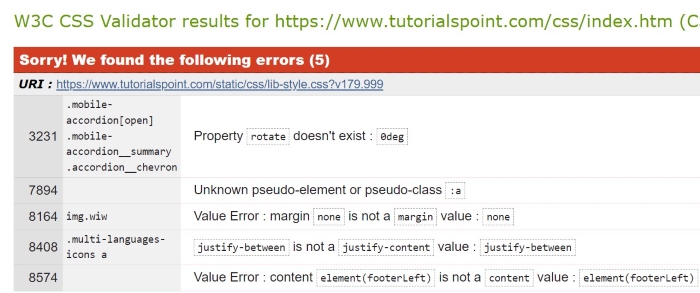
CSS Validation Example
The image below shows css validation done by W3C:
Validation Warnings
When you validate your CSS, you may see warnings. These warnings do not stop your CSS from working, but they indicate that something is not perfect. Here are some common validation warnings:
Deprecated Properties: Some CSS properties are old and should not be used anymore. Its better to use newer alternatives.
Invalid Values: If you use a value that does not fit with the property, a warning will show up. Make sure to check the correct values for each property.
Redundant Code: Warnings may point out code that is not needed because it does not change anything. Cleaning this up can help your CSS be more efficient.
Selectors Too Specific: If your CSS selectors are too specific, they can make your code harder to read and maintain. Try to keep selectors simple.
Why Validate Your CSS Code?
Validating the stylesheet of a webpage is important for ensuring that website displays and functions correctly across different browsers and devices.
Improves Browser Compatibility: Validation makes sure your CSS follows the rules, so your webpage looks good on all browsers.
Enhances Performance: Clean and correct CSS helps your webpage load faster, while mistakes or extra code can slow it down.
Debugging Made Easier: Validating your CSS helps you find and fix mistakes, making it easier to manage your code.
SEO Benefits: Well-organized and correct CSS can improve the user experience and make your site faster. This way your site can get ranked easily in search engines.
CSS Layout is essential for defining the visual structure, organization, and responsiveness of a website. In this tutorial, we will explore various CSS techniques to create effective website layouts.
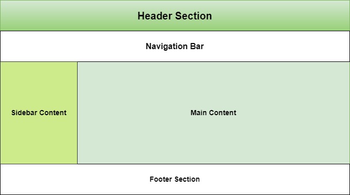
Structure of Webpage Layout
A webpage is made up of various sections like header, menus, content, and footer based on which there are many different layout designs available for developers.
To know how to define a webpage structure, checkout our tutorial on HTML Layout. Here we explained each and every elements of a webpage layout. In this tutorial we will see how to style a webpage layout using CSS.
Table of Contents
CSS Normal Layout Flow
CSS Float Layout
CSS Flex Layout
CSS Grid Layouts
CSS Positioning
CSS Responsive Layout
CSS Normal Layout Flow
Normal flow is the default layout mode where elements are positioned in the order they appear in the HTML document.
Block level elements like <div>, <p>, headings will stack vertically and takes up full width if not specified.
Inline elements like <span>, <strong> stack horizontally. You cannot alter height and width of these elements.
Inline block elements will behave like both inline and block. They will start from current line but you can alter it’s size.
Let’s see an example for CSS normal layout flow
Example
<!DOCTYPE html><html><head><style>
div, span{
border: 2px solid;
margin: 10px;
}
.inlineBlock{
display: inline-block;
height: 100px;
width: 100px;
}
</style></head><body><div> Block Element </div><div> Block Element </div><span> Inline element </span><span> Inline element </span><div> Block Element </div><span> Inline element </span><div class="inlineBlock">
Inline Block Element
</div></body></html></pre>
CSS Float Layout
Float Layout is used to position elements left or right in document flow. Main use of this layout system is to create two column layout and to wrap texts to either sides of image in webpage.
This layout create a sidebar at left side of the page occupying 25% of available width and main content at right with 75% width.
In this example we will see how float is used with images to wrap text.
Example
<!DOCTYPE html><html><head><style>
.float-left {
float: left;
margin-bottom: 20px;
margin-right: 10px;
border: 3px solid;
}
h3{
clear: left;
}
</style></head><body><img src="/css/images/logo.png" class="float-left" ><p>This text will wrap around the floated image.</p><h3>This text with float cleared</h3></body></html></pre>
CSS Flex Layout
CSS Flex Layout organizes elements within a container along a single dimension, which can be either horizontally or vertically aligned.
Following example uses flex-direction as row, means items will be arranged horizontally. For vertical arrangement you need to set flex direction as column.
CSS Grid Layout is a two-dimensional layout system used for organizing elements horizontally and vertical while developing responsive webpages.
In the following example we define columns as '2fr 1fr 1fr', this means that first column should take 2 fraction of available space and rest two columns take 1 fraction of available space.
CSS Positioning helps to manipulate position of any element in a web page.
Along with position property, other properties like top, bottom, left and right are used to control its exact position on the page. They specify the offsets of an element from its edges.
Example
<!DOCTYPE html><html lang="en"><head><style>
*{
padding: 15px;
}
.container {
border: 1px solid #ccc;
}
.static-element {
position: static;
background-color: lightblue;
}
.relative-element {
position: relative;
top: 20px;
left: 30px;
background-color: lightgreen;
}
.normal-flow {
background-color: lightcoral;
margin: 10px 0;
}
</style></head><body><div class="container"><div class="static-element">
This is a static element (default position).
</div><div class="relative-element">
This element is relatively positioned 20px
down and 30px right.
</div><div class="normal-flow">
This element is in the normal document
flow, after the relative element.
</div></div></body></html></pre>
CSS Responsive Layout
A Responsive webpage layout looks good in all the end user devices like phones, tablets and desktops. It will automatically adjust size and other features accordance with user device.
In CSS the Media Queries are used to apply different CSS styles based on the screen size, resolution, and other characteristics of the user device.
@media (width > 700px){/* Styles for screens that are at least 700px wide */}
The following example demonstrates that when the screen width is between 600px and 800px, the background color changes to yellow and text color changes to red.
Example
<html><head><style>
p {
color: blue;
}
@media (600px < width < 800px) {
p {
background-color: yellow;
color: red;
}
}
</style></head><body><h1> TutorialsPoint </h1><p> CSS Media Type - Screen </p><p>
Resize the browser size to see the effect. (Open HTML
compiler of TutorialsPoint and try there )
</p></body></html></pre>
CSS printing involves using specific CSS rules and properties to control how a webpage is formatted when printed. Generally for any printable versions of webpage, the styling will be done with light colors. Because the dark color like black, red will consume more ink from printer. In this tutorial we will learn how to design a printer friendly webpage using CSS.
Table of Contents
Styles For Printer-Friendly Pages
Using a Print Style Sheet
Using Media Queries and @page
Detecting Print Requests
Styles For Printer-Friendly Pages
Here are the key styles that can be applied for creating printer-friendly pages:
Simplify the Layout: Remove unnecessary elements like sidebars, navigation menus, advertisement sections and interactive content by setting display as none
Remove Background Colors: It is recommended to remove background color (or set light color) and set text color as black for printable version of pages. This helps to save ink.
Adjust Font Sizes and Styles: Use readable font sizes and styles, typically larger and more legible fonts like serif fonts.
Display URLs for Links: When you print a page containing hyperlinks, the exact URL for that will not be visible. So you need to replace this with exact link on printable version.
Manage Page Breaks: Make sure to control where content breaks between pages to avoid splitting important sections or headings across pages.
There are multiple ways we can style printer version of pages. We can explicitly declare an external stylesheet for printer version or we can use media queries inside internal stylesheet. Let’s look into that.
Using a Print Style Sheet
You can have a external stylesheet explicitly for printing needs and link it to your code. You just need to set the value for media attribute as “print” for link tag. Add the following tag to head section of your HTML document.
CSS @page rule is used to control aspects like the size, orientation, and margins of the printed content. This can be useful for setting a consistent page size and margin for all printed pages and creating booklets or documents with specific page layouts.
@page{size: A4 portrait;/* A4 size, portrait orientation */margin: 2cm;/* 2cm margins on all sides */}/* First page has different styling */@page :first{margin: 5cm;}
Let see an example for this two.
Example
<!DOCTYPE html><html><head><style>
body{
background-color: black;
color: white;
padding: 10px;
}
@media print {
body {
background-color: white;
color: black;
padding: 10px;
}
}
@page {
size: A4 portrait;
margin: 2cm;
}
button {
background-color: aqua;
padding: 5px;
}
</style></head><body><h3> Tutorialspoint </h3><p>CSS Media Type - Print</p><p>
Background is white for printable version of this page.
Check out...
</p><button onclick="printPage()">Print Page</button><script>
function printPage() {
window.print();
}
</script></body></html></pre>
Detecting Print Requests
Browsers trigger 'beforeprint' and 'afterprint' events to identify when printing is about to happen or has just occurred. You can use these events to modify the user interface during the print process, such as showing or hiding specific elements while printing, or even change style after printing.
CSS text effects are used to manage styles of text by setting overflow rules, wrapping rules, line-breaking rules and writing modes to text. The text effects allow us to apply different types of effects on text used in an HTML document. In this chapter, we will learn how to add effects to texts in CSS.
What are Text Effects in CSS?
The following are the text effects commonly used in CSS:
text-overflow: It specifies how to manage the text that is overflowing the container.
word-wrap: It specifies to break the long words that are overflowing from the container.
word-break: It specifies to break the words that are separated by the hyphens when the text is overflowing container.
writing-mode: It specifies the horizontal and vertical writing modes of the text.
We will see examples for all of these properties in upcoming sections. There are several other properties related to the text in CSS, we have covered all of those in the CSS Text Styling chapter.
Text Overflow
The text-overflow property is used to control the text that exceeds the parent’s width. You can clip the text that exceeds the width of the parent or add an ellipsis(…) to indicate text continues.
Syntax
The syntax for the CSS text-overflow property is as follows:
p{text-overflow: clip | ellipsis;}
Example
The following example demonstrates the use of text-overflow property with clip and ellipsis values on the paragraph element.
.txt2 {
text-overflow: ellipsis;
}
</style></head><body><h3> Text overflow clip </h3><p class="txt1">
This is some large amount of text to understand text
overflow property
</p><h3> Text overflow ellipsis </h3><p class="txt2">
This is some large amount of text to understand text
overflow property
</p></body></html></pre>
Word Wrap
The word-wrap property is used to allow long words to be able to be broken and wrapped onto the next line. This ensures that the content fits within its container, preventing overflow.
Syntax
The syntax for the CSS word-wrap property is as follows:
p{word-wrap: normal | break-word;}
Example
In this example, we have used word-wrap property with normal and break-word. The text with normal overflows the container, while with word-break, the word is broken to fit the container.
<html><head><style>
p{
border: 2px solid;
width: 40%;
padding: 2%;
}
.txt1{
word-wrap: normal;
}
.txt2 {
word-wrap: break-word;
}
</style></head><body><h3> Word wrap normal </h3><p class="txt1">
ThisIsAVeryLongWordThatWillNotBreakAndWillOverflowItsContainer
</p><h3> Word wrap break-word </h3><p class="txt2">
ThisIsAVeryLongWordThatWillBreakAndWrapOntoTheNextLine
</p></body></html></pre>
Word Break
The word-break property is used to specify how words should break when reaching the end of a line. This property is particularly useful for handling text that doesn't naturally wrap well, such as long words or URLs.
Syntax
The syntax for the CSS word-break property is as follows:
p{word-break: normal | break-all | keep-all;}
Example
In this example, we have used the word-break property with 'normal', 'break-all', and 'keep-all' property values on the paragraph element.
The writing-mode property is used to define the direction in which text is written within a block. This property is especially useful for supporting languages that are written vertically or for creating rotated text effects.
Syntax
The syntax for the CSS writing-mode property is as follows:
.txt3 {
writing-mode: vertical-lr;
}
</style></head><body><h3> Writing mode horizontal-tb </h3><p class="txt1">
This text is written in the traditional horizontal
direction from left to right
</p><h3> Writing mode vertical-rl </h3><p class="txt2">
This text is written vertically from top to bottom,
with lines stacked right to left
</p><h3> Writing mode vertical-lr </h3><p class="txt3">
This text is written vertically from top to bottom,
with lines stacked left to right
</p></body></html></pre>
CSS Text Effects Related Properties
Following is the list of CSS properties of styling text:
Property
Description
Example
text-overflow
Specifies how to manage the text that are overflowing the container.
Try It
word-wrap
Specifies to break the long words that are overflowing container.
Try It
word-break
Specifies to break the words that are separated by the hyphens when text is overflowing container.
Try It
writing-mode
Specifies horizontal and vertical writing modes of text.
Try It
text-justify
Specifies the justification method of text when text-align is set to "justify".
CSS at-rules are special instructions or statements beginning with the “@” symbol. They are used to control or modify the behavior of the stylesheet and are typically used for tasks such as defining media queries, importing external stylesheets, or specifying font faces.
CSS at-rules improves the CSS capabilities beyond basic selectors and property-value pairs. An at-rule begins with an at (@) sign, followed by an identifier, and further includes everything up to the next semicolon (;) or next CSS block.
Syntax
/* General structure */
@identifier (RULE);
Types of @ Rules
Regular
CSS provides different regular at-rules, based on the identifier and each has a different syntax.
@charset: Specifies the character encoding of an external stylesheet.
@import: Used to import an external CSS file into the current stylesheet.
@namespace: Used to declare and define XML namespaces within a CSS stylesheet.
Nested
A subset of nested statements that serve as both standalone style sheet statements and components within conditional group rules.
@media: Content of conditional group rule gets applied, if the device meets the criteria of the condition defined using media query.
@supports: Content of conditional group rule gets applied, if the given condition is met by the browser.
@page: Defines the layout of printed pages.
@font-face: Defines custom fonts to be used in a web page.
@keyframes: Defines the aspect of intermediate steps in a CSS animation sequence.
@counter-style: Defines the different custom counter styles that are not predefined.
@font-feature-values: Defines the common names in font-variant-alternates for feature activated in OpenType. It deals with the usage of alternate glyphs and these glyphs are defined in @font-feature-values
@property: Defines the usage of custom properties and variables.
@layer: Defines a layer and sets the order of precedence, when there are multiple cascade layers.
CSS @ Rules – @page Example
Here is an example of usage of @page:
<html><head><style>
@page :first {
margin-left: 80%;
margin-top: 80%;
}
p {
page-break-after: always;
}
</style></head><body><p>Page One.</p><p>Page Two.</p><button>Print</button><script>
CSS pseudo-elements are used to style specified parts of an element. While browsing a webpage, you might have noticed that the first letter of some paragraphs is larger than rest of letters. This type of styling for a specific part of elements is done using pseudo-elements in CSS. In this tutorial we will explain all the pseudo-elements and their functioning.
Table of Contents
What is Pseudo-Element?
Insertion Pseudo-Elements
CSS Backdrop Pseudo-Element
CSS Cue Pseudo-Element
CSS First-Letter Pseudo-Element
CSS First-Line Pseudo-Element
CSS File-Selector-Button
CSS Marker Pseudo-Element
CSS Placeholder Pseudo-Element
CSS Selection Pseudo-Element
Multiple Pseudo-elements
All CSS Pseudo-Elements
What is Pseudo-Element?
A pseudo-element in CSS, is used to style a specific part of an element that are not the part of the DOM (Document Object Model) and do not exist in the HTML markup. For Example first letter of a paragraph, placeholder text inside input element or selected part in a document.
Pseudo-elements are denoted by a double colon (::) notation.
Only one pseudo-element can be used in a selector.
A pseudo-element in a selector must appear after all the other components. For example, p::last-line:hover is invalid.
Pseudo-elements can be used to add decorative styles, create special effects, and modify the appearance of certain parts of an element, that has a state already applied to it. For example, p:hover::last-line is a valid statement and selects the last line of the paragraph when the paragraph is hovered
Syntax
selector::pseudo-element{property: value;}
The single colon syntax is supported by the browsers for the four original pseudo-elements, i.e., ::before, ::after, ::first-line, and ::first-letter.
Content Insertion Pseudo-Elements
In CSS, pseudo-elements ::before and ::after are used to insert text contents or images before and after any element.
Example
This example shows how to insert text and images at start and end of a paragraph using CSS.
<!DOCTYPE html><html><head><style>
p:before {
content: "NOTE:";
font-weight: bold;
}
p:after {
content: url(/css/images/smiley.png);
}
</style></head><body><p>
We inserted intro at start and emoji at end.
</p></body></html></pre>
CSS Backdrop Pseudo-Element
In CSS the ::backdrop pseudo-element is used to style the backdrop of an element that is in a modal context, such as the backdrop behind a <dialog> element when it is shown.
Example
Following example demonstrates use of ::backdrop pseudo-element.
<!DOCTYPE html><html><head><style>
body{
height: 200px;
}
dialog {
padding: 20px;
border: 2px solid black;
border-radius: 10px;
}
dialog::backdrop {
/* Semi-transparent black */
background-color: rgba(0, 0, 0, 0.5);
}
</style></head><body><h3> Backdrop Example </h3><dialog id="myDialog"><p> This is a dialog with a styled backdrop. </p><button id="closeButton"> Close </button></dialog><button id="openButton">Open Dialog</button><script>
const dialog = document.getElementById('myDialog');
const openButton = document.getElementById('openButton');
const closeButton = document.getElementById('closeButton');
In CSS, the pseudo-element ::cue is used with Web Video Text Tracks to style specific parts of text tracks, such as subtitles or captions, for media elements like <video> and <audio>.
Example
Following example demonstrates use of ::cue pseudo-element
In CSS, the ::first-letter pseudo-element is used to target the first letter of text content of any elements like div, paragraph, span etc
Example
Following example demonstrates use of ::first-letter pseudo-element:
<!DOCTYPE html><html><head><style>
p::first-letter {
text-transform: uppercase;
font-size: 2em;
color: darkred;
font-style: italic;
}
</style></head><body><p>
this is a paragraph with first letter in lowercase,
we used ::first-letter pseudo-element to capitalize
first-letter of paragraph with a larger font size
and a different color.
</p></body></html></pre>
CSS First-Line Pseudo-Element
In CSS, the ::first-line pseudo-element is used to target the first line of text content of any elements like div, paragraph, span etc
Example
Following example demonstrates use of ::first-line pseudo-element:
<!DOCTYPE html><html><head><style>
p::first-line {
background-color: #f0f0f0;
color: darkred;
font-style: italic;
}
</style></head><body><p>
This is a normal paragraph with no stylings, we used
::first-line pseudo-element to only style first-line of
paragraph by adding a background color, font-style and
text color
</p></body></html></pre>
CSS File-Selector-Button Pseudo-Element
In CSS, the ::file-selector-button pseudo-element is used to style the button of a file input element (<input type="file">) in modern browsers.
Example
Following example demonstrates use of ::file-selector-button pseudo-element:
In CSS, the ::selection pseudo-element is used to style the user selected text inside any elements like div, paragraph, span etc
Example
Following example demonstrates use of ::selection pseudo-element:
<!DOCTYPE html><html><head><style>
.highlight::selection {
color: yellow;
background: brown;
}
</style></head><body><p class="highlight">
Select Me!!! to see the effect.
</p><p> No style applied to me. </p></body></html></pre>
Multiple Pseudo-elements
We can also add multiple pseudo elements to a selector, Check out the example.
Example
Following example demonstrates usage of multiple pseudo-elements (::first-line and ::first-letter).
<!DOCTYPE html><html><head><style>
p::first-line {
text-decoration: underline;
}
p::first-letter {
text-transform: uppercase;
font-size: 2em;
color: red;
}
</style></head><body><p>
the first line of this paragraph will be underlined and
first letter is uppercase, 2em and red in color, as the
pseudo-element ::first-line & ::first-letter is applied
on p. The other lines are not underlined.
</p></body></html></pre>
All CSS Pseudo-Elements
The following table shows all pseudo-elements in CSS:
Pseudo-element
Description
Example
::after
Adds a pseudo-element that is the last child of the selected element.
Try It
::backdrop
Used to style the backdrop of an element like dialog box.
Try It
::before
Adds a pseudo-element that is the first child of the selected element.
Try It
::cue
Used to style the captions and cues in media with video text tracks.
Try It
::first-letter
Applies styles to the first letter of the first line of a block level element.
Try It
::first-line
Applies styles to the first line of a block level element.
Try It
::file-selector-button
Represents the button of an <input> of type="file".
Try It
::marker
Selects the marker box of a list item.
Try It
::part()
Represents an element within a shadow tree that has a matching part attribute.
Try It
::placeholder
Represents a placeholder text in an <input> or <textarea> element.
Try It
::selection
Applies styles to the selected part of the document (selected by clicking and dragging the mouse across text).
Try It
::slotted()
Represents an element that has been placed into a slot inside an HTML template.
Try It
::grammar-error
Used to style text that has been identified as grammatically incorrect by the browsers built-in grammar checking tools.
Try It
::spelling-error
Used to style text that has been identified as incorrect spelling by the browsers built-in spelling checking tools.
Pseudo-classes in CSS are used to select and style elements based on their state or position within the document tree, without the need for adding extra classes or JavaScript.
For Example, pseudo-class can be used to change color of element when mouse is hovered over it or Click a button to change color.
Hover over me!Click me!
Table of Contents
What is Pseudo-class?
Pseudo-Class Hover
Pseudo-Class Active
Pseudo-Class Focus
Pseudo-Class nth Child
Pseudo-Class First-Child
Pseudo-Class Last-Child
Pseudo-Class Lang
Pseudo-Class not
List of CSS Pseudo Classes
What is Pseudo-class?
Pseudo-classes often used along with CSS Selectors by inserting a colon (:) after selector. For example a : hover{}, Here selector a will selects all the anchor tags in document.
A functional pseudo-class contains a pair of parentheses to define the arguments. For example: :lang(en).
The element to which a pseudo-class is attached, is termed as an anchor element. For example: button:hover, a:focus, etc. Here button and a elements are called the anchor elements.
Pseudo-classes apply style to an element as per the content of the document tree.
Pseudo-classes also apply a style to an element in relation to the external factors, such as history of the navigation of the element (:visited), status of the content (:checked), or position of mouse (:hover)
Syntax
selector:pseudo-class{property: value;}
Pseudo-Class Hover
In CSS, pseudo-class :hover is used to specify mouse hovering state of an element. This used to style element while users mouse passes through an element in document.
</style></head><body><h3>Anchor Tag Hovering</h3><a href="#">Hover over me!</a><h3>Div Hovering</h3><div>Hover me</div></body></html>
Pseudo-Class Active
The pseudo-class :active will apply style to an element when user activates the element by clicking or tapping on it. This is most commonly used with interactive elements like button and anchor tag, but all the HTML elements can use this pseudo-class.
Syntax
tag:active{property: value;}
Example
Here is an example that shows different usage of pseudo-class active.
<!DOCTYPE html><html lang="en"><head><style>
a, p, li {
color: black;
background-color: lightgrey;
padding: 7px;
border: 3px solid;
}
a:active {
color: red;
}
p:active {
background-color: gold;
}
li:active {
background-color: darkred;
}
</style></head><body><h2>Active Pseudo-Class Example</h2><h3>For Button:</h3><a href="#">Click Me</a><h3>For paragraph:</h3><p>Click me to see the effect.</p><h3>For list:</h3><ul><li>Item 1</li><li>Item 2</li><li>Item 3</li></ul></body></html></pre>
Pseudo-Class Focus
The pseudo-class :focus will apply style to an element when user focused an element like input tag by clicking on it. Before typing text in input element users has to click in input area to enable cursor, this is called focusing.
Syntax
tag:focus{property: value;}
Example
This example will show how to use pseudo-class focus in HTML.
The pseudo-class nth-child can take number, mathematical expression or values like odd, even as parameter. To know about values associated with nth child visit our tutorial on Pseudo Class nth-child().
<!DOCTYPE html><html lang="en"><head><style>
div{
border: 2px solid;
margin: 7px;
padding: 2px;
}
/* Apply Style to 2nd child of div */
div:nth-child(2){
background-color:red;
}
/* Apply Style to all odd children of li */
li:nth-child(odd) {
background-color: lightgray;
}
/* Apply Style to all even children of li */
li:nth-child(even) {
background-color: lightblue;
}
</style></head><body><h2>Pseudo-Class nth-child</h2><h3>2nd child of Div</h3><div><div>1st div</div><div>2nd div</div><div>3rd div</div><div>4th div</div></div><h3>Selecting odd and even children</h3><ul><li>First item</li><li>Second item</li><li>Third item</li><li>forth item</li><li>Third item</li><li>fifth item</li></ul></body></html></pre>
Pseudo-Class First-Child
The pseudo-class first-child used to select first direct child element.
Syntax
tag:first-child{property: value;}
Example
Following example show how to use first-child pseudo-class in HTML.
<!DOCTYPE html><html lang="en"><head><style>
div{
border: solid;
}
/* Selects all first child paragraphs */
p:first-child {
color: blue;
}
</style></head><body><p>
This paragraph is first child of body
element, will be blue.
</p><p>This paragraph will not be affected.</p><p>Another paragraph that won't be affected.</p><div><p>
This paragraph is first child of div
element will be blue.
</p><p>This paragraph will not be affected.</p><p>Another paragraph that won't be affected.</p></div></body></html></pre>
Pseudo-Class Last-Child
The pseudo-class last-child used to select last direct child element.
Syntax
tag:last-child{property: value;}
Example
Following example show how to use last-child pseudo-class in HTML.
<!DOCTYPE html><html lang="en"><head><style>
div{
border: solid;
}
/* Selects all last child paragraphs */
p:last-child {
color: blue;
}
</style></head><body><p>This paragraph will not be affected.</p><p>Another paragraph that won't be affected.</p><div><p>This paragraph will not be affected.</p><p>Another paragraph that won't be affected.</p><p>
This paragraph is last child of div
element will be blue.
</p></div><p>
This paragraph is last child of body
element, will be blue.
</p></body></html>
Pseudo-Class Lang
The pseudo-class :lang() will apply style to an element based on value of lang attribute set to the element or it's parent.
Here is an example of :lang() pseudo-class:
<html><head><style>
/* Selects all the tags that set english as language */
:lang(en) {
quotes: '""';
}
/* Selects all the tags that set french as language */
:lang(fr) {
This language is set as english, Here
css use double(" ") quotes
</q><br><q lang="fr">
This language is set as French, Here
css use guillemet( ) quotes
</q></body></html>
Pseudo-Class Not
The pseudo-class :not(selector) is used to apply style on all the elements expect elements that included in mentioned selectors. To know what is a selector in CSS check out our tutorial on CSS Selectors.
Syntax
tag:not(selector){property: value;}
The selector can be a class, id, or tag in html.
Example
Following example shows how to use not pseudo-class in CSS
/*Style all paragraph except class special*/
p:not(.special) {
color: red;
}
/*Style all special paragraph except id superSpecial*/
.special:not(#superSpecial){
background-color: lightgrey;
}
</style></head><body><p>This is a normal paragraph.</p><p class="special" id="superSpecial">
This is a super special paragraph.
</p><p>This is another normal paragraph.</p><p class="special">
This is special paragraph.
</p></body></html>
List of CSS Pseudo Classes
The table given below lists all the CSS pseudo-classes:
Pseudo-class
Description
Example
:active
Represents an element that has been activated by the user.
Try It
:any-link
Represents an element that acts as the source anchor of a hyperlink, independent of whether it has been visited.
Try It
:autofill
Matches an element that has its value autofill by the browser.
Try It
:checked
Matches any radio, checkbox or option element that is checked or toggled.
Try It
:default
Selects form elements that are the default in a group of related elements.
Try It
:defined
Represents any custom element that has been defined.
Try It
:disabled
Represents a disabled element.
Try It
:empty
Matches an element that has no children.
Try It
:enabled
Represents an enabled element, after its has been activated.
Try It
:first
Represents the first page of a printed document, with the @page at-rule.
Try It
:first-child
Represents the first element among a group of sibling elements.
Try It
:first-of-type
Represents the first element of its type among a group of sibling elements.
Try It
:fullscreen
Matches an element that is currently displayed in fullscreen mode.
Try It
:focus
Represents an element that has received focus.
Try It
:focus-visible
Applies while an element matches the :focus pseudo-class or receives focus.
Try It
:focus-within
Matches an element if the element or any of its descendants are focused.
Try It
:has()
This represents an element if any of the relative selectors.
Try It
:host
This selects the shadow host of the shadow DOM containing the CSS it is used inside.
Try It
:host()
This function selects the shadow host of the shadow DOM containing the CSS it is used inside.
Try It
:host-context()
This function allows you to style a custom element based on the classes or attributes of its ancestor elements.
Try It
:hover
Matches when the user interacts with an element with a pointing device, like a mouse, but does not necessarily activate it.
Try It
:indeterminate
Represents any form element whose state is indeterminate or unknown.
Try It
:in-range
Represents an element whose current value is within the range limits.
Try It
:invalid
Represents any element whose contents fail to validate.
Try It
:is()
Takes a selector list as its argument, and selects any element that can be selected by one of the selectors in that list.
Try It
:lang()
Matches an element based on the language they are defined to be in.
Try It
:last-child
Represents the last element among a group of sibling elements.
Try It
:last-of-type
Represents the last element of its type among a group of sibling elements.
Try It
:left
Represents all left-hand pages of a printed document, used with @page at-rule.
Try It
:link
Represents an element that has not yet been visited.
Try It
:modal
Matches an element that is in a state in which it excludes all interaction with elements outside it until the interaction has been dismissed.
Try It
:not()
Represents an element that do not match a list of selectors.
Try It
:nth-child()
Selects child elements according to their position among all the sibling elements within a parent element.
Try It
:nth-last-child()
Matches elements based on their position among siblings, counting from the last (end)
Try It
:nth-last-of-type()
Matches elements based on their position among siblings of the same type, counting from the last (end).
Try It
:nth-of-type()
Matches elements based on their position among siblings of the same type.
CSS Layers are a concept that is used to control the stacking order of different DOM elements in a webpage. The z-index property determines the stacking order of elements within a stacking context.
The elements with a higher z-index are layered above those with a lower z-index and if elements share the same z-index, they stack according to their order in the DOM. We will look more into details and examples of CSS layering in this tutorial.
Table of Contents
CSS Layering With z-index Property
Layer Text Above Image
Positioning Without z-index Property
CSS Layering With z-index Property
As mentioned above the z-index property can be used to decide stacking order of element in a webpage. The following example demonstrates how to create vertically stacked elements using z-index property. The elements with higher z-index value are positioned above the elements of lower z-index value.
In CSS position property can be used to position text in different locations above an image.
First we need to set position property for image container as position: relative and position property of text as position: absolute. Now you can position of text elements using CSS inset properties like top, bottom, left and right.
Example
<html><head><style>
.container {
position: relative;
border: 2px solid #ef2c2c;
}
.center {
position: absolute;
top: 45%;
width: 100%;
text-align: center;
}
.top-left {
position: absolute;
top: 12px;
left: 30px;
}
.top-right {
position: absolute;
top: 12px;
right: 30px;
}
.bottom-left {
position: absolute;
bottom: 12px;
left: 30px;
}
.bottom-right {
position: absolute;
bottom: 12px;
right: 30px;
}
img {
width: 100%;
opacity: 0.7;
}
</style></head><body><div class="container"><img src="/css/images/red-flower.jpg"
width="1000px" height="350px"><h3 class="center">
Text at Center
</h3><h3 class="top-left">
Text at Top Left
</h3><h3 class="top-right">
Text at Top Right
</h3><h3 class="bottom-left">
Text at Bottom Left</h3><h3 class="bottom-right">
Text at Bottom Right
</h3></div></body></html></pre>
Positioning Without z-index Property
The following example demonstrates how to create layers without using z-index property.
CSS Positioning helps to manipulate position of any element in a web page. In this tutorial we will learn position property and values associated with it.
Table of Contents
What is CSS Position?
Static Positioned Element
Relative Positioned Elements
Absolutely Positioned Elements
Position Fixed Element
Sticky Positioned Element
Positioning Text in an Image
Position Related Properties
What is CSS Position?
In CSS position property is used to create floating elements, floating sidebar, and other interactive features by adjusting position of elements in webpage.
Along with position property, other properties like top, bottom, right, and left are used to control its exact position on the page. They specify the offsets of an element from its edges. We will see examples for those in this tutorial.
When you use the position: static property, the element will be positioned normally in the document flow. The left, right, top, bottom, and z-index properties will not affect the element. This is the default value for position property.
Example
In this example we defined two static positioned div elements and one relative positioned element. See the difference.
<!DOCTYPE html><html lang="en"><head><style>
.container {
padding: 20px;
border: 1px solid #ccc;
}
.static-element {
position: static;
background-color: lightblue;
padding: 10px;
margin: 10px 0;
}
.non-static-element {
position: relative;
top: 20px;
background-color: lightgreen;
padding: 10px;
}
</style></head><body><div class="container"><div class="static-element">
This is a static element (default position).
</div><div class="non-static-element">
This element is not static and is moved
20px down.
</div><div class="static-element">
This is another static element (default
position).
</div></div></body></html></pre>
Relative Positioned Elements
CSS position: relative property positions the elements relative to their original position in the page. You can use the left, right, top, and bottom properties to move the element around, but it will still take up space in the document flow.
Example
In this example we defined one static positioned div element and one relative positioned element. See the difference.
This is a static element (default position).
</div><div class="relative-element">
This element is relatively positioned 20px
down and 30px right.
</div><div class="normal-flow">
This element is in the normal document
flow, after the relative element.
</div></div></body></html></pre>
Absolutely Positioned Elements
An element with position: absolute is taken out of the document flow and positioned relative to its nearest positioned ancestor (if any). If there is no positioned ancestor, then the element is positioned relative to the viewport.
You can use top, right, bottom, and left properties to specify the position of the element relative to its containing block.
Example
This example show use of position absolute
<!DOCTYPE html><html lang="en"><head><style>
*{
padding: 15px;
}
.container {
/* This makes container positioned ancestor */
position: relative;
width: 70%;
height: 200px;
border: 1px solid #ccc;
}
.static-element {
position: static;
background-color: lightblue;
padding: 10px;
margin: 10px 0;
}
.absolute-element {
position: absolute;
/* 50px from top of nearest positioned ancestor */
top: 50px;
/* 30px from left of nearest positioned ancestor */
left: 30px;
background-color: lightgreen;
padding: 10px;
}
</style></head><body><div class="container"><div class="static-element">
This is a static element (default position).
</div><div class="absolute-element">
This element is absolutely positioned 30px
from top and 50px from left.
</div></div></body></html></pre>
Position Fixed Element
In CSS position: fixed property is used to make element stay in the same place on the screen even when the user scrolls. You can then use the left, right, top, and bottom properties to position the element where you want it.
Example
In this example you can see that paragraph element remain there when you scroll down.
}
</style></head><body><div><p>You can Scroll down...</p><p class="fixed-position">
Tutorialspoint CSS Position Fixed
</p><p>
White screen will remain at 50%
height from top
</p></div></body></html></pre>
Sticky Positioned Element
In CSS position: sticky property is used to make any element stay at the top of container even when the user scrolls. You can then use the left, right, top, and bottom properties to position the element where you want it.
The position: sticky property is a combination of the position: relative and position: fixed properties
Example
In this example you can see that when you scroll, fixed move to top
}
</style></head><body><div><p>You can Scroll down...</p><p class="sticky-position">
TutorialsPoint CSS Position Fixed
</p><p>
White screen will stick at top of
screen when you scroll down.
</p></div></body></html></pre>
Positioning Text in an Image
In following example, you can use the position: absolute property to position text in different directions inside an image. The text elements are positioned at the top left, top right, bottom left, and bottom right corners.
Example
In the following example we have positioned text on an image.
width="1000px" height="350px"><h3 class="center">
Text at Center
</h3><h3 class="top-left">
Text at Top Left
</h3><h3 class="top-right">
Text at Top Right
</h3><h3 class="bottom-left">
Text at Bottom Left</h3><h3 class="bottom-right">
Text at Bottom Right
</h3></div></body></html></pre>
CSS Position Related Properties
Following is the list of all the CSS properties related to position:
Property
Description
Example
bottom
Used with the position property to place the bottom edge of an element.
Try It
clip
Sets the clipping mask for an element.
Try It
left
Used with the position property to place the left edge of an element.
Try It
overflow
Determines how overflow content is rendered.
Try It
right
Used with the position property to place the right edge of an element.