Category: CSS

  • bottom Property

    CSS bottom property is used to set the bottom position of a positioned element. It specifies the distance between the bottom edge of the element and the bottom edge of its containing element. Based on the value of the position property, the effect of bottom property, is determined.

    Syntax

    bottom: auto | length | percentage | initial | inherit;

    Property Values

    ValueDescription
    autoIt lets the browser calculate the element’s bottom edge position. Default.
    lengthIt sets the element’s bottom edge position in length units (eg.10px, 20px etc.). Negative value are valid.
    percentageIt sets the element’s bottom edge position in percentage of containing element(e.g. 10%, 20% etc.). Negative values are valid.
    initialIt sets the property to its default value.
    inheritIt inherits the property from the parent element.

    Examples of CSS Border Property

    The following examples explain the bottom property with different values.

    Bottom Property with Absolute Position

    To use bottom property with absolute position, the element must be contained within a parent which itelf should be positioned. The element will then be placed relative to the parent. The distance from the bottom of the parent container edge can be specified in length or percentage values (e.g. 10px, 20% etc.) or auto value. This is shown in the following example.

    Example

    <!DOCTYPE html><html><head><style>
    
      .container {
         position: relative;
         background-color: lightgray;
         height: 400px;
      }
      
      .boxes{
         position: absolute;
         border: 3px solid black;
         padding: 10px;
         width: 20%;
      }
      .box {
         bottom: 150px;
         background-color: lightcoral;
      }
      .box2{
         bottom: 10%;
         background-color: lightgreen;
      }
      .box3{
         bottom: auto;
         background-color: lightblue;
      }
    </style></head><body><h2>
      CSS bottom property
    </h2><p>
      Position: Absolute, the absolute position
      places the element relative to its positioned
      parent element.
    </p><p>
      For all the boxes, the parent is the grey
      container with 'relative' position, so it
      they have been placed at 10%, 150px and
      auto from the bottom edge of their parent.
    </p><div class="container"><div class=" boxes box">
         Position: Absolute, bottom: 150px
      &lt;/div&gt;&lt;div class=" boxes box2"&gt;
         Position: Absolute, bottom: 10%
      &lt;/div&gt;&lt;div class="boxes box3"&gt;
         Position: Absolute, bottom: auto
      &lt;/div&gt;&lt;/div&gt;&lt;/body&gt;&lt;/html&gt;</pre>

    Bottom Property with Relative Position

    When the bottom property is used with relative position, the element will be placed relative to its normal position. The distance from the bottom of its normal position can be specified in length or percentage values (e.g. 10px, 20% etc.) or auto value. This is shown in the following example.

    Example

    <!DOCTYPE html><html><head><style>
    
      .container {
         position: relative;
         background-color: lightgray;
         height: 300px;
      }
      .boxes {
         position: relative;
         border: 3px solid black;
         padding: 10px;
         width: 20%;
      }
      .box {
         bottom: auto;
         background-color: lightcoral;
      }
      .box2 {
         bottom: 55%;
         background-color: lightgreen;
      }
      .box3 {
         bottom: 25px;
         background-color: lightblue;
      }
    </style></head><body><h2>
      CSS bottom property
    </h2><p>
      Position: Relative, the relative position
      places the element relative to its normal
      position.
    </p><p>
      For all the boxes, the parent is the grey
      container with 'relative' position, so they
      have been placed at 25px, auto and 55% from
      their normal positions.
    </p><br/><br/><br/><br/><div class="container"><div class=" boxes box">
         Position: Relative, bottom: auto
      &lt;/div&gt;&lt;div class=" boxes box2"&gt;
         Position: Relative, bottom: 55%
      &lt;/div&gt;&lt;div class="boxes box3"&gt;
         Position: Relative, bottom: 25px
      &lt;/div&gt;&lt;/div&gt;&lt;/body&gt;&lt;/html&gt;</pre>

    Bottom Property with Fixed Position

    The fixed position places an element at a specific position, the element stays at the position despite scroll. The position of the element from the bottom can be specified in length or percentage (e.g. 10px, 20% etc.) or auto value. This is shown in the following example.

    Example

    <!DOCTYPE html><html><head><style>
    
      .container {
         position: relative;
         background-color: lightgray;
         height: 700px;
      }
      .boxes {
         position: fixed;
         border: 3px solid black;
         padding: 10px;
         width: 20%;
      }
      .box {
         bottom: auto;
         background-color: lightcoral;
      }
      .box2 {
         bottom: 75px;
         background-color: lightgreen;
      }
      .box3 {
         bottom: 2%;
         background-color: lightblue;
      }
    </style></head><body><h2>
      CSS bottom property
    </h2><p>
      Position: Fixed, the fixed position places
      the element at a fixed position even during
      a scroll.
    </p><p>
      For all the boxes, the parent is the grey
      container with 'relative' position, so they
      have been placed at auto, 75px and 2% from
      the parent's bottom edge.
    </p><div class="container"><div class=" boxes box">
      Position: Fixed, bottom: auto
      &lt;/div&gt;&lt;div class=" boxes box2"&gt;
      Position: Fixed, bottom: 75px
      &lt;/div&gt;&lt;div class="boxes box3"&gt;
      Position: Fixed, bottom: 2%
      &lt;/div&gt;&lt;/div&gt;&lt;/body&gt;&lt;/html&gt;</pre>

    Bottom Property with Sticky Position

    The sticky position keeps an element fixed relative to its container when scrolling past a specified point. With the bottom property, we can control the distance from the containers bottom edge. Values like auto, 10px, or 10% adjust its sticking behavior accordingly. This is shown in the following example.

    Example

    <!DOCTYPE html><html><head><style>
    
      .container {
         position: relative;
         background-color: lightgray;
         height: 100vh;
      }
      .boxes {
         position: sticky;
         border: 3px solid black;
         padding: 10px;
         width: 20%;
      }
      .box {
         bottom: auto;
         background-color: lightcoral;
      }
      .box2 {
         bottom: 10px;
         background-color: lightgreen;
      }
      .box3 {
         bottom: 10%;
         background-color: lightblue;
      }
    </style></head><body><h2>
      CSS Bottom Property with Sticky Position
    </h2><p>
      Position: Sticky, the bottom property affects
      how the element sticks to its container's bottom
      edge.
    </p><p>
      The parent container has a height of 700px,
      so the sticky elements are positioned at auto,
      10px, and 10% from the container's bottom edge.
    </p><div class="container"><div class="boxes box">
         Position: Sticky, bottom: auto
      &lt;/div&gt;&lt;div class="boxes box2"&gt;
         Position: Sticky, bottom: 10px
      &lt;/div&gt;&lt;div class="boxes box3"&gt;
         Position: Sticky, bottom: 10%
      &lt;/div&gt;&lt;/div&gt;&lt;/body&gt;&lt;/html&gt;</pre>
  •  z index Property

    The z-index Property

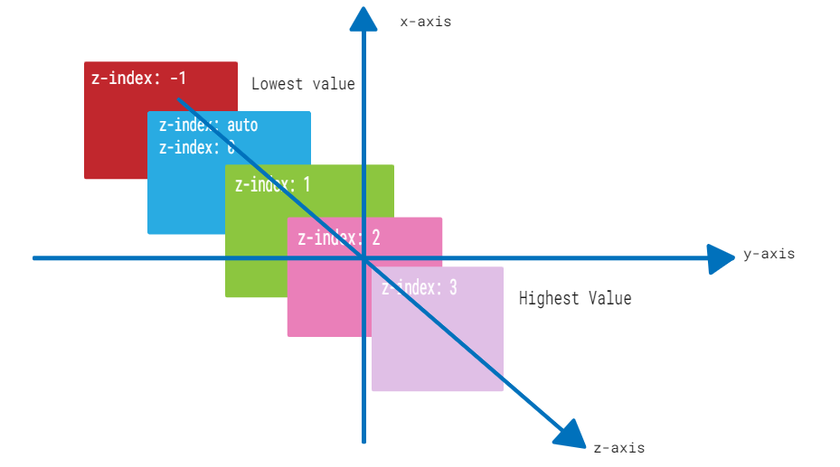
    CSS z-index property controls the stacking order of elements in a web page when they overlap in the same stacking context. Elements with a higher z-index value appear in front of elements with lower values.

    The following diagram demonstrates the z-index layout for reference:

    z-index

    CSS z-index property can be used with positioned elements that are nested inside of other positioned elements.

    Syntax

    The syntax for z-index property is as follows:

    z-index: auto | number | initial | inherit;

    Property Values

    ValueDescription
    autoIt is the default value. The stack order is equal to that of the parent element.
    <Integer>It represents a positive or negative integer. It sets the element’s stack level to the given value.
    initialIt is used to set this property to it’s default value.
    inheritIt is used to inherit the property of it’s parent element.

    Applies to

    All positioned elements.

    CSS z-index With auto Value

    CSS z-index: auto sets the z-index of an element to its parent element’s stack order. It is the default value for the z-index property.

    Example

    The following example demonstrates the z-index property with auto value.

    <html><head><style>
       .box1 {
    
      position: absolute;
      height: 200px;
      width: 280px;
      background-color: #f0baba;
      z-index: auto;
      text-align: center;
      padding: 3px;
      left: 10px;
      top: 10px;
    } .box2 {
      position: absolute;
      height: 120px;
      width: 200px;
      background-color: #eae98f;
      z-index: 1;
      text-align: center;
      padding: 5px;
      margin: 20px;
      left: 30px;
      top: 30px;
    } p {
      margin-top: 250px;
    } </style></head><body><p>The element with z-index value of auto appears behind the element with the z-index value of 1.</p><div class="box1"><span>CSS z-index: auto</span><div class="box2"><span>CSS z-index: 1</span></div></div></body></html>

    CSS z-index With Positive Integer

    CSS z-index property can have a positive integer value. The element with a higher integer value will appear above elements with lower values in the stacking order.

    Example

    The following example demonstrates the z-index property with a positive integer value.

    <html><head><style>
       .box1 {
    
      position: absolute;
      height: 200px;
      width: 280px;
      background-color: #f0baba;
      z-index: 1;
      text-align: center;
      padding: 3px;
      left: 10px;
      top: 10px;
    } .box2 {
      position: absolute;
      height: 140px;
      width: 220px;
      background-color: #eae98f;
      z-index: 2;
      text-align: center;
      padding: 5px;
      margin: 10px;
      left: 30px; 
      top: 30px;
    } .box3 {
      position: absolute;
      height: 90px;
      width: 160px;
      background-color: #b7c8ae;
      z-index: 3;
      text-align: center;
      padding: 5px;
      margin: 20px;
      left: 50px; 
      top: 50px;
    } p {
      margin-top: 250px;
    } </style></head><body><p>The element with z-index value of 1 appears behind the element with the z-index value of 2 and 3.</p><div class="box1">
      CSS z-index: 1
    </div><div class="box2">
      CSS z-index: 2
    </div><div class="box3">
      CSS z-index: 3
    </div></body></html>

    CSS z-index With Negative Integer

    You can also use negative integer values for the z-index property. An element with a negative z-index value will be stacked below elements with a higher z-index value.

    Example

    The following example demonstrates the z-index property with a negative integer value.

    <html><head><style>
       .box1 {
    
      position: absolute;
      height: 200px;
      width: 280px;
      background-color: #f0baba;
      z-index: -3;
      text-align: center;
      padding: 3px;
      left: 10px; 
      top: 10px;
    } .box2 {
      position: absolute;
      height: 140px;
      width: 220px;
      background-color: #eae98f;
      z-index: -2;
      text-align: center;
      padding: 5px;
      margin: 10px;
      left: 30px; 
      top: 30px;
    } .box3 {
      position: absolute;
      height: 90px;
      width: 160px;
      background-color: #b7c8ae;
      z-index: -1;
      text-align: center;
      padding: 5px;
      margin: 20px;
      left: 50px; 
      top: 50px;
    } p {
      margin-top: 250px;
    } </style></head><body><p>The element with z-index value of -3 appears behind the element with the z-index value of -2 and -1.</p><div class="box1">
      CSS z-index: -3
    </div><div class="box2">
      CSS z-index: -2
    </div><div class="box3">
      CSS z-index: -1
    </div></body></html>

    Placing Text Over Image

    The z-index property can be used for placing a text over an image and vice-versa.

    Example

    In this example, we are placing a text over an image using CSS z-index property and position property.

    <!DOCTYPE html><html lang="en"><head><title>Displaying Text Over Image</title><style>
    
        .container {
            position: relative;
            width: 500px;
        }
        img {
            display: block;
        }
        .txt {
            position: absolute;
            top: 20%;
            left: 35%;
            transform: translate(-50%, -50%);
            color: white;
            font-family: Verdana, sans-serif;
            font-size: 16px;
            background: rgba(0, 0, 0, 0.5);
        }
    &lt;/style&gt;&lt;/head&gt;&lt;body&gt;&lt;h2&gt;CSS z-index Property&lt;/h2&gt;&lt;div class="container"&gt;&lt;img src="/html/images/test.png" alt="Logo"&gt;&lt;p class="txt"&gt;This text displays over the photo.&lt;/p&gt;&lt;/div&gt;&lt;/body&gt;&lt;/html&gt;</pre>

    CSS z-index With Sticky Position

    The z-index can be used with position:sticky to fix the element's position on scroll.

    Example

    In this example, we have used the sticky value with z-index property to fix the position of div boxes on scroll.

    <html><head><style>
       .box1 {
    
      position: sticky;
      height: 200px;
      width: 280px;
      background-color: #f0baba;
      z-index: 1;
      text-align: center;
      padding: 3px;
      margin: 10px;
      left: 10px; 
      top: 80px;
    } .box2 {
      position: sticky;
      height: 140px;
      width: 220px;
      background-color: #eae98f;
      z-index: 2;
      text-align: center;
      padding: 5px;
      margin: 10px;
      left: 40px; 
      top: 200px;
    } .box3 {
      position: sticky;
      height: 90px;
      width: 160px;
      background-color: #b7c8ae;
      z-index: 3;
      text-align: center;
      padding: 5px;
      margin: 10px;
      left: 70px; 
    } </style></head><body><p>Move cursor upward to see the effect.</p><div class="box1">
      CSS z-index: 1
    </div><div class="box2">
      CSS z-index: 2
    </div><div class="box3">
      CSS z-index: 3
    </div></body></html>

    CSS z-index With Fixed Position

    The z-index property is used with the position:fixed value to fix an element at the top of the content when the user scrolls down.

    Example

    In the example, we have used position:fixed value to fix the text content on top while scrolling.

    <html><head><style>
       .container {
    
      position: relative;
      height: 350px;
    } .box1 {
      position: fixed;
      height: 200px;
      width: 280px;
      background-color: #f0baba;
      z-index: -3;
      text-align: center;
      padding: 3px;
      left: 10px; 
      top: 10px;
    } .box2 {
      position: fixed;
      height: 140px;
      width: 220px;
      background-color: #eae98f;
      z-index: -2;
      text-align: center;
      padding: 5px;
      margin: 10px;
      left: 30px; 
      top: 30px;
    } .box3 {
      position: fixed;
      height: 90px;
      width: 160px;
      background-color: #b7c8ae;
      z-index: -1;
      text-align: center;
      padding: 5px;
      margin: 20px;
      left: 50px; 
      top: 50px;
    } h3 {
         margin-top: 320px;
    } </style></head><body><h3>Scroll down the content to see the effect.</h3><div class="container"><div class="box1">
         CSS z-index: -3
      &lt;/div&gt;&lt;div class="box2"&gt;
         CSS z-index: -2
      &lt;/div&gt;&lt;div class="box3"&gt;
         CSS z-index: -1
      &lt;/div&gt;&lt;/div&gt;&lt;/body&gt;&lt;/html&gt;</pre>

    CSS z-index With Static Position

    The position:static property value makes the use of z-index property ineffective. The z-index property does not affect the stacking order of elements that have the static value of position property.

    Example

    The following example shows that the z-index property is ineffective when position:static property is used:

    <html><head><style>
       .box1 {
    
      position: static;
      height: 200px;
      width: 280px;
      background-color: #f0baba;
      z-index: 1;
      text-align: center;
      padding: 3px;
      margin: 10px;
      left: 10px;
      top: 10px;
    } .box2 {
      position: static;
      height: 140px;
      width: 220px;
      background-color: #eae98f;
      z-index: 2;
      text-align: center;
      padding: 5px;
      margin: 10px;
      left: 30px; 
      top: 30px;
    } .box3 {
      position: static;
      height: 90px;
      width: 160px;
      background-color: #b7c8ae;
      z-index: 3;
      text-align: center;
      padding: 5px;
      margin: 10px;
      left: 50px; 
      top: 50px;
    } </style></head><body><p>The z-index property has no effect on the stacking order of elements if the position property is set to static.</p><div class="box1">
      CSS z-index: 1
    </div><div class="box2">
      CSS z-index: 2
    </div><div class="box3">
      CSS z-index: 3
    </div></body></html>

    CSS z-index With Relative Position

    The position:relative property can be used with z-index property to position the element relative to its original position in the document flow.

    Example

    The following example demonstrates use of position:relative property value with z-index property.

    The example shows that when elements have the position: relative property, the z-index property positions the element relative to its original position in the document flow.

    <html><head><style>
       .box1 {
    
      position: relative;
      height: 200px;
      width: 280px;
      background-color: #f0baba;
      z-index: 1;
      text-align: center;
      padding: 3px;
      margin: 10px;
      left: 10px;
      top: 10px;
    } .box2 {
      position: relative;
      height: 140px;
      width: 220px;
      background-color: #eae98f;
      z-index: 2;
      text-align: center;
      padding: 5px;
      margin: 10px;
      left: 30px; 
      top: 30px;
    } .box3 {
      position: relative;
      height: 90px;
      width: 160px;
      background-color: #b7c8ae;
      z-index: 3;
      text-align: center;
      padding: 5px;
      margin: 10px;
      left: 50px; 
      top: 50px;
    } </style></head><body><p>The z-index property positions the element relative to its original position if position is relative.</p><div class="box1">
      CSS z-index: 1
    </div><div class="box2">
      CSS z-index: 2
    </div><div class="box3">
      CSS z-index: 3
    </div></body></html>
  • opacity Property

    The opacity Property

    CSS opacity property controls the transparency of an element. It determines how much of a hidden element’s content is visible. The property can be used on various elements, whether they contain text, images, or serve as backgrounds.

    CSS opacity Example

    Here is an example of the opacity property. You can change the slider and see the change in opacity and the value of opacity.

    Slide this slider to see the change in opacity.

    Adjust Opacity:

    0.5

    Syntax

    The syntax for the CSS opacity property is as follows:

    opacity: number | percentage | initial | inherit;

    Property Values

    ValueDescription
    numberIt specifies the opacity level of elements using numeric values between 0 (fully transparent) and 1 (Visible).
    percentageIt specifies the opacity level of elements using percent values between 0% (fully transparent) and 100% (Visible).
    initialIt sets the property to its default value.
    inheritIt inherits the property from the parent element.

    CSS opacity Property with Numeric Values

    To set the transparency level of an element, we can specify numeric values between 0 and 1 including them with the opacity property.

    Example

    In this example, we have used numeric values to specify the opacity level of div elements.

    <!DOCTYPE html><html><head><style>
    
      .props {
         height: 50px;
         padding: 20px;
         text-align: center;
         font-weight: bold;
         font-size: 20px;
         background-color: lightgreen;
      }
      .first {
         opacity: 0.3;
      }
      .second {
         opacity: 0.6;
      }
      .third {
         opacity: 1;
      }
    </style></head><body><h2>
      CSS opacity property
    </h2><h4>
      opacity: 0.3
    </h4><div class="props first">
      This div has opacity: 0.3
    </div><h4>
      opacity: 0.6
    </h4><div class="props second">
      This div has opacity: 0.6
    </div><h4>
      opacity: 1
    </h4><div class="props third">
      This div has opacity: 1
    </div></body></html>

    CSS opacity Property with Percentage Values

    To set the transparency level of an element, we can specify percentage values between 0% and 100% including them with the opacity property.

    Example

    In this example, we have used the percent value to specify the opacity level of div elements.

    <!DOCTYPE html><html><head><style>
    
      .props {
         height: 50px;
         padding: 20px;
         text-align: center;
         font-weight: bold;
         font-size: 20px;
         background-color: lightgreen;
      }
      .first {
         opacity: 30%;
      }
      .second {
         opacity: 60%;
      }
      .third {
         opacity: 100%;
      }
    </style></head><body><h2>
      CSS opacity property
    </h2><h4>
      opacity: 30%
    </h4><div class="props first">
      This div has opacity: 30%
    </div><h4>
      opacity: 60%
    </h4><div class="props second">
      This div has opacity: 60%
    </div><h4>
      opacity: 100%
    </h4><div class="props third">
      This div has opacity: 100%
    </div></body></html>

    CSS opacity for Images

    You can use the opacity property to set the transparency level of images. Setting the transparency level of an image can help in creating an overlay.

    Example

    In this example, we have used the opacity property to set the transparency level of the logo at different levels.

    <!DOCTYPE html><html><head><style>
    
      .props {
         width: 300px;
         height: 150px;
      }
      .first-img {
         opacity: 0.1;
      }
      .second-img {
         opacity: 50%;
      }
      .third-img {
         opacity: 1;
      }
    </style></head><body><h2>
      CSS opacity property
    </h2><h4>
      opacity: 0.1
    </h4><img class="first-img props" src="/css/images/logo.png" alt="Tutorials point"><h4>
      opacity: 50%
    </h4><img class="second-img props" src="/css/images/logo.png" alt="Tutorials point"><h4>
      opacity: 1
    </h4><img class="third-img props" src="/css/images/logo.png" alt="Tutorials point"></body></html>

    CSS opacity Property with RGBA Color Values

    The opacity property applies transparency to an element and its child elements. To avoid this and still achieve transparency, we can use the rgba() values. These values specify colors along with opacity only to the desired element.

    Example

    In this example, we have used the opacity and rgba() functions to highlight the difference between these two.

    <!DOCTYPE html><html><head><style>
    
      div {
         width: 200px;
         padding: 10px;
         text-align: center;
      }
      .first-color {
         background-color: rgba(77, 77, 255);
      }
      .decimal-opacity1 {
         opacity: 0.1;
      }
      .decimal-opacity2 {
         opacity: 0.3;
      }
      .decimal-opacity3 {
         opacity: 0.6;
      }
      .decimal-opacity4 {
         opacity: 0.9;
      }
      .rgba-opacity1 {
         background-color: rgba(77, 77, 255, 0.1);
      }
      .rgba-opacity2 {
         background-color: rgba(77, 77, 255, 0.3);
      }
      .rgba-opacity3 {
         background-color: rgba(77, 77, 255, 0.6);
      }
      .rgba-opacity4 {
         background-color: rgba(77, 77, 255, 0.9);
      }
      .container {
         font-weight: bolder;
         margin-left: 50px;
         float: left;
      }
    </style></head><body><h2>
      CSS opacity property
    </h2><p>
      It is clear from the 
    <strong>
      transparent element
    </strong>
      portion below, that the opacity property is 
      applied to all other elements present within 
      the element that uses opacity property. 
    </p><p>
      To prevent this, we can make use of the 
    <strong>
      rgba values
    </strong>
      which define the color along with opacity. The 
      opacity is applied only to the particular element 
      and not to the elements present within it.
    </p><div class="container"><h4>
         Transparent element
      &lt;/h4&gt;&lt;div class=" first-color decimal-opacity1"&gt;
         CSS Opacity 0.1
      &lt;/div&gt;&lt;div class="first-color decimal-opacity2"&gt;
         CSS Opacity 0.3
      &lt;/div&gt;&lt;div class="first-color decimal-opacity3"&gt;
         CSS Opacity 0.6
      &lt;/div&gt;&lt;div class="first-color decimal-opacity4"&gt;
         CSS Opacity 0.9
      &lt;/div&gt;&lt;/div&gt;&lt;div class="container"&gt;&lt;h4&gt;
         With RGBA color values
      &lt;/h4&gt;&lt;div class="rgba-opacity1"&gt;
         CSS Opacity 10%
      &lt;/div&gt;&lt;div class="rgba-opacity2"&gt;
         CSS Opacity 30%
      &lt;/div&gt;&lt;div class="rgba-opacity3"&gt;
         CSS Opacity 60%
      &lt;/div&gt;&lt;div class="rgba-opacity4"&gt;
         CSS Opacity 90%
      &lt;/div&gt;&lt;/div&gt;&lt;/body&gt;&lt;/html&gt;</pre>
  • Width Property

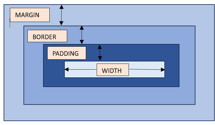
    The width property sets the width of an element’s content area. In case, the box-sizing is set to border-box, the property width sets the width of the border area.

    The value specified by the width property remains within the values defined by min-width and max-width properties.

    Refer the image for the understanding of width of an element.

    width

    Possible Values

    • <length>: A specific length value such as pixels (px), centimeters (cm), inches (in), etc.
    • <percentage>: A percentage of the width of the containing element.
    • auto: The browser will calculate the width automatically based on the content. It is the default value.
    • max-content: Defines the intrinsic preferred width.
    • min-content: Defines the intrinsic minimum width.
    • fit-content: Fits the content in the available space, but never more than max-content.
    • fit-content: fit-content formula is used, i.e, min(max-content, max(min-content, <length-percentage>)).

    Applies to

    All the HTML elements except non-replaced inline elements, table rows, and row groups.

    DOM Syntax

    object.style.width = "100px";
    

    CSS Width – Length Unit

    Here is an example of adding a width to a div element in length units:

    <html><head><style>
       div {
    
      border: 1px solid black;
      margin-bottom: 5px;
    } div.a {
      width: 100px;
      background-color: rgb(230, 230, 203);
    } div.b {
      width: 5em;
      background-color: rgb(230, 230, 203);
    } </style></head><body><div class="a">This div element has a width of 100px.</div><div class="b">This div element has a width of 5em.</div></body></html>

    CSS Width – Percentage Value

    Here is an example of adding a width to a div element in percentage values:

    <html><head><style>
       div {
    
      border: 1px solid black;
      margin-bottom: 5px;
    } div.a {
      width: 120%;
      background-color: yellow;
    } div.b {
      width: 20%;
      background-color: rgb(236, 190, 190);
    } </style></head><body><div class="a">This div element has a width of 120%.</div><div class="b">This div element has a width of 20%.</div></body></html>

    CSS Width – Auto

    Here is an example of adding a width to a div element as auto:

    <html><head><style>
       div {
    
      border: 1px solid black;
      margin-bottom: 5px;
    } div.auto {
      width: auto;
      background-color: yellow;
    } </style></head><body><div class="auto">This div element has a width set as auto.</div></body></html>

    CSS Width – Using max-content and min-content

    Here is an example of width equal to max-content and min-content:

    <html><head><style>
       div {
    
      border: 1px solid black;
      margin-bottom: 5px;
    } div.c {
      width: max-content;
      background-color: bisque;
    } div.d {
      width: min-content;
      background-color: darkseagreen;
    } </style></head><body><div class="c">This div element has a width as max-content.</div><div class="d">This div element has a width of min-content.</div></body></html>

    CSS width – Image

    Here is an example of adding width to an image:

    <html><head><style>
       div {
    
      border: 1px solid black;
      margin-bottom: 5px;
    } .demoImg {
      margin-top: 15px;
      width: 300px;
      margin-right: 0.5in;
    } </style></head><body><img class="demoImg" src="images/scancode.png" alt="image-width"></body></html>

    CSS width – Using fit-content

    Here is an example of fit-content value set for width of a list:

    <html><head><style>
       ul {
    
      background-color: beige;
      width: fit-content;
      padding: 1.5em;
      border: 2px solid black;
    } li {
      display: inline-flex;
      background-color: orange;
      border: 2px solid black;
      padding: 0.5em;
    } </style><body><ul><li>Item1</li><li>Item2</li><li>Item3</li><li>Item4</li></ul></body></html>

    CSS Width – Related Properties

    Following is the list of related CSS properties of width:

    propertyvalue
    max-widthSets an upper bound on the width of an element.
    min-widthSets a lower bound on the width of an element.
    min-contentSets intrinsic minimum width of the content.
    max-contentSets intrinsic maximum width of the content.
    fit-contentFits the content depending on the available size.
    fit-content()Clamps a given size based on the formula min(maximum size, max(minimum size, argument)).

  • character Property

    CSS hyphenate-character property allows you to specify the character that should be used as the hyphenation point when text is hyphenated using the hyphens property. When text is hyphenated, the browser will insert a hyphen character at appropriate points within words.

    Syntax

    hyphenate-character: auto | string | initial | inherit;

    Property Values

    ValueDescription
    autoSuitable character is selected by the browser based on the current typography conventions. Default.
    stringIt specifies the character to be used at the end of line before a hyphenation break.
    initialThis sets the property to its default value.
    inheritThis inherits the property from the parent element.

    Examples of CSS Hyphenate Character Property

    The following examples explain the hyphenate-character property with different values.

    Hyphenate Character Property with Auto Value

    To allow the browser to use its default hyphenation character for breaking words which typically is a standard hyphen (-) or another character defined by the browsers settings for hyphenation, we use the auto value. This is shown in the following example.

    Example

    <!DOCTYPE html><html><head><style>
    
      div {
         width: 80px;
         border: 2px solid blue;
         hyphens: auto;
         hyphenate-character: auto;
      }
    </style></head><body><h2>
      CSS hyphenate-character property
    </h2><h4>
      hyphenate-character: auto
    </h4><div>
      CSS hyphenatecharacter auto
    </div></body></html>

    Hyphenate Character Property with String Value

    To use different characters for hyphenation, we specify the character in string to the hyphenate-character property. The specified character(s) will be used as the hyphenation character when breaking words. This is shown in the following example.

    Example

    <!DOCTYPE html><html><head><style>
    
      div {
         width: 80px;
         border: 2px solid blue;
         hyphens: auto;
      }
      .box1 {
         hyphenate-character: "=";
      }
      .box2 {
         hyphenate-character: "*";
      }
      .box3 {
         hyphenate-character: "%";
      }
    </style></head><body><h2>
      CSS hyphenate-character property
    </h2><h4>hyphenate-character: "="</h4><div class="box1">
      CSS hyphenatecharacter "="
    </div><h4>hyphenate-character: "*"</h4><div class="box2">
      CSS hyphenatecharacter "*"
    </div><h4>hyphenate-character: "%"</h4><div class="box3">
      CSS hyphenatecharacter "%"
    </div></body></html>
  • height Property

    CSS height property specifies the height of an element. It determines how tall an element will be, affecting its layout and positioning within the document. The property can be applied to block-level elements, inline-block elements, and replaced elements like images.

    Syntax

    height: auto | length | percentage | min-content | max-content | initial | inherit;

    Property Values

    ValueDescription
    autoThe element expands or contracts based on its content. Default.
    lengthIt sets a fixed height for the element using length units (e.g. px, em, rem etc.)
    percentageIt sets the height as a percentage of the height of the element’s containing block.
    min-contentIt makes the element’s height fit the minimum height required by its content, preventing content from overflowing.
    max-contentIt adjusts the element height to fit the tallest content without wrapping or truncating it.
    initialThis sets the property to its default value.
    inheritThis inherits the property from the parent element.

    Examples of CSS Height Property

    The following examples explain the height property with different values.

    Height Property with Auto Value

    To allow the height of an element to be dependent on the length of its content, we use the auto value. This is shown in the following example.

    Example

    <!DOCTYPE html><html><head><style>
    
      .outer {
         background-color: lightgrey;
         height: 200px;
         padding: 10px;
         box-sizing: border-box;
      }
      .inner {
         text-align: center;
         border: 2px solid;
         background-color: lightblue;
         height: auto;
      }
    </style></head><body><h2>
      CSS height property
    </h2><h4>
      height: auto
    </h4><div class="outer"><div class="inner">
         This div is having auto height. 
         The height of this div depends on the content.
      &lt;/div&gt;&lt;/div&gt;&lt;/body&gt;&lt;/html&gt;</pre>

    Height Property with Length Values

    To set a fixed height to an element, we use the length units (e.g. px, em, rem etc.). The element will be having a fixed height, if the content of the element is larger than the size of the element, overflow will occur. This is shown in the following example.

    Example

    <!DOCTYPE html><html><head><style>
    
      .outer {
         background-color: lightgrey;
         height: 200px;
         padding: 10px;
         box-sizing: border-box;
      }
      .inner {
         text-align: center;
         border: 2px solid;
         background-color: lightblue;
      }
      .inner1 {
         height: 40px;
      }
      .inner2 {
         height: 90px;
      }
    </style></head><body><h2>
      CSS height property
    </h2><h4>
      height: 40px 90px
    </h4><div class="outer"><p class="inner inner1">
         This paragraph is having 40px height.
      &lt;/p&gt;&lt;p class="inner inner2"&gt;
         This paragraph is having 90px height.
      &lt;/p&gt;&lt;/div&gt;&lt;/body&gt;&lt;/html&gt;</pre>

    Height Property with Percentage Values

    To set a fixed height to an element, we use the percentage values (e.g. 10%, 20% etc.). The element's height will be relative to the height of its containing block. If the content of the element is greater than the size, overflow will occur. This is shown in the following example.

    Example

    <!DOCTYPE html><html><head><style>
    
      .outer {
         background-color: lightgrey;
         height: 300px;
         padding: 10px;
         box-sizing: border-box;
      }
      .inner {
         text-align: center;
         border: 2px solid;
         background-color: lightblue;
      }
      .inner1 {
         height: 30%;
      }
      .inner2 {
         height: 50%;
      }
    </style></head><body><h2>
      CSS height property
    </h2><h4>
      height: 30% 50%
    </h4><div class="outer"><p class="inner inner1">
         This paragraph is having 30% 
         height of the outer container.
      &lt;/p&gt;&lt;p class="inner inner2"&gt;
         This paragraph is having 50% 
         height of the outer container.
      &lt;/p&gt;&lt;/div&gt;&lt;/body&gt;&lt;/html&gt;</pre>

    Height Property with Min Content Value

    To set the element height to the minimum size required to fit its content without overflow, we use the min-content value. This ensures that the height is just enough to display the content in a single line without wrapping or truncation. This is shown in the following example.

    Example

    <!DOCTYPE html><html><head><style>
    
      .outer {
         background-color: lightgrey;
         height: 200px;
         padding: 10px;
         box-sizing: border-box;
      }
      .inner {
         text-align: center;
         border: 2px solid;
         background-color: lightblue;
         height: min-content;
      }
    </style></head><body><h2>
      CSS height property
    </h2><h4>
      height: min-content
    </h4><div class="outer"><p class="inner ">
         TutorialsPoint is an online educational
         platform offering a vast range of tutorials
         and courses on programming, web development, 
         data science, and other technical subjects, 
         featuring detailed guides and interactive
         content.
      &lt;/p&gt;&lt;/div&gt;&lt;/body&gt;&lt;/html&gt;</pre>

    Height Property with Max Content Value

    To adjust the element height to fit the tallest content within it, we use the max-content. The height expands to accommodate the largest item or content, ensuring that no content is cut off or wrapped. This is shown in the following example.

    Example

    <!DOCTYPE html><html><head><style>
    
      .outer {
         background-color: lightgrey;
         height: 200px;
         padding: 10px;
         box-sizing: border-box;
      }
      .inner {
         text-align: center;
         border: 2px solid;
         background-color: lightblue;
         height: max-content;
      }
    </style></head><body><h2>
      CSS height property
    </h2><h4>
      height: max-content
    </h4><div class="outer"><p class="inner ">
         TutorialsPoint is an online educational
         platform offering a vast range of tutorials
         and courses on programming, web development, 
         data science, and other technical subjects, 
         featuring detailed guides and interactive 
         content.
      &lt;/p&gt;&lt;/div&gt;&lt;/body&gt;&lt;/html&gt;</pre>
  • translate Property

    The translate Property

    The translate property of CSS allows you to move an element along the X-axis (horizontal), Y-axis (vertical), and Z-axis (depth).

    The translate property is similar to the translate() function of the transform property. The only difference between the two is that the latter does not support the Z-axis setting.

    Syntax

    The syntax for the CSS translate property is as follows:

    translate: x-axis y-axis z-axis | none;

    Possible values

    ValueDescription
    noneIt specifies no translation should be applied.
    x-axisIt specifies translation along the X-axis. If one value is specified with the translate property, then it specifies translation in the x-axis.
    y-axisIt specifies translation along the Y-axis. If two values are specified with the translate property, then the first value specifies translation in the x-axis and the second value in the y-axis. To specify translation only the in y-axis, specify the first value as 0px.
    z-axisIt specifies translation along the Z-axis. If three values are specified with the translate property, then the first, second, and third value specifies translation in the x-axis, y-axis, and z-axis respectively. To specify translation only in the z-axis, specify the first two values as 0px.

    You can use either <length> or <percentage> to specify the value of the translate property.

    Applies to

    All the transformable elements.

    CSS translate Property with none Value

    To specify that there should not be any translation effect on any axis, we use the translate property with none value.

    Example

    The following example sets the translate property to none which disables the translation effect on the div box.

    <html><head><style>
    
        .box {
            height: 100px;
            width: 100px;
            display: inline-block;
            padding: 10px;
            border: 1px solid black;
            transition: all 0.3s ease;
        }
        .box:hover {
            background-color: #04af2f;
            translate: none;
        }
    &lt;/style&gt;&lt;/head&gt;&lt;body&gt;&lt;div class="box"&gt;&lt;/div&gt;&lt;/body&gt;&lt;/html&gt;</pre>

    CSS translate on X-Axis

    You can use a single value with the translate property to move an element on the horizontal axis. You can either use length or percentage value for this.

    Example

    In this example, we have used a positive length value on the first box and a negative percentage value on the second box with the translate property. The first box will move to the right and the second box will move to the left on the x-axis.

    <!DOCTYPE html><html lang="en"><head><style>
    
        .container {
            height: 100px;
            width: 200px;
            padding: 10px;
            border: 1px solid black;
            margin: auto;
            display: flex;
            justify-content: space-around;
            align-items: center;
            background-color: #f0f0ff;            
        }
        .box {
            height: 80px;
            width: 80px;
            border: 1px solid black;
            display: inline-block;
            transition: all 0.3s ease;
            background-color: white;
        }
        .box1:hover {
            background-color: #04af2f;
            translate: 10px;
        }
        .box2:hover {
            background-color: #031926;
            translate: -10%;
        }
    &lt;/style&gt;&lt;/head&gt;&lt;body&gt;&lt;h2&gt;CSS translate Property&lt;/h2&gt;&lt;p&gt;Translation on x-axis.&lt;/p&gt;&lt;div class="container"&gt;&lt;div class="box box1"&gt;&lt;/div&gt;&lt;div class="box box2"&gt;&lt;/div&gt;&lt;/div&gt;&lt;/body&gt;&lt;/html&gt;</pre>

    CSS translate on Y-Axis

    To translate an element on the y-axis, you need to use a double value with the translate property while setting the first value to 0.

    Example

    In this example, we have used a positive length value on the first box and a negative percentage value on the second box with the translate property. The first box will move downwards and the second box will move upwards on the y-axis.

    <!DOCTYPE html><html lang="en"><head><style>
    
        .container {
            height: 150px;
            width: 200px;
            padding: 10px;
            border: 1px solid black;
            margin: auto;
            display: flex;
            justify-content: space-around;
            align-items: center;
            background-color: #f0f0ff;            
        }
        .box {
            height: 80px;
            width: 80px;
            border: 1px solid black;
            display: inline-block;
            transition: all 0.3s ease;
            background-color: white;
        }
        .box1:hover {
            background-color: #04af2f;
            translate: 0px 15px;
        }
        .box2:hover {
            background-color: #031926;
            translate: 0% -15%;
        }
    &lt;/style&gt;&lt;/head&gt;&lt;body&gt;&lt;h2&gt;CSS translate Property&lt;/h2&gt;&lt;p&gt;Translation on y-axis.&lt;/p&gt;&lt;div class="container"&gt;&lt;div class="box box1"&gt;&lt;/div&gt;&lt;div class="box box2"&gt;&lt;/div&gt;&lt;/div&gt;&lt;/body&gt;&lt;/html&gt;</pre>

    CSS translate on Z-Axis

    To translate an element on the z-axis, you need to use a triple value with the translate property while setting the first two values to 0.

    Example

    In this example, we have used a positive and negative length value on the first box and second box respectively with the translate property. The first box will appear to move closer to the screen while the second box will move away from the screen.

    <!DOCTYPE html><html lang="en"><head><style>
    
        .container {
            perspective: 100px;
            height: 150px;
            width: 200px;
            padding: 10px;
            border: 1px solid black;
            margin: auto;
            display: flex;
            justify-content: space-around;
            align-items: center;
            background-color: #f0f0ff;            
        }
        .box {
            height: 80px;
            width: 80px;
            border: 1px solid black;
            display: inline-block;
            transition: all 0.3s ease;
            background-color: white;
        }
        .box1:hover {
            background-color: #04af2f;
            translate: 0 0 15px;
        }
        .box2:hover {
            background-color: #031926;
            translate: 0 0 -10px;
        }
    &lt;/style&gt;&lt;/head&gt;&lt;body&gt;&lt;h2&gt;CSS translate Property&lt;/h2&gt;&lt;p&gt;Translation on z-axis.&lt;/p&gt;&lt;div class="container"&gt;&lt;div class="box box1"&gt;&lt;/div&gt;&lt;div class="box box2"&gt;&lt;/div&gt;&lt;/div&gt;&lt;/body&gt;&lt;/html&gt;</pre>

    CSS translate on X and Y Axes

    You can translate an element on both the x and y axes by using a double value with the translate property.

    Example

    In this example, we have used two values with the translate property. The first and second value moves the box in horizontal and vertical directions respectively.

    <!DOCTYPE html><html lang="en"><head><style>
    
        .container {
            height: 150px;
            width: 250px;
            padding: 10px;
            border: 1px solid black;
            margin: auto;
            display: flex;
            justify-content: space-around;
            align-items: center;
            background-color: #f0f0ff;            
        }
        .box {
            height: 80px;
            width: 80px;
            border: 1px solid black;
            display: inline-block;
            transition: all 0.3s ease;
            background-color: white;
        }
        .box1:hover {
            background-color: #04af2f;
            translate: 15px 10px;
        }
        .box2:hover {
            background-color: #031926;
            translate: -15% -15%;
        }
    &lt;/style&gt;&lt;/head&gt;&lt;body&gt;&lt;h2&gt;CSS translate Property&lt;/h2&gt;&lt;p&gt;Translation on both x and y-axis.&lt;/p&gt;&lt;div class="container"&gt;&lt;div class="box box1"&gt;&lt;/div&gt;&lt;div class="box box2"&gt;&lt;/div&gt;&lt;/div&gt;&lt;/body&gt;&lt;/html&gt;</pre>

    CSS translate on Y and Z Axes

    You can translate an element on both the y and z-axes by using a double value with the translate property while setting the x-axes value as 0.

    Example

    In this example, we have used two values with the translate property. The second and third value moves the box to the y-axis and z-axis respectively.

    <!DOCTYPE html><html lang="en"><head><style>
    
        .container {
            perspective: 100px;
            height: 150px;
            width: 250px;
            padding: 10px;
            border: 1px solid black;
            margin: auto;
            display: flex;
            justify-content: space-around;
            align-items: center;
            background-color: #f0f0ff;            
        }
        .box {
            height: 80px;
            width: 80px;
            border: 1px solid black;
            display: inline-block;
            transition: all 0.3s ease;
            background-color: white;
        }
        .box1:hover {
            background-color: #04af2f;
            translate: 0px 15px 10px;
        }
        .box2:hover {
            background-color: #031926;
            translate:0 -15% 10px;
        }
    &lt;/style&gt;&lt;/head&gt;&lt;body&gt;&lt;h2&gt;CSS translate Property&lt;/h2&gt;&lt;p&gt;Translation on both y and z-axis.&lt;/p&gt;&lt;div class="container"&gt;&lt;div class="box box1"&gt;&lt;/div&gt;&lt;div class="box box2"&gt;&lt;/div&gt;&lt;/div&gt;&lt;/body&gt;&lt;/html&gt;</pre>

    CSS translate on X and Z Axes

    To translate an element on both the x and z-axes, you can use a double value with the translate property while setting the y-axis value to 0.

    Example

    In this example, we have used two values with the translate property. The first and third value moves the box to the x-axis and z-axis respectively.

    <!DOCTYPE html><html lang="en"><head><style>
    
        .container {
            perspective: 100px;
            height: 150px;
            width: 250px;
            padding: 10px;
            border: 1px solid black;
            margin: auto;
            display: flex;
            justify-content: space-around;
            align-items: center;
            background-color: #f0f0ff;            
        }
        .box {
            height: 80px;
            width: 80px;
            border: 1px solid black;
            display: inline-block;
            transition: all 0.3s ease;
            background-color: white;
        }
        .box1:hover {
            background-color: #04af2f;
            translate: 15px 0 15px;
        }
        .box2:hover {
            background-color: #031926;
            translate: -15% 0 10px;
        }
    &lt;/style&gt;&lt;/head&gt;&lt;body&gt;&lt;h2&gt;CSS translate Property&lt;/h2&gt;&lt;p&gt;Translation on both x and z-axis.&lt;/p&gt;&lt;div class="container"&gt;&lt;div class="box box1"&gt;&lt;/div&gt;&lt;div class="box box2"&gt;&lt;/div&gt;&lt;/div&gt;&lt;/body&gt;&lt;/html&gt;</pre>

    CSS translate on X, Y and Z Axes

    To translate an element in all directions, you can use three values with the translate property.

    Example

    In this example, we have used three values with the translate property. The first, second, and third value moves the box horizontally, vertically, and in the z-axis respectively.

    <!DOCTYPE html><html lang="en"><head><style>
    
        .container {
            perspective: 100px;
            height: 150px;
            width: 250px;
            padding: 10px;
            border: 1px solid black;
            margin: auto;
            display: flex;
            justify-content: space-around;
            align-items: center;
            background-color: #f0f0ff;            
        }
        .box {
            height: 80px;
            width: 80px;
            border: 1px solid black;
            display: inline-block;
            transition: all 0.3s ease;
            background-color: white;
        }
        .box1:hover {
            background-color: #04af2f;
            translate: 15px 15% 15px;
        }
        .box2:hover {
            background-color: #031926;
            translate: -15% -10px 10px;
        }
    &lt;/style&gt;&lt;/head&gt;&lt;body&gt;&lt;h2&gt;CSS translate Property&lt;/h2&gt;&lt;p&gt;Translation on x,y, and z-axis.&lt;/p&gt;&lt;div class="container"&gt;&lt;div class="box box1"&gt;&lt;/div&gt;&lt;div class="box box2"&gt;&lt;/div&gt;&lt;/div&gt;&lt;/body&gt;&lt;/html&gt;</pre>
  • zoom Property

    The zoom Property

    CSS zoom property is used to control the magnification level of HTML elements. The zoom property is a non-standard property of CSS and it is advisable to use the scale() function with the transform property to achieve the same output.

    Syntax

    The syntax for the CSS zoom property is as follows:

    zoom: normal | percentage | number;

    Possible Values

    ValueDescription
    normalIt specifies that the element should be rendered at its normal size.
    <percentage>It specifies the zoom factor in percent value. A value equal to 100% specifies normal size. The value less than 100% specifies zoom-out, and the value more than 100% specifies zoom-in.
    <number>It specifies the zoom factor in the number value. A value equal to 1.0 specifies normal size. The value less than 1.0 specifies zoom-out, and the value more than 1.0 specifies zoom-in.

    Applies to

    The zoom property can be applied to all the HTML elements.

    CSS zoom Property with normal Value

    The normal is the default value of the zoom property. The element appears at its regular size with zoom:normal.

    Example

    In this example, we have used the default value(normal) of the zoom property.

    <html><style>
    
    .normal {
        zoom: normal;
    }
    </style><head></head><body><h2>CSS zoom Property</h2><p class="normal">CSS zoom with normal value.</p></body></html>

    CSS zoom Property with percent Value

    You can use the zoom property with percent value to add a zoom-in or zoom-out effect to any element.

    Example

    In this example, we have used the percentage value > 100% to create a zoom-in effect on a div box upon hovering over it.

    <html><head><style>
    
        .box {
            height: 50px;
            width: 200px;
            border: 1px solid black;
            text-align: center;
            transition: all 0.3s ease;
            position: relative;
        }
        .box:hover {
            zoom: 2;
        }
        .box::before {
            content: "This is a normal box";
        }
        .box:hover::before {
            content: "";
        }
        .box:hover::after {
            content: "This is after applying zoom with percent value.";
            display: block;
            position: absolute;
            width: 100%;
            text-align: center;
        }
    &lt;/style&gt;&lt;/head&gt;&lt;body&gt;&lt;h2&gt;CSS zoom Property with Percent&lt;/h2&gt;&lt;div class="box"&gt;&lt;/div&gt;&lt;/body&gt;&lt;/html&gt;</pre>

    CSS zoom Property with numeric Value

    To add a zoom-in or zoom-out effect to any element, you can use the zoom property with a numeric value.

    Example

    In this example, we have used the numeric value > 1 to create a zoom-in effect on a div box upon hovering over it.

    <html><head><style>
    
        .box {
            height: 50px;
            width: 200px;
            border: 1px solid black;
            text-align: center;
            transition: all 0.3s ease;
            position: relative;
        }
        .box:hover {
            zoom: 2;
        }
        .box::before {
            content: "This is a normal box";
        }
        .box:hover::before {
            content: "";
        }
        .box:hover::after {
            content: "This is after applying zoom";
            display: block;
            position: absolute;
            width: 100%;
            text-align: center;
        }
    &lt;/style&gt;&lt;/head&gt;&lt;body&gt;&lt;h2&gt;CSS zoom Property with Number&lt;/h2&gt;&lt;div class="box"&gt;&lt;/div&gt;&lt;/body&gt;&lt;/html&gt;</pre>

    CSS zoom Property with Transition

    You can use transition with the zoom property to create a smooth zoom-in or zoom-out effect.

    Example

    In this example, we have created three div boxes that create a smooth zoom-in effect upon hovering over them.

    <html><head><style>
       div.box {
    
      width: 25px;
      height: 25px;
      vertical-align: middle;
      display: inline-block;
      transition: transform .5s;
      padding: 10px;
    } div#a {
      background-color: rgb(58, 220, 22);
      zoom: normal;
    } div#b {
      background-color: rgb(239, 86, 137);
      zoom: 200%;
    } div#c {
      background-color: rgb(223, 217, 44);
      zoom: 2.9;
    } div.box:hover {
      transform: scale(1.5);
    } </style></head><body><h1>Animation added on hover</h1><div id="a" class="box"></div><div id="b" class="box"></div><div id="c" class="box"></div></body></html>
  • Focus Effects

    CSS focus effects are used to make form elements like input fields, buttons, and links more dynamic and engaging for users interacting with the webpage.

    The :focus pseudo-class in CSS is used to target an element when it receives focus (by clicking on it or by pressing tab). Its purpose is to apply styles or trigger specific behaviors to enhance the user experience or provide additional visual feedback.

    Focus on me!

    The :focus is a tool to make interactive elements more dynamic and engaging, especially when users navigate using the keyboard.

    Table of Contents

    • What is Focus Pseudo-Class?
    • CSS Focus Effect on Input Field
    • CSS Button With Focus Effect
    • CSS Border With Focus Effect
    • CSS Box-Shadow With Focus Effect
    • CSS Styling on Focusing

    What is Focus Pseudo-Class?

    • In CSS, the pseudo-class :focus is a type of selector used to target and style an element when it gains focus, usually through keyboard navigation or mouse interaction.
    • Focus effects are mostly used with interactive elements like form fields, buttons, etc., to provide users a clear indication of the focused element.
    • Focus effects are useful to add a dynamic and engaging look to a website and improve accessibility.

    CSS Focus Effect on Input Field

    Here is an example of styling input fields when they receive focus:

    Example

    <!DOCTYPE html><html><head><style>
    
        .input-field {
            width: 80%; 
            height: 30px; 
            padding: 5px;
            margin: 10px 0;
            background-color: #f0f0f0; 
            border: 1px solid black; 
            font-size: 16px;
            outline: none;
        }
        .input-field:focus {
            border: 3px solid darkblue;
            padding: 10px;
        }
    &lt;/style&gt;&lt;/head&gt;&lt;body&gt;&lt;div class="main"&gt;&lt;input type="text" class="input-field" 
               placeholder="Enter your name" tabindex="0"&gt;&lt;input type="text" class="input-field" 
               placeholder="Enter your email" tabindex="1"&gt;&lt;input type="text" class="input-field" 
               placeholder="Enter your password" tabindex="2"&gt;&lt;/div&gt;&lt;/body&gt;&lt;/html&gt;</pre>

    CSS Button With Focus Effect

    Here is an example of styling a button in a focused state.

    Example

    <!DOCTYPE html><html><head><style>
    
        button {
            padding: 10px 20px;
            margin: 10px;
            background-color: #ffffff;
            color: #228B22;
            border: 2px solid #228B22;
            border-radius: 5px;
            text-decoration: none;
            font-size: 16px;
            font-weight: bold;
            transition: background-color 0.3s, color 0.3s;
        }
        button:focus {
            background-color: #FFCC33;
            color: #ffffff;
            outline: none;
            transform: scale(1.2);
        }
    &lt;/style&gt;&lt;/head&gt;&lt;body&gt;&lt;button&gt; Focus on me! &lt;/button&gt;&lt;/body&gt;&lt;/html&gt;</pre>

    CSS Border With Focus Effect

    Here is an example that shows how the border is changing when the element receives focus:

    Example

    <!DOCTYPE html><html><head><style>
    
        div {
            padding: 10px 20px;
            margin: 10px;
            background-color: #228B22;
            color: #ffffff;
            border: 2px solid #228B22;
            border-radius: 5px;
            text-decoration: none;
            font-size: 16px;
            font-weight: bold;
            transition: all 0.3s;
        }
        div:focus {
            border-radius: 20px;
            outline: none;
        }
    &lt;/style&gt;&lt;/head&gt;&lt;body&gt;&lt;div tabindex="0"&gt; Focus on me! &lt;/div&gt;&lt;/body&gt;&lt;/html&gt;</pre>

    CSS Box-Shadow With Focus Effect

    Here is an example, where box-shadow is added when the div receives focus:

    Example

    <!DOCTYPE html><html><head><style>
    
        div {
            padding: 10px 20px;
            margin: 10px;
            background-color: #228B22;
            color: #ffffff;
            border: 2px solid #228B22;
            border-radius: 5px;
            text-decoration: none;
            font-size: 16px;
            font-weight: bold;
            transition: all 0.3s;
        }
        div:focus {
            box-shadow: 20px 20px 10px grey;
            outline: none;
        }
    &lt;/style&gt;&lt;/head&gt;&lt;body&gt;&lt;div tabindex="0"&gt; Focus on me! &lt;/div&gt;&lt;/body&gt;&lt;/html&gt;</pre>

    CSS Styling on Focusing

    Here is an example, where a shadow effect is given to a button on focus:

    Example

    <!DOCTYPE html><html><head><style>
    
        body {
            height: 300px;
            overflow: hidden;
            display: grid;
            justify-content: center;
            align-items: center;
        }
    
        .glow {
            padding: 10px;
            width: 250px;
            height: 50px;
            border: none;
            outline: none;
            color: #fff;
            background: #111;
            cursor: pointer;
            position: relative;
            z-index: 0;
            border-radius: 20px;
        }
    
        .glow:before {
            content: '';
            background: linear-gradient(60deg, #ff0000, #ff7300, 
                                #fffb00, #48ff00, #00ffd5, #002bff, 
                                #7a00ff, #ff00c8, #ff0000);
            position: absolute;
            top: -4px;
            left:-4px;
            background-size: 400%;
            z-index: -1;
            filter: blur(15px);
            width: calc(100% + 6px);
            height: calc(100% + 6px);
            animation: glowing 20s linear infinite;
            opacity: 0;
            transition: opacity .3s ease-in-out;
            border-radius: 10px;
        }
    
        .glow:focus:before {
            opacity: 1;
        }
    
        .glow:after {
            z-index: -1;
            content: '';
            position: absolute;
            width: 100%;
            height: 100%;
            background: #111;
            left: 0;
            top: 0;
            border-radius: 10px;
        }
    
        @keyframes glowing {
            0% { 
                background-position: 0 0; 
            }
            50% { 
                background-position: 400% 0; 
            }
            100% { 
                background-position: 0 0; 
            }
        }
    &lt;/style&gt;&lt;/head&gt;&lt;body&gt;&lt;button class="glow" type="button" tabindex="0"&gt;
        FOCUS ON ME!
    &lt;/button&gt;&lt;/body&gt;&lt;/html&gt;</pre>

  • display Property

    The display Property

    CSS display property specifies the behaviour of HTML elements. It defines how an elements is displayed on the webpage.

    Syntax

    display: value;

    Display Property Values

    ValueDescription
    inlineIt displays the element as an inline element on which width and height properties do not have any effect. Default.
    blockIt displays the element as a block element which starts on a new line and takes up the whole width.
    contentsIt make an element disappear from the layout while keeping its child elements visible and in their original positions within the layout.
    flexIt displays an element as a block-level flex container.
    gridIt displays an element as a block-level grid container.
    inline-blockIt allows an element to flow along with other inline elements along with having block-level characteristics such as width and height.
    inline-flexIt displays an element as an inline-level flex container.
    inline-gridIt displays an element as an inline-level grid container.
    inline-tableIt displays the element as an inline-level table.
    run-inIt displays an element depending on context as either block or inline.
    tableIt enables the element to behave like a <table> element.
    table-captionIt enables the element to behave like a <caption> element.
    table-column-groupIt enables the element to behave like a <colgroup> element.
    table-header-groupIt enables the element to behave like a <thead> element.
    table-footer-groupIt enables the element to behave like a <tfoot> element.
    table-row-groupIt enables the element to behave like a <tbody> element
    table-cellIt enables the element to behave like a <td> element.
    table-columnIt enables the element to behave like a <col> element.
    table-rowIt enables the element to behave like a <tr> element.
    noneIt removes the element completely.
    initialThis sets the property to its default value.
    inheritThis inherits the property from the parent element.

    CSS display Property with inline Value

    The following example illustrates the use of inline value on div elements making them appear as inline element.

    Example

    <!DOCTYPE html><html><head><style>
    
      .inline-item {
         display: inline;
         background-color: #4CAF50;
         color: white;
         padding: 10px;
         margin: 5px;
      }
      .container {
         border: 3px solid #ccc;
         padding: 15px;
      }
    </style></head><body><h2>
      CSS display property
    </h2><h4>
      display: inline 
    </h4><div class="container"><div class="inline-item">
         Item 1
      &lt;/div&gt;&lt;div class="inline-item"&gt;
         Item 2
      &lt;/div&gt;&lt;div class="inline-item"&gt;
         Item 3
      &lt;/div&gt;&lt;/div&gt;&lt;/body&gt;&lt;/html&gt;</pre>

    CSS display Property with block Value

    The following example illustrates the use of block value on span elements making them appear as block element.

    Example

    <!DOCTYPE html><html><head><style>
    
      .block-item {
         display: block;
         background-color: #4CAF50;
         color: white;
         padding: 10px;
         margin: 5px;
      }
      .container {
         border: 3px solid #ccc;
         padding: 15px;
      }
    </style></head><body><h2>
      CSS display property
    </h2><h4>
      display: block 
    </h4><div class="container"><span class="block-item">
         Item 1
      &lt;/span&gt;&lt;span class="block-item"&gt;
         Item 2
      &lt;/span&gt;&lt;span class="block-item"&gt;
         Item 3
      &lt;/span&gt;&lt;/div&gt;&lt;/body&gt;&lt;/html&gt;</pre>

    CSS display Property with Contents Value

    The following example illustrates the use of the contents value. In this example, the .child element behaves as direct child of .parent element bypassing the .wrapper element.

    Example

    <!DOCTYPE html><html><head><style>
    
      .wrapper {
         display: contents;
      }
      .child {
         text-align: center;
         background-color: #4CAF50;
         color: white;
         padding: 10px;
         margin: 5px;
      }
      .parent {
         display: block;
         background-color: #f0f0f0;
         padding: 10px;
      }
    </style></head><body><h2>
      CSS display property
    </h2><h4>
      display: contents
    </h4><div class="parent"><div class="wrapper"><div class="child">
            Child 1
         &lt;/div&gt;&lt;div class="child"&gt;
            Child 2
         &lt;/div&gt;&lt;div class="child"&gt;
            Child 3
         &lt;/div&gt;&lt;/div&gt;&lt;/div&gt;&lt;/body&gt;&lt;/html&gt;</pre>

    CSS display Property with Flex Value

    To set an element to be a flex container making its children (flex items) layout in a flexible and responsive way, we use the flex value. The container uses the Flexbox layout model, which allows for easy alignment, distribution, and ordering of items along a single axis. This is shown in the following example.

    Example

    <!DOCTYPE html><html><head><style>
    
      .flex-container {
         display: flex;
         background-color: #f0f0f0;
         padding: 10px;
      }
      .flex-item {
         background-color: #4CAF50;
         color: white;
         padding: 10px;
         margin: 5px;
         flex: 1;
      }
    </style></head><body><h2>
      CSS display property
    </h2><h4>
      display: flex
    </h4><div class="flex-container"><div class="flex-item">
         Item 1
      &lt;/div&gt;&lt;div class="flex-item"&gt;
         Item 2
      &lt;/div&gt;&lt;div class="flex-item"&gt;
         Item 3
      &lt;/div&gt;&lt;/div&gt;&lt;/body&gt;&lt;/html&gt;</pre>

    CSS display Property with Grid Value

    To set an element to be a grid container which uses the grid layout model, allowing for the creation of two-dimensional layouts with rows and columns, we use the grid value. Grid items can be placed and sized explicitly or automatically across the grid. This is shown in the following example.

    Example

    <!DOCTYPE html><html><head><style>
    
      .grid-container {
         display: grid;
         background-color: #f0f0f0;
         padding: 10px;
         gap: 10px;
      }
      .grid-item {
         background-color: #4CAF50;
         color: white;
         padding: 10px;
         text-align: center;
      }
    </style></head><body><h2>
      CSS display property
    </h2><h4>
      display: grid
    </h4><div class="grid-container"><div class="grid-item">
         Item 1
      &lt;/div&gt;&lt;div class="grid-item"&gt;
         Item 2
      &lt;/div&gt;&lt;div class="grid-item"&gt;
         Item 3
      &lt;/div&gt;&lt;/div&gt;&lt;/body&gt;&lt;/html&gt;</pre>

    CSS display Property with Inline Block Value

    To make an element behave like an inline-level element (allowing it to flow with text and other inline content) while retaining block-level properties such as width and height, we use the inline-block value. This is shown in the following example.

    Example

    <!DOCTYPE html><html><head><style>
    
      .inline-block-item {
         text-align: center;
         display: inline-block;
         width: 200px;
         background-color: #4CAF50;
         color: white;
         padding: 10px;
         margin: 5px;
      }
      .container {
         border: 3px solid #ccc;
         padding: 15px;
      }
    </style></head><body><h2>
      CSS display property
    </h2><h4>
      display: inline-block 
    </h4><div class="container"><span class="inline-block-item">
         Item 1
      &lt;/span&gt;&lt;span class="inline-block-item"&gt;
         Item 2
      &lt;/span&gt;&lt;span class="inline-block-item"&gt;
         Item 3
      &lt;/span&gt;&lt;/div&gt;&lt;/body&gt;&lt;/html&gt;</pre>

    CSS display Property with Inline Flex Property

    To set an element to be an inline-level flex container making the container behaves like an inline element, flowing with surrounding text or inline elements, while still applying Flexbox layout rules to its children, we use the inline-flex property. This is shown in the following example.

    Example

    <!DOCTYPE html><html><head><style>
    
      .inline-flex-container {
         display: inline-flex;
         background-color: #f0f0f0;
         padding: 10px;
      }
      .flex-item {
         background-color: #4CAF50;
         color: white;
         padding: 10px;
         margin: 5px;
         flex: 1;
      }
    </style></head><body><h2>
      CSS display property
    </h2><h4>
      display: inline-flex
    </h4><div class="inline-flex-container"><div class="flex-item">
         Item 1
      &lt;/div&gt;&lt;div class="flex-item"&gt;
         Item 2
      &lt;/div&gt;&lt;div class="flex-item"&gt;
         Item 3
      &lt;/div&gt;&lt;/div&gt;&lt;/body&gt;&lt;/html&gt;</pre>

    CSS display Property with Inline Grid Value

    To set an element to be an inline-level grid container such that it behaves like an inline element (flowing with text and other inline content) while using the grid layout model to arrange its children, we use the inline-grid value. This is shown in the following example.

    Example

    <!DOCTYPE html><html><head><style>
    
      .grid-container {
         display: inline-grid;
         background-color: #f0f0f0;
         padding: 10px;
         gap: 10px;
      }
      .inline-grid-item {
         background-color: #4CAF50;
         color: white;
         padding: 10px;
         text-align: center;
      }
    </style></head><body><h2>
      CSS display property
    </h2><h4>
      display: inline-grid
    </h4><div class="grid-container"><div class="inline-grid-item">
         Item 1
      &lt;/div&gt;&lt;div class="inline-grid-item"&gt;
         Item 2
      &lt;/div&gt;&lt;div class="inline-grid-item"&gt;
         Item 3
      &lt;/div&gt;&lt;/div&gt;&lt;/body&gt;&lt;/html&gt;</pre>

    CSS display Property with Run In Value

    To make an element behave as a block-level element or an inline-level element depending on the context, we use the run-in value. It is intended to allow an element to "run in" with surrounding text or other elements. This is shown in the following example.

    Example

    <!DOCTYPE html><html><head><style>
    
      .block-container {
         display: block;
         background-color: #f0f0f0;
         padding: 10px;
      }
      .run-in {
         display: run-in;
         background-color: #4CAF50;
         color: white;
         padding: 10px;
         margin: 5px;
      }
    </style></head><body><h2>
      CSS display property
    </h2><h4>
      display: run-in
    </h4><div class="block-container"><div class="run-in">
         Run-In Element
      &lt;/div&gt;&lt;p&gt;
         This paragraph follows the run-in element. Depending on 
         the browser support, the run-in element might appear 
         as a block or inline element here.
      &lt;/p&gt;&lt;/div&gt;&lt;/body&gt;&lt;/html&gt;</pre>

    CSS display Property with list-item Value

    The following example illustrates the use of list-item value on div elements making them appear as bulleted list.

    Example

    <!DOCTYPE html><html><head><style>
    
      .list-item {
         display: list-item;
         background-color: #4CAF50;
         padding: 10px;
         margin: 10px;
         text-align: center;
      }
    </style></head><body><h2>
      CSS display property
    </h2><h3>
      display: list item
    </h3><div class="list-item">
      Item 1
    </div><div class="list-item">
      Item 2
    </div><div class="list-item">
      Item 3
    </div></body></html>

    CSS display Property with Table Values

    To create table-like layouts with CSS without using HTML table elements, we can use different displays for the table. In the following example, some values tabletable-rowtable-cell and table-caption have been used.

    • table: creates a container that behaves like a <table>,
    • table-cell: styles elements like <td> cells,
    • table-row: defines elements as rows like <tr>,
    • table-caption: functions like a <caption> element, positioning captions for the table.

    Example

    <!DOCTYPE html><html><head><style>
    
      div {
         background-color: #4CAF50;
         color: white;
         display: flex;
         border: 1px solid black;
      }
      .table {
         display: table;
      }
      .row {
         display: table-row;
         padding: 3px;
      }
      .cell {
         display: table-cell;
         padding: 3px;
      }
      .caption {
         display: table-caption;
         text-align: center;
      }
    </style></head><body><h2>
      CSS display property
    </h2><h4>
      display: table, table-row, table-cell, table-caption
    </h4><div class="table"><div class="caption">
         Sample Table
      &lt;/div&gt;&lt;div class="row"&gt;&lt;div class="cell"&gt;
            Row1-Cell1
         &lt;/div&gt;&lt;div class="cell"&gt;
            Row1-Cell2
         &lt;/div&gt;&lt;div class="cell"&gt;
            Row1-Cell3
         &lt;/div&gt;&lt;/div&gt;&lt;div class="row"&gt;&lt;div class="cell"&gt;
            Row2-Cell1
         &lt;/div&gt;&lt;div class="cell"&gt;
            Row2-Cell2
         &lt;/div&gt;&lt;div class="cell"&gt;
            Row2-Cell3
         &lt;/div&gt;&lt;/div&gt;&lt;div class="row"&gt;&lt;div class="cell"&gt;
            Row3-Cell1
         &lt;/div&gt;&lt;div class="cell"&gt;
            Row3-Cell2
         &lt;/div&gt;&lt;div class="cell"&gt;
            Row3-Cell3
         &lt;/div&gt;&lt;/div&gt;&lt;/div&gt;&lt;/body&gt;&lt;/html&gt;</pre>

    CSS display Property with none Value

    The following example illustrates the use of none value on div elements to hide the element.

    Example

    <!DOCTYPE html><html><head><style>
    
      .hidden {
         display: none;
      }
      .visible {
         background-color: #4CAF50;
         color: white;
         padding: 10px;
         margin: 10px;
      }
    </style></head><body><h2>
      CSS display property
    </h2><h4>display: none</h4><div class="visible">
      This is visible
    </div><div class="hidden">
      This is hidden
    </div><div class="visible">
      This is also visible
    </div></body></html>