CSS isolation property is used to control how an element’s content interacts with its parent and sibling elements in terms of rendering and stacking context. It essentially determines whether an element establishes a new stacking context or not.
Syntax
isolation: auto | isolate | initial | inherit;
Property Values
Value
Description
auto
It indicates that the element’s content does not create a new stacking context. Instead, it inherits the stacking context of its parent. Default.
isolate
This value indicates that the element creates a new stacking context, isolating its content from the rest of the document. This means that the element’s content will be rendered independently of its siblings and parent elements.
initial
It sets the property to its default value.
inherit
It inherits the property from the parent element.
Examples of CSS Isolation Property
The following examples explain the isolation property with different values.
Isolation Property with Auto Value
The following example demonstrates the auto value of the isolation property which does not create a new stacking context. The mix-blend-mode: difference subtracts the top color from the bottom color and creating in a high-contrast effect.
The following example demonstrates the isolate value of the isolation property that creates a new stacking context for box1, preventing the box1 from blending with external elements and the blend mode applied to box2 doesn't impact elements inside box1. The mix-blend-mode: difference property subtracts the top color from the bottom color and creating high-contrast effect.
CSS inset property is used to control the position of an element relative to its containing block. It is a shorthand property for defining values to the properties top, right, bottom, and / or left in a single statement. The position property must be declared in order for the property to show its effect.
Syntax
inset: auto | length | percentage | initial | inherit;
Property Values
Value
Description
auto
It determines the size of the element based on its content or other layout factors. Default.
length
It sets the inset distance of an element using length units (e.g. px, em, rem etc.). Negative values can be used.
percentage
It sets the inset distance of an element using percentage values relative to its parent container.
initial
It sets the property to its default value.
inherit
It inherits the property from the parent element.
Examples of CSS Inset Property
The following examples explain the inset property with different values.
Inset Property with Auto Value
To let the browser calculate the positioning based on the element’s default behavior or other factors, we use the auto value. This value is often used to align the elements position according to its containing block’s edges. This is shown in the following example.
TutorialsPoint offers extensive online tutorials
and courses on various tech topics, including
programming, web development, and data science.
</p></div></body></html></pre>
Inset Property with Length Values
To set the position of the element, we can use length units (e.g. px,rem,em etc.). The inset property accepts upto four values. Depending on the number of values provided, the corresponding edges will be affected. This is shown in the following example.
TutorialsPoint offers extensive online tutorials
and courses on various tech topics, including
programming, web development, and data science.
</p></div><h4>
inset: 15px 40px (top and bottom have
15px distance while left and right
have 40px distance)
TutorialsPoint offers extensive online tutorials
and courses on various tech topics, including
programming, web development, and data science.
</p></div><h4>
inset: 15px 35px 45px (top has 15px
distance, left and right have 35px
distance and bottom has 45px distance)
TutorialsPoint offers extensive online tutorials
and courses on various tech topics, including
programming, web development, and data science.
</p></div><h4>
inset: 15px 25px 35px 45px (top has 15px
distance, right has 25px distance, bottom
has 35px distance and left has 45px distance)
TutorialsPoint offers extensive online tutorials
and courses on various tech topics, including
programming, web development, and data science.
</p></div></body></html></pre>
Inset Property with Percentage Values
To set the position of the element, we can use percentage values (e.g. 5%, 10% etc.). The inset property accepts upto four values. Depending on the number of values provided, the corresponding edges will be affected. This is shown in the following example.
TutorialsPoint offers extensive online tutorials
and courses on various tech topics, including
programming, web development, and data science.
</p></div><h4>
inset: 5% 15% 25% (top has 5% distance,
left and right have 15% distance and
bottom has 25% distance of the container)
TutorialsPoint offers extensive online tutorials
and courses on various tech topics, including
programming, web development, and data science.
</p></div><h4>
inset: 5% 25% 30% 15% (top has 5% distance,
right has 25% distance, bottom has 30%
distance and left has 15% distance of
the container)
TutorialsPoint offers extensive online tutorials
and courses on various tech topics, including
programming, web development, and data science.
</p></div></body></html></pre>
Inset Property with Mixed Values
To set the position of the element, we can use a combination of length units (e.g. px,rem,em etc.) and percentage values (e.g. 10%, 20% etc.). The inset property accepts upto four values. Depending on the number of values provided, the corresponding edges will be affected. This is shown in the following example.
inset: 25px 10% 15px 35% (top has 25px distance,
right has 10% distance from the container, bottom
has 15px distance and left has 35% distance from
the container)
</h4><div class="container"><p class="values">
TutorialsPoint offers extensive online tutorials
and courses on various tech topics, including
programming, web development, and data science.
</p></div></body></html></pre>
Note: The inset property accepts different number of parameters, so depending on the number of values provided, the corresponding edges will be affected.
One value: it applies distance to all four edges equally.
Two values: the first value provides distance to top and bottom edges while the second value provides value to the left and right edges.
Three values: the first value provides distance to the top edge, second value provides distance to left and right edges and the third value provides distance to the bottom edge.
Four Values: the first value provides distance to the top edge, second value to the right edge, third value to the bottom edge and fourth value to the left edge.
CSS all property resets all properties of an element, with the exception of unicode bidi, direction and CSS custom properties. It can reset properties to their original or inherited values or to the values explicitly defined in another cascade layer or in the stylesheet origin.
Syntax
all: initial | inherit | unset;
Property Values
Value
Description
initial
It changes all the properties applied to an element or to its parent to their initial value.
inherit
It changes all the properties applied to an element or to its parent to their parent value.
unset
It changes all the properties applied to the element or the element’s parent to their parent value if they are inheritable else to their initial value if not
Examples of CSS All Property
The following example explains the all property with different values.
All Property with Initial Value
To let an element’s properties be set to their default values assigned by the browser such that no defined styling is applicable to them, we use the initial value. This is shown in the following example.
Example
<!DOCTYPE html><html><head><style>
html {
font-size: 25px;
color: lightcoral;
font-style: italic;
}
See how this sentence changes!-
This is reference sentence
</div><br/><div id="custom2">
See how this sentence changed. This sentence
is using initial value so it does not inherit
anything from its parent element or html element,
this is evident from the text style and color.
</div></body></html>
All Property with Inherit Value
To let an element’s properties be set to the properties of the element’s parent or the html element then, we use the inherit value. The properties defined by the parent if present will be applied if not then the html element properties will be applied. This is shown in the following example.
Example
<!DOCTYPE html><html><head><style>
html {
font-size: 25px;
color: lightcoral;
font-style: italic;
}
See how this sentence changes!-
This is reference sentence
</div><br/><div id="custom2">
See how this sentence changed. This sentence
is using inherit value so it inherits the properties
from its parent or from the html element, in this
case the html element. It has inherited font-size,
color and font-style.
</div></body></html>
All Property with Unset Value
To let the properties of an element be obtained from its parent if present or from html element if absent or from the default values decided by the browser (behave like initial) in the absence of both then, we use unset value. This is shown in the following example.
This sentence is using the 'unset' value and also
has a parent, so it inherits the parent properties.
</div></div><br/><div class="custom2">
This sentence is also using the 'unset' value but it
doesnt have a parent, so it follows the initial value
getting default values.
The CSS min-content is a value that can be used for sizing properties to specify the minimum size of a box or element based on its content.
It specifically suggests that text content will make use of soft-wrapping opportunities, which enable the material to resize to the length of its longest word. The min-content value is calculated based on the intrinsic minimum size required by the content inside the box.
Syntax
/* Used as a length */
width: min-content;
inline-size: min-content;
height: min-content;
block-size: min-content;
/* Used in grid tracks */
grid-template-columns: 100px 2fr min-content;
CSS min-content – Box Sizing
The following example demonstrates the use of min-content keyword for box sizing.
CSS unicode-bidi property is used to control how bidirectional text is displayed in a document. Bidirectional text contains both left-to-right (LTR) and right-to-left (RTL) text.
The unicode-bidi property allows developers to override the default behavior of the browser and ensure that bidirectional text is displayed correctly.
Possible Values
normal − This is the default value, and it specifies that the text should be displayed according to the inherent direction of the text itself. In other words, it will use the direction of the characters in the text to determine how it should be displayed.
embed − This value is used to explicitly set the direction of the text within an element. When you set unicode-bidi to embed, you can also use the direction property to specify whether the text should be displayed left-to-right (ltr) or right-to-left (rtl).
bidi-override − This value creates an override for inline elements. In case of block elements, it overrides the browser’s bi-directional text algorithm and flows the text inside any inline children strictly according to the direction property.
isolate − This value isolates the element from its siblings.
isolate-override − This value uses the isolation behavior of the isolate keyword to the surrounding content and the override behavior of the bidi-override keyword to the inner content.
plaintext − Prevents bidirectional text (BIDI) algorithms from affecting the text inside the element.
Applies to
All positioned elements, but some of the values have no effect on non-inline elements.
CSS properties unicode-bidi and direction are the only properties that are not affected by the all shorthand property.
This property is only used by Document Type Definition (DTD) designers. It is generally not recommended for web designers or similar authors to override it.
CSS unicode-bidi – normal Value
The following example demonstrates using unicode-bidi: normal, the text in its default order from right-to-left direction (RTL) −
<html><head><style>
   .box {
  direction: rtl;
  unicode-bidi: normal;
  color:red;   }
</style></head><body><h2>CSS unicode-bidi - normal Value</h2><p>The following text is displayed in its default order from right-to-left direction.</p><div class="box">
  Lorem Ipsum is simply dummy text of the printing and typesetting industry.     </div></body></html>
CSS unicode-bidi – embed Value
The following example demonstrates using unicode-bidi: embed. This value embeds the direction of the text within its surrounding content, and when the direction is set to rtl, the text is displayed in a right-to-left (RTL) direction −
<html><head><style>
   .box {
  direction: rtl;
  unicode-bidi: embed;
  color:red;   }
</style></head><body><h2>CSS unicode-bidi - embed Value</h2><p>The following text is displayed in its default order from right-to-left direction.</p><div class="box">
  Lorem Ipsum is simply dummy text of the printing and typesetting industry.     </div></body></html>
CSS unicode-bidi – bidi-override Value
The following example demonstrates using unicode-bidi: bidi-override. This value displays the text in reverse order, with the right most character displayed in the first position.−
}
</style></head><body><h2>CSS unicode-bidi - bidi-override Value</h2><p>The following text is displayed in reverse order of the characters in right-to-left direction.</p><div class="box">
Lorem Ipsum is simply dummy text of the printing and typesetting industry.
</div></body></html>
CSS unicode-bidi – isolate Value
The following example demonstrates using unicode-bidi: isolate. This value is used to isolate a bidirectional text from its surrounding text. −
<html><head><style>
   .box {
  direction: rtl;
  unicode-bidi: isolate;
  color:red;   }
</style></head><body><h2>CSS unicode-bidi - isolate Value</h2><p>The following text is displayed in its default order from right to left.</p><div class="box">
  Lorem Ipsum is simply dummy text of the printing and typesetting industry.     </div></body></html>
CSS unicode-bidi – isolate-override Value
The following example demonstrates using unicode-bidi: isolate-override. This value is used to isolate and override the bidirectional text from its surrounding text −
}
</style></head><body><h2>CSS unicode-bidi - isolate-override Value</h2><p>The following text is displayed in reverse order of the characters in right-to-left direction.</p><div class="box">
Lorem Ipsum is simply dummy text of the printing and typesetting industry.
</div></body></html>
CSS unicode-bidi – plaintext Value
The following example demonstrates using unicode-bidi: plaintext. This value treats the text as plain text without applying any bidirectional text algorithms. −
}
</style></head><body><h2>CSS unicode-bidi - plaintext Value</h2><p>The following text is displayed in its default order from left-to-right direction.</p><div class="box">
Lorem Ipsum is simply dummy text of the printing and typesetting industry.
</div></body></html>
CSS unicode-bidi – Related Properties
Following is the list of CSS properties related to unicode-bidi:
property
value
direction
Sets the direction of text in a block-level element.
CSS writing-mode property is used to specify the direction of text content flows within an element. It specifies whether text should be displayed horizontally or vertically.
It is particularly useful for handling text orientation in non-Latin scripts, such as Chinese, Japanese, and Arabic, as well as for creating creative and visually interesting layouts.
Possible Values
horizontal-tb − Default value. It sets the text to be laid out in horizontal writing mode, where text flows from left to right and top to bottom, as in most Western languages.
vertical-rl − This value specifies a vertical writing mode from right to left, commonly used for scripts like Chinese, Japanese, or Korean. Text flows vertically, starting from the right and proceeding to the left.
vertical-lr − Similar to vertical-rl, this value also represents a vertical writing mode, but the text flows from left to right, which is used in scripts like Mongolian.
sideways-rl − This value specifies vertical text flow from top to bottom, but positions the text from right to left. This value is used for vertical scripts like Mongolian or some forms of vertical Japanese text, where the characters are rotated 90 degrees clockwise and read from right to left.
sideways-lr − This value specifies vertical text flow from bottom to top, but positions the text from left to right.
The lr, lr-tb, rl, tb, tb-lr, and tb-rl writing modes in CSS are deprecated, and should no longer be used. Instead, you should use the horizontal-tb or vertical-lr writing modes.
The following table shows the deprecated writing modes and their equivalents:
Deprecated Value
Equivalent Value
lr
horizontal-tb
rl
horizontal-tb
lr-tb
horizontal-tb
tb
vertical-lr
tb-lr
vertical-lr
tb-rl
vertical-rl
Applies to
All the HTML elements except table row groups, table column groups, table rows, and table columns.
Lorem ipsum dolor sit amet, consectetur adipiscing elit, sed do eiusmod tempor incididunt ut labore et dolore magna aliqua. Ut enim ad minim veniam, quis nostrud exercitation ullamco laboris nisi ut aliquip ex ea commodo consequat. Duis aute irure dolor in reprehenderit in voluptate velit esse cillum dolore eu fugiat nulla pariatur. Excepteur sint occaecat cupidatat non proident, sunt in culpa qui officia deserunt mollit anim id est laborum.
</div></body></html>
CSS writing-mode – vertical-rl Value
The following example demonstartes writing-mode property set to value vertical-rl, where text is read from right to left and top to bottom −
Lorem ipsum dolor sit amet, consectetur adipiscing elit, sed do eiusmod tempor incididunt ut labore et dolore magna aliqua. Ut enim ad minim veniam, quis nostrud exercitation ullamco laboris nisi ut aliquip ex ea commodo consequat. Duis aute irure dolor in reprehenderit in voluptate velit esse cillum dolore eu fugiat nulla pariatur. Excepteur sint occaecat cupidatat non proident, sunt in culpa qui officia deserunt mollit anim id est laborum.
</div></body></html>
CSS writing-mode – vertical-lr Value
The following example demonstartes that the writing-mode property set to value vertical-rl value, where text is read from left to right and top to bottom: −
Lorem ipsum dolor sit amet, consectetur adipiscing elit, sed do eiusmod tempor incididunt ut labore et dolore magna aliqua. Ut enim ad minim veniam, quis nostrud exercitation ullamco laboris nisi ut aliquip ex ea commodo consequat. Duis aute irure dolor in reprehenderit in voluptate velit esse cillum dolore eu fugiat nulla pariatur.
</div></body></html>
CSS writing-mode – sideways-rl Value
The sideways-rl value is only supported by Firefox Browser.
The following example demonstrates that writing-mode property set to value sideways-rl, where text read vertically from top to bottom, with characters arranged from right to left −
}
</style></head><body><h2>CSS writing-mode: sideways-rl - This example is only supported by Firefox Browser.</h2><div class="box">
Lorem ipsum dolor sit amet, consectetur adipiscing elit, sed do eiusmod tempor incididunt ut labore et dolore magna aliqua. Ut enim ad minim veniam, quis nostrud exercitation ullamco laboris nisi ut aliquip ex ea commodo consequat. Duis aute irure dolor in reprehenderit in voluptate velit esse cillum dolore eu fugiat nulla pariatur.
</div></body></html>
CSS writing-mode – sideways-lr Value
The sideways-lr value is only supported by Firefox Browser.
The following example demonstrates that writing-mode property set to value sideways-lr, where text is read vertically from top to bottom, with characters arranged from left to right −
}
</style></head><body><h2>CSS writing-mode: sideways-lr - This example is only supported by Firefox Browser.</h2><div class="box">
Lorem ipsum dolor sit amet, consectetur adipiscing elit, sed do eiusmod tempor incididunt ut labore et dolore magna aliqua. Ut enim ad minim veniam, quis nostrud exercitation ullamco laboris nisi ut aliquip ex ea commodo consequat. Duis aute irure dolor in reprehenderit in voluptate velit esse cillum dolore eu fugiat nulla pariatur.
</div></body></html>
CSS writing-mode – Asthetic Use (english Language)
The values vertical-lr and vertical-rl can be used in English language for asthetics as demonstrated in the following example:
Lorem ipsum dolor sit amet, consectetur adipiscing elit, sed do eiusmod tempor incididunt ut labore et dolore magna aliqua. Ut enim ad minim veniam, quis nostrud exercitation ullamco laboris nisi ut aliquip ex ea commodo consequat. Duis aute irure dolor in reprehenderit in voluptate velit esse cillum dolore eu fugiat nulla pariatur. Excepteur sint occaecat cupidatat non proident, sunt in culpa qui officia deserunt mollit anim id est laborum.
</div></div></body></html>
CSS writing-mode – Related Properties
Following is the list of CSS properties related to writing-mode:
property
value
display
Sets the direction of text.
unicode-bidi
Determine the behavior of bi-directional text in a document.
text-orientation
Sets the orientation of the characters in a line.
text-combine-upright
Combines multiple typographic character units into the space of a single typographic character unit.
CSS clip property is used to create a clipping region for an element, which defines the visible area of the element. Only the specified region will be visible and other regions will be hidden. The clip property only applies to elements with absolute or fixed positioning.
Syntax
clip: auto | shape | initial | inherit;
Property Values
Value
Description
auto
No clipping will be applied to the element. Default value.
shape
It clips an element. The only value possible is rect(top, right, bottom, left).
initial
It sets the property to its default value.
inherit
It inherits the property from the parent element.
Examples of CSS Clip Property
The following examples explain the clip property with different values.
Clip Property with Auto Value
To not clip an absolute or fixed positioned element, so that the entire element is visible, we use the auto value of the clip porperty. This is shown in the following example.
TutorialsPoint is an educational platform offering
a vast array of tutorials and resources across various
subjects, including programming, web development, and
technology. It aims to provide accessible and
comprehensive learning materials for learners
of all levels globally.
</div><br/><p>
Clip: auto value
</p><div class="clip-rect">
TutorialsPoint is an educational platform offering
a vast array of tutorials and resources across various
subjects, including programming, web development,
and technology. It aims to provide accessible and
comprehensive learning materials for learners of
all levels globally.
</div><br/></body></html>
Clip Property with rect() Value
To clip portion of an absolute or fixed positioned element such that only the specified region is visible and remaining region is not visible, we use the rect(top, right, bottom, left) value of the clip property. The specified value will clip the element from the top and left edges. This is shown in the following example.
TutorialsPoint is an educational platform offering
a vast array of tutorials and resources across various
subjects, including programming, web development,
and technology. It aims to provide accessible and
comprehensive learning materials for learners
of all levels globally.
</div><br/><p>
Clip: rect(0px 170px 140px 0px) value
</p><div class="clip-rect">
TutorialsPoint is an educational platform
offering a vast array of tutorials and resources
across various subjects, including programming,
web development, and technology. It aims to provide
accessible and comprehensive learning materials
for learners of all levels globally.
</div><br/></body></html>
Clip Property with Images
The clip property can also be used with absolute or fixed positioned images. In the following example, auto and rect(top, right, bottom, left) values have been used with the image.
CSS counters act as variables that are used for numbering purposes. They can be increased or decreased by CSS rules. Counters enable us to modify the presentation of content depending on its position. For instance, you can use counters to automatically assign numbers to paragraphs, headings, and lists.
body{counter-reset: section;}/* A simple counter when a new h2 element starts */h2::before{counter-increment: section;content:"Section "counter(section)": ";}
CSS counters are a kind of variables maintained by CSS, which can be incremented, decremented, or reset at different points in your document. In this tutorial we will how to implemented and manage counter using CSS.
Table of Contents
How to Implement Counters in CSS?
Automatic Numbering With Counters
Nesting Counters
Reversed counter
CSS Counter Related Properties
How to Implement Counters in CSS?
Counters can be used to create numbered lists, sections, or any other content that needs counting. Follow these steps to create counter in a webpage
Initialize the Counter: To start using a counter, you first need to initialize it using the counter-reset property.
body{counter-reset: section;}
This example initializes a counter named section with an initial value of 0. The counter is reset to 0 every time the body element appears.Increment the Counter: To increment the counter, use the counter-increment property.
li::before{counter-increment: section;}
This example increments the section counter every time an <li> element appears and displays the count before text.Display the Counter: To display the value of the counter, use the counters() function.
li::before{content:counters(section,".")" ";}
This example displays the value of the section counter followed by a period and a space before the content of the li element.
Automatic Numbering With Counters
Counters can be used to automatically number elements in a document. The following example demonstrates how to use counters to number list items.
A reversed counter is a special kind of counter that counts backwards instead of forward. To create a reversed counter, name it with the reversed() function when you set it up with counter-reset.
body{counter-reset:reversed(section);}
The reversed counters start with a default initial value equal to the number of elements, not zero. This means that it can simply count down from the number of elements to one.
The reversed counter property is supported only by Firefox browser
Example
Try this in Firefox browser
<!DOCTYPE html><html><head><style>
body {
counter-reset: reversed(
section);
}
p::before {
counter-increment: section -1;
content: "Section " counter(section) ": ";
}
</style></head><body><p>This is fourth paragraph</p><p>This is Third paragraph</p><p>This is second paragraph</p><p>This is first paragraph</p></body></html></pre>
CSS Counter Related Properties
Following is the list of CSS properties of counter:
Property
Description
Example
counter-reset
It is used to create or reset a counter.
Try It
counter-set
It is used to set a counter to a specific value.
Try It
counter-increment
It is used to increment the counter value.
Try It
counter()
It provides a string that represents the current value of named counter.
CSS Box Model is a fundamental concept in CSS (Cascading Style Sheets) that define how an elements on a web page will be structured and displayed. It defines the properties and behavior of the content, padding, borders, and margins of an element. Here in this article you will learn all about the CSS Box Model.
What is CSS box model?
The CSS box model is a container that used to structure the elements in a webpage so the element can be displayed visually good. It consists of four essential components content, padding, border, and margin, as shown in the following diagram.
CSS Box Model Components
Lets understand each components in detail.
Content: This is the innermost part of the box and refers to the actual content of an element, such as text, images, or other media. You can set its size using the properties such as inline size and block-size, also known as width and height.
Padding: Represents the space between the content and the element’s border. It can be applied separately to each side of the element (top, right, bottom, and left). The size of this box is set using padding and other related properties.
Border: Defines a line or boundary around the padding and content of an element. The size, style and color of this box is set using border and other related properties.
Margin: Represents the space outside the border of an element. Like padding, margins can also be set separately for each side and are typically used to create space between elements on a webpage. The size of this box is set using margin and other related properties.
The total space of an element occupies on the web page is the sum of its content width, padding, border, and margin. Understanding the CSS Box Model is crucial for designing and positioning elements on a webpage, as it allows you to control spacing, layout, and overall design.
Types of Box-Model
There are two types of box models as listed below.
Standard Box Model (Content-Box)
Alternative Box Model (Border-Box)
Browsers use the standard box model, by default. Let us look into both the types of box models in the following sections.
Standard CSS Box Model
In standard box-model, height and width properties include only the content area of element. Padding, borders, and margins are added outside the content area.
Consider the following styling box. Let us calculate the actual space taken by the box:
The following example shows how to define a standard box model in HTML. Here we given the default value content-box for box-sizing property. Here we can notice that width of padding and border is included in offsetWidth of the element.
<!DOCTYPE html><html lang="en"><head><style>
.box {
width: 300px;
height: 100px;
padding: 20px;
border: 10px solid black;
margin: 30px;
/* This is the default value */
box-sizing: content-box;
}
</style></head><body><div class="box" id="myBox">
Total Width = 300 (content) + 20 (padding
left) + 20 (padding right) + 10 (border
left) + 10(border right) = 360 px
</div><p id="dis"></p><script>
// Get the div element
var box = document.getElementById('myBox');
// Get total width of element
var totalWidth = box.offsetWidth;
document.getElementById('dis').innerText =
'Width of the div using offsetWidth property: '
+ totalWidth + 'px';
</script></body></html></pre>
Alternative Box Model
In case of an alternative box model, the actual width of an element is the value of width that is passed to it and same is the case with height. There is no need of adding the padding and border while calculating the actual size of the box. In order to enable or turn on the alternative box model for an element, you need to set box-sizing: border-box on it.
.box {
box-sizing: border-box;
}
Let us consider the same dimensions of the box, as mentioned in standard box model example and calculate the actual space taken by the box:
The space taken by the box having dimensions listed up will be.
Total width = width = 300px
Total height = height = 100px
Alternative Box-Model Example
Here is an example alternative box models. Here we changed box-sizing property to border-box, hence total width of element not include width of border and padding.
<!DOCTYPE html><html lang="en"><head><style>
.box {
width: 300px;
height: 150px;
padding: 20px;
border: 10px solid black;
margin: 30px;
/* Change this property to see difference */
box-sizing: border-box;
}
</style></head><body><div class="box" id="myBox">
Total Width = 300 px <br>
Total Height = 150 px
</div><p id="dis"></p><script>
// Get the div element
var box = document.getElementById('myBox');
// Get the total width of element
var totalWidth = box.offsetWidth;
document.getElementById('dis').innerText =
'Total width of div using offsetWidth property: '
+ totalWidth + 'px';
</script></body></html></pre>
Significance of Box-Model
Visual Representation: The box model allows developers to visualize and understand how elements are structured and how they will appear on the web page.
Layout and Positioning: The box model affects the layout and positioning of elements on a web page.
Size Calculations: The box model allows for precise calculations of element dimensions, including the width and height.
Control and Customization: With the box model, developers have fine-grained control over the appearance of elements.
Responsive Design: The box model plays a crucial role in responsive web design, where elements need to adapt and respond to different screen sizes and devices.
Box Model & Inline Boxes
The inline elements also have boxes around them. They also have margin, padding, borders, just like any other box.
Example
Here is an example where the box model around an inline element <p> is explained. Refer the diagram for detail description.
}
</style></head><body><h1>Box model</h1><p>Example for a box model.</p></body></html>
Display as Inline Block
An element with display: inline-block, respects the width and height values. And the values of padding, border, and margin will push away other elements, from the box.
This feature is useful in cases where you want to give a larger area for an element, for example, a link <a>. You can use the display: inline-block on that element along with padding and other related properties.
The display:inline-block respects the
width of the element. Here it is applied
on the link <a href="">First</a>.
As you change the value of padding, margin
or/and border you can see the change.
</p></body></html></pre>
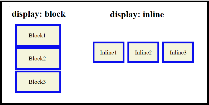
Block and Inline Boxes
CSS offers different types of boxes that are either block boxes or inline boxes. The way these boxes are displayed, it can be of two types: inner display type and outer display type.
Display of a box can be set using the display property of CSS, which have various values. Based on these values the display can be determined.
Refer the diagram for a better understanding of 'display: block | inline'.
For detailed information and examples of display property in CSS, visit CSS display property article.
CSS :root selector in CSS is a pseudo-class that matches the root element of a document tree. In the case of HTML documents, :root represents the <html> element itself, so this selector is identical to the html element selector. But the :root selector have more specificity than HTML element selector.
Syntax
/* Selects the root element (<html>) of the document */:root{
// css variable declarations or properties
}
Declaring Global CSS variables
The main purpose of root selector is to declare variables in CSS. This will have a global access across every selectors in the stylesheet. Lets see an example.
Example
<!DOCTYPE html><html><head><style>
:root {
--main-color: blue;
--secondary-color: white;
}
body {
background-color: var(--main-color);
}
h1 {
color: var(--secondary-color);
}
</style></head><body><h1>Welcome to CSS Root Example</h1><p>
This is an example of using CSS root to define and use
custom CSS variables.
</p></body></html></pre>