CSS rounded corners are created using the border-radius property. This property allows you to specify the radius of the corners of an element’s outer border edge.
Possible Values
- <length>: Size of circle radius is denoted, using length values. Negative values are not valid.
- <percentage>: Size of circle radius is denoted, using percentage values.
- Horizontal axis percentage is referred to the width of the box.
- Vertical axis percentage is referred to the height of the box.
- Negative values are not valid.
Applies to
All the HTML elements, except for table and inline-table elements with border-collapse set to collapse. Applies to ::first-letter.
DOM Syntax
object.style.borderRadius = "length";
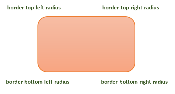
The following diagram demonstrates the different border-radius corners for reference:
The following table shows the possible values for rounded corners as follows −
| Value | Description | |
|---|---|---|
| radius |  | Is a <length> or a <percentage> that sets the radius for all four corners of the element. It is used only in the one-value syntax. |
| top-left and bottom-right |  | Is a <length> or a <percentage> that sets the radius for the top-left and bottom-right corners of the element. It is used only in the two-value syntax. |
| top-right and bottom-left |  | Is a <length> or a <percentage> that sets the radius for the top-right and bottom-left corners of the element. It is used only in the two- and three-value syntaxes. |
| top-left |  | Is a <length> or a <percentage> that sets the radius for the top-left corner of the element. It is used on three and four value syntaxes. |
| top-right |  | Is a <length> or a <percentage> that sets the radius for the top-right corners of the element. It is used only in the four-value syntax. |
| bottom-right |  | Is a <length> or a <percentage> that sets the radius for the bottom-right corners of the element. It is used only in the three and four-value syntaxes. |
| bottom-left |  | Is a <length> or a <percentage> that sets the radius for the bottom-left corners of the element. It is used only in the four-value syntax. |
Individual border radius properties, such as border-top-left-radius, cannot inherit from their parent element. Instead, you must use the individual longhand properties to set the border radius of each corner.
CSS Border Radius – Length Value
The following example demostrates how to use the border-radius property to create rounded corners for all four corners of a box −
<html><head><style>
   .rounded-box {
  width: 200px;
  height: 100px;
  background-color: pink;
  line-height: 100px;
  border-radius: 20px;   }
</style></head><body><div class="rounded-box">
  This is a rounded corner box.   </div></body></html>
You can use the border-radius property to create rounded corners on box, borders, and images.
Here is an example −
<html><head><style>
   .rounded-box {
  width: 200px;
  height: 100px;
  background-color: pink;
  border-radius: 20px;
  margin-bottom: 10px;   }
   .border-box {
  width: 200px;
  height: 100px;
  border-radius: 2em;
  border: 3px solid green;
  margin-bottom: 20px;      }
   .img-border-radius {
  background-image: url(images/tree.jpg);
  background-size: 100% 100%;
  border-radius: 20%;
  width: 200px;
  height: 150px;   }
</style></head><body><div class="rounded-box">
  This is a rounded corner box.   </div><div class="border-box">
  This is a rounded corner box.   </div><div class="img-border-radius">
  This is a rounded corner image.   </div></body></html>
You can use the border-radius property to create different rounded corner styles on an element.
Here is an example −
<html><head><style>
   .rounded-box {
  width: 200px;
  height: 100px;
  background-color: pink;
  margin: 10px;
  padding: 5px;   }
   .rounded-box.tl {
  border-radius: 30px 0 0 0;   }
   .rounded-bo x.tr {
  border-radius: 0 2em 0 0;   }
   .rounded-box.bl {
  border-radius: 0 0 0 15%;   }
   .rounded-box.br {
  border-radius: 0 0 30px 0;   }
   .rounded-box.tl-br {
  border-radius:  2em 0 2em 0;   }
   .rounded-box.tr-bl {
  border-radius: 0 15% 0 15%;   }
</style></head><body><div class="rounded-box tl">
  top-left rounded corner.   </div><div class="rounded-box tr">
  top-right rounded corner.   </div><div class="rounded-box bl">
  bottom-left rounded corner.   </div><div class="rounded-box br">
  bottom-right rounded corner.   </div><div class="rounded-box tl-br">
  top-left and bottom-right rounded corners.   </div><div class="rounded-box tr-bl">
  top-right and bottom-left rounded corners.   </div></body></html>
CSS Rounded Corner Images
You can use the border-radius property to create different rounded corner styles on elements.
Here is an example −
<html><head><style>
   img {
  width: 200px;
  height: 100px;
  margin: 10px;   }
   .top-left {
  border-radius: 30px 0 0 0;   }
   .top-right {
  border-radius: 0 2em 0 0;   }
   .bottom-left {
  border-radius: 0 0 0 15%;   }
   .bottom-right {
  border-radius: 0 0 30px 0;   }
   .tl-br {
  border-radius:  2em 0 2em 0;   }
   .tr-bl {
  border-radius: 0 15% 0 15%;   }
</style></head><body><h4>top-left rounded corner.</h4><img class="top-left" src="images/tree.jpg" /><h4>top-right rounded corner.</h4><img class="top-right" src="images/tree.jpg" /><h4> bottom-left rounded corner.</h4><img class="bottom-left" src="images/tree.jpg" /><h4>bottom-right rounded corner.</h4><img class="bottom-right" src="images/tree.jpg" /><h4>top-left and bottom-right rounded corners.</h4><img class="tl-br" src="images/tree.jpg" /><h4>top-right and bottom-left rounded corners.</h4><img class="tr-bl" src="images/tree.jpg" /></body></html>
We can create a circle and an ellipse using the CSS border-radius property.
Here is an example −
<html><head><style>
   .rounded-circle {
  width: 100px;
  height: 100px;
  background-color: pink;
  text-align: center;
  border-radius: 50%;   }
   .rounded-ellipse {
  width: 200px;
  height: 100px;
  background-color: pink;
  text-align: center;
  border-radius: 50%;   }
</style></head><body><div class="rounded-circle">
  circle   </div><div class="rounded-ellipse">
  ellipse   </div></body></html>
CSS border-radius – Related Properties
Following is the list of CSS properties related to border-radius:
| property | value |
|---|---|
| border-top-left-radius | Sets the roundness of the top-left corner of an element’s border. |
| border-top-right-radius | Sets the roundness of the top-right corner of an element’s border. |
| border-bottom-right-radius | Sets the roundness of the bottom-right corner of an element’s border. |
| border-bottom-left-radius | Sets the roundness of the bottom-left corner of an element’s border. |
| border-start-start-radius | Sets the roundness of the block-start and inline-start corner of an element’s border. |
| border-start-end-radius | Sets the roundness of the block-start and inline-end corner of an element’s border. |
| border-end-start-radius | Sets the roundness of the block-end and inline-start corner of an element’s border. |
| border-end-end-radius | Sets the roundness of the block-end and inline-end corner of an element’s border. |
Leave a Reply