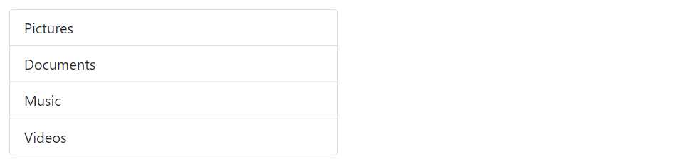
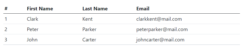
The list groups are very useful and flexible component for displaying lists of elements in a beautiful manner. In most basic form a list group is simply an unordered list with the class .list-group whereas, the list items having the class .list-group-item.
— The output of the above example will look something like this:
Tip: List groups are 100% wide by default. To set their width explicitly you can either use the Bootstrap’s width utility classes (e.g. w-25, w-50, etc.) or place them inside grid columns.
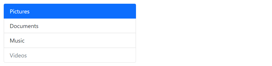
Indicate Disabled and Active Items
You can simply add the class .active to a .list-group-item to indicate the current active selection. Similarly, you can add .disabled to a .list-group-item to make it look like disabled.
— The output of the above example will look something like this:
Tip: In case of list group with linked items, the .disabled class only make the link look like disabled, but the link is still clickable. To actually disable links you need to remove the anchor’s href attribute either using the JavaScript or manually.
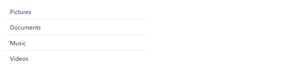
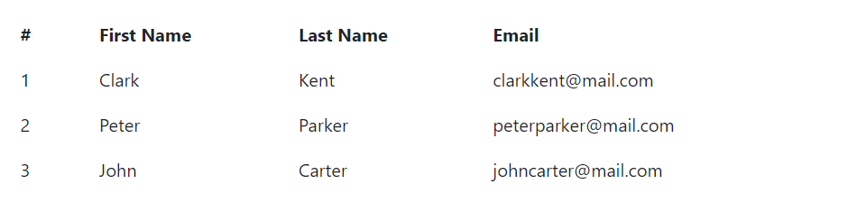
Edge-to-Edge List Groups
You can optionally add the class .list-group-flush to the list-group element to remove outer borders and rounded corners to create list groups that are edge-to-edge with their parent container.
Let’s check out the following example to understand how it actually works:
— The output of the above example will look something like this:
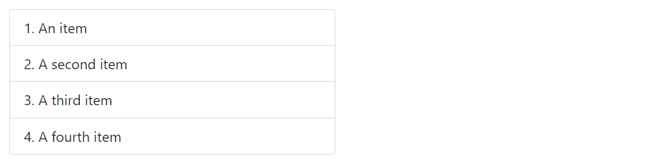
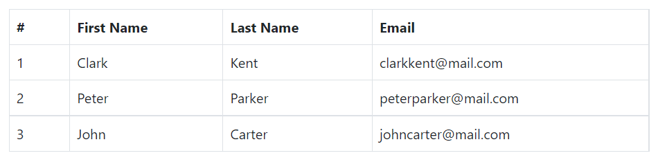
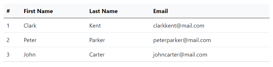
Creating Numbered List Groups
You can also create list groups where items are numbered through simply adding the modifier class .list-group-numbered on the .list-group element, like this:
Example
<ol class="list-group list-group-numbered w-50">
<li class="list-group-item">An item</li>
<li class="list-group-item">A second item</li>
<li class="list-group-item">A third item</li>
<li class="list-group-item">A fourth item</li>
</ol>
— The output of the above example will look something like this:
Note: Numbers are generated via CSS (as opposed to <ol> element’s default browser styling) for better placement inside list group items and to allow for better customization. See the CSS counter-reset and counter-increment properties to learn more about it.
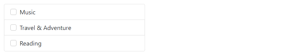
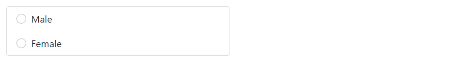
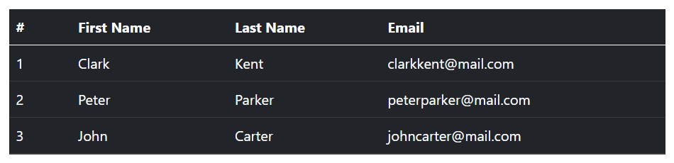
List Group with Checkboxes and Radios
You can also place Bootstrap’s custom checkboxes and radio buttons within the list group items.
The following example will create a list group with custom checkboxes:
— The output of the above example will look something like this:
You’ll learn about custom checkboxes and radio buttons in the Bootstrap custom forms chapter.
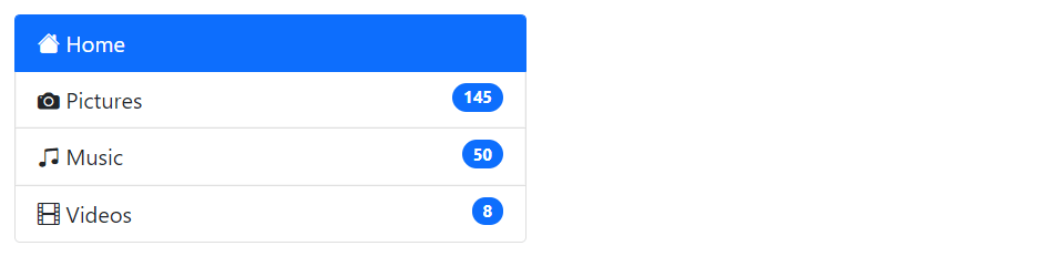
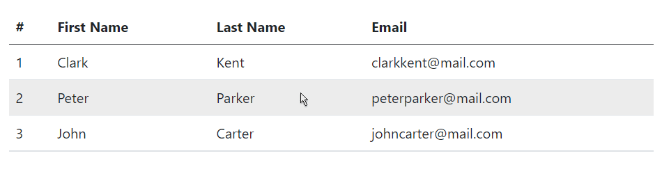
List Group with Linked Items
You can also link list group items with the little change in HTML markup.
Just replace the <li> with <a> tag and use <div> element as a parent instead of <ul>. You can also add icons and badges to this list group to make it more elegant. Here’s an example:
— The output of the above example will look something like this:
Tip: You can use the Bootstrap list group component for creating the sidebar navigation menu, e.g. displaying the list of products or categories on your website.
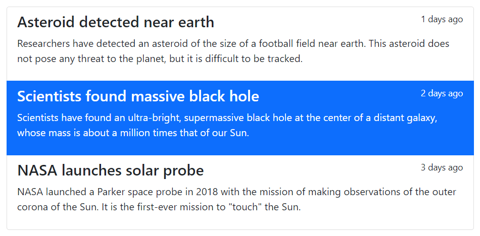
List Group with Custom Content
You can also add nearly any HTML within the list groups with the help of flexbox utilities.
Here’s an example of a linked list group with headings and paragraph.
Example
<div class="list-group">
<a href="#" class="list-group-item list-group-item-action">
<div class="d-flex w-100 justify-content-between">
<h4>Asteroid detected near earth</h4>
<small>1 days ago</small>
</div>
<p>Researchers have detected an asteroid of the size of a football field near earth. This asteroid does not pose any threat to the planet, but it is difficult to be tracked.</p>
</a>
<a href="#" class="list-group-item list-group-item-action active">
<div class="d-flex w-100 justify-content-between">
<h4>Scientists found massive black hole</h4>
<small>2 days ago</small>
</div>
<p>Scientists have found an ultra-bright, supermassive black hole at the center of a distant galaxy, whose mass is about a million times that of our Sun.</p>
</a>
<a href="#" class="list-group-item list-group-item-action">
<div class="d-flex w-100 justify-content-between">
<h4>NASA launches solar probe</h4>
<small>3 days ago</small>
</div>
<p>NASA launched a Parker space probe in 2018 with the mission of making observations of the outer corona of the Sun. It is the first-ever mission to "touch" the Sun.</p>
</a>
</div>
— The output of the above example will look something like this:
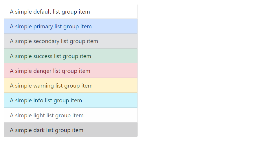
List Group with Contextual States
Like most of the other components you can also use contextual classes on the list group items to apply extra emphasis on them. Here’s an example:
Example
<ul class="list-group w-50">
<li class="list-group-item">A simple default list group item</li>
<li class="list-group-item list-group-item-primary">A simple primary list group item</li>
<li class="list-group-item list-group-item-secondary">A simple secondary list group item</li>
<li class="list-group-item list-group-item-success">A simple success list group item</li>
<li class="list-group-item list-group-item-danger">A simple danger list group item</li>
<li class="list-group-item list-group-item-warning">A simple warning list group item</li>
<li class="list-group-item list-group-item-info">A simple info list group item</li>
<li class="list-group-item list-group-item-light">A simple light list group item</li>
<li class="list-group-item list-group-item-dark">A simple dark list group item</li>
</ul>
— The output of the above example will look something like this:
Similarly, you can use these contextual classes to the linked list group items. You can also use the class .active to specify the active list group item. Here’s an example:
Example
<div class="list-group">
<a href="#" class="list-group-item list-group-item-action">A simple default list group item</a>
<a href="#" class="list-group-item list-group-item-action list-group-item-primary">A simple primary list group item</a>
<a href="#" class="list-group-item list-group-item-action list-group-item-secondary">A simple secondary list group item</a>
<a href="#" class="list-group-item list-group-item-action list-group-item-success">A simple success list group item</a>
<a href="#" class="list-group-item list-group-item-action list-group-item-danger">A simple danger list group item</a>
<a href="#" class="list-group-item list-group-item-action list-group-item-warning">A simple warning list group item</a>
<a href="#" class="list-group-item list-group-item-action list-group-item-info">A simple info list group item</a>
<a href="#" class="list-group-item list-group-item-action list-group-item-light">A simple light list group item</a>
<a href="#" class="list-group-item list-group-item-action list-group-item-dark">A simple dark list group item</a>
</div>
Please, check out the Bootstrap tabs chapter to learn how to create dynamic vertical tabs using the Bootstrap list group component without using any JavaScript code.
You can create three different types of HTML lists:
Unordered lists — A list of items in which the order does not explicitly matter. The list items in unordered lists are marked with bullets, e.g. ⚬, ●, etc.
Ordered lists — A list of items in which the order does explicitly matter. The list items in ordered lists are marked with numbers, e.g. 1, ⅵ, etc.
Definition list — A list of terms with their associated descriptions.
See the tutorial on HTML lists, to learn more about the different lists types.
Unstyled Ordered and Unordered Lists
Sometimes you might need to remove the default styling form the list items. You can do this by simply applying the class .list-unstyled to the respective <ul> or <ol> elements.
— The output of the above example will look something like this:
Note: The .list-unstyled class removes the default list-style and left padding only from the list items which are immediate children of the <ul> or <ol> element.
Placing Ordered and Unordered List Items Inline
If you want to create a horizontal menu using the ordered or unordered list you need to place all list items in a single line (i.e. side by side). You can do this simply by adding the class .list-inline to the <ul> or <ol>, and the class .list-inline-item to the child <li> elements.
— The output of the above example will look something like this:
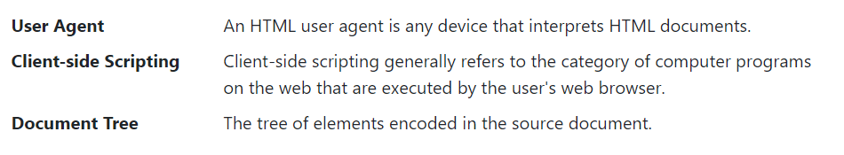
Creating Horizontal Definition Lists
The terms and descriptions in a definition list can also be aligned horizontally side-by-side using the Bootstrap grid system’s predefined classes. Here’s an example:
Example
<dl class="row">
<dt class="col-sm-3">User Agent</dt>
<dd class="col-sm-9">An HTML user agent is any device that interprets HTML documents.</dd>
<dt class="col-sm-3 text-truncate">Client-side Scripting</dt>
<dd class="col-sm-9">Client-side scripting generally refers to the category of computer programs on the web that are executed by the user's web browser.</dd>
<dt class="col-sm-3">Document Tree</dt>
<dd class="col-sm-9">The tree of elements encoded in the source document.</dd>
</dl>
— The output of the above example will look something like this:
The HTML tables are used to present data in grid manner like row and columns. Using Bootstrap you can greatly improve the appearance of table in a quick and easy way.
See the tutorial on HTML tables to learn more about tables.
Creating a Simple Table with Bootstrap
You can create tables with basic styling that has horizontal dividers and small cell padding (8px by default), by just adding the Bootstrap’s class .table to the <table> element.
— The output of the above example will look something like this:
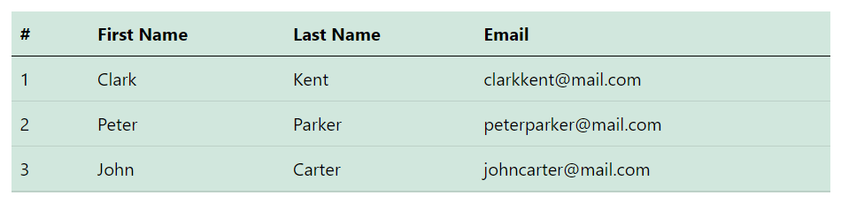
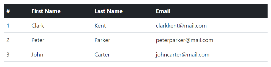
Creating Accented Tables
Bootstrap even provides a handful of contextual classes such as .table-primary, .table-secondary, .table-success, .table-danger, .table-warning, .table-info, .table-light and .table-dark to color tables, table rows or individual cells.
For example, you can create a dark version of the table (i.e. table with light text on dark backgrounds) by adding the contextual class .table-dark to the .table base class, like this:
— The output of the above example will look something like this:
Similarly, you can use other contextual classes. For instance, the following example uses the class .table-success on the .table to create green colored variant of a table.
— The output of the above example will look something like this:
Check out the snippets section for examples of some beautifully designed Bootstrap tables.
Tip: You can use these contextual classes on the .table base class to create colored version of any table such as stripped, hoverable, bordered, compact table, and so on.
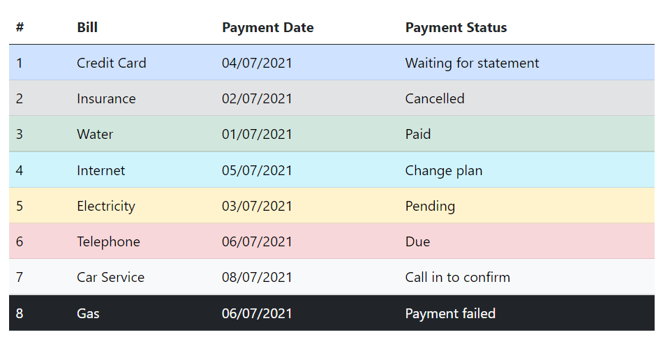
Similar to the tables you can also use these contextual classes to emphasize the rows within a table. Here’s an example of a table with emphasized rows, let’s take a look:
— The output of the above example will look something like this:
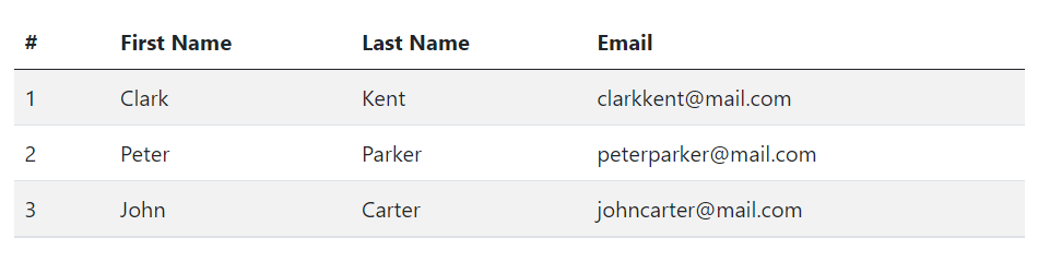
Creating Tables with Striped Rows
You can also add zebra-striping to the table rows within the <tbody> by simply adding an additional class .table-striped to the .table base class, as shown below:
— The output of the above example will look something like this:
Creating Bordered Tables
You can add borders on all sides of the table and cells by adding the modifier class .table-bordered to the .table base class, as shown in the following example:
— The output of the above example will look something like this:
Enabling Hover State on Table Rows
You can also enable a hover state on table rows within a <tbody> element by adding the modifier class .table-hover to the .table base class. Let’s try out the following example:
— The output of the above example will look something like this:
Creating Small or Compact Tables
You can also make your tables more compact and save the space through adding the modifier class .table-sm to the .table base class. The .table-sm class makes the table compact by cutting all cell padding in half. Let’s take a look at the following example:
— The output of the above example will look something like this:
Setting Table Head Colors
Similar to light and dark tables, you can use the modifier classes .table-light or .table-dark on the <thead> element to make it appear in light or dark gray.
The following example will create a table with light gray background head.
— The output of the above example will look something like this:
Creating Responsive Tables with Bootstrap
You can also create responsive tables to enable horizontal scrolling on small devices.
To make any table responsive just place it inside a <div> element and apply the .table-responsive class on it. You can also specify when the table should have a scrollbar, based on the viewport width (i.e. breakpoints), using the classes .table-responsive{-sm|-md|-lg|-xl}.
Let’s try out the following example to understand how it basically works:
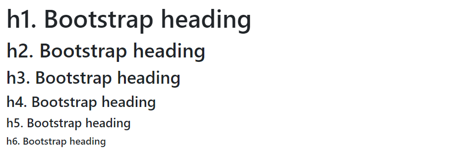
You can define all HTML headings, <h1> through <h6> — In the same way you define in simple HTML document. You can also utilize the heading classes .h1 through .h6 on other elements, if you want to apply the style on element’s text same as headings.
— The output of the above example will look something like this:
Customizing Headings
Additionally, you can use the <small> tag with .text-muted class to display the secondary text of any heading in a smaller and lighter variation. Here’s an example:
— The output of the above example will look something like this:
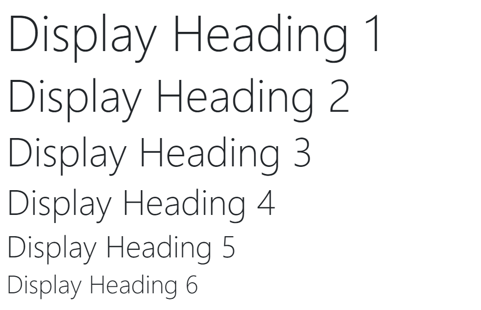
Display Headings
Bootstrap also provides display headings that can be used when you need a heading to stand out. Display headings are displayed in larger font-size but lighter font-weight.
Six different display headings are available. Here’s is an example:
— The output of the above example will look something like this:
Working with Paragraphs
Bootstrap’s global default font-size is 1rem (typically 16px), with a line-height of 1.5 (typically 24px), which is applied to the <body> element as well as all the paragraphs i.e. the <p> elements. In addition to that margin-bottom of 1rem is also applied to all the paragraphs.
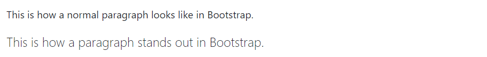
You can also make a paragraph stand out by adding the class .lead on it.
Example
<p>This is how a normal paragraph looks like in Bootstrap.</p>
<p class="lead">This is how a paragraph stands out in Bootstrap.</p>
— The HTML code in the above examples will produce the following result:
Tip: In CSS rem stands for “root em”. 1rem is equal to the font size of the root element (i.e. the <html> element), which is 16px in most browsers by default.
Text Alignment
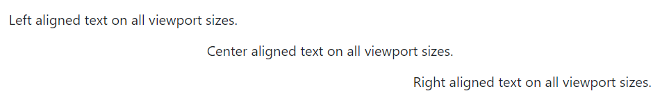
You can easily align text to left, right, and center using the text alignment classes.
Example
<p class="text-start">Left aligned text on all viewport sizes.</p>
<p class="text-center">Center aligned text on all viewport sizes.</p>
<p class="text-end">Right aligned text on all viewport sizes.</p>
— The output of the above example will look something like this:
You can also align text based on screen size using the responsive text alignment classes. These classes use the same viewport width breakpoints as the grid system.
Example
<p class="text-sm-center">Text will be center aligned on small sized (sm) viewports and up.</p>
<p class="text-md-center">Text will be center aligned on medium sized (md) viewports and up.</p>
<p class="text-lg-center">Text will be center aligned on large sized (lg) viewports and up.</p>
<p class="text-xl-center">Text will be center aligned on extra-large sized (xl) viewports and up.</p>
Text Formatting
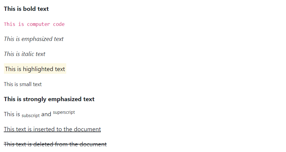
You are free to use text formatting tags like <strong>, <i>, <small> to make your text bold, italic, small and so on, in the same way you do in simple HTML page. Here’s an example:
Example
<p><b>This is bold text</b></p>
<p><code>This is computer code</code></p>
<p><em>This is emphasized text</em></p>
<p><i>This is italic text</i></p>
<p><mark>This is highlighted text</mark></p>
<p><small>This is small text</small></p>
<p><strong>This is strongly emphasized text</strong></p>
<p>This is <sub>subscript</sub> and <sup>superscript</sup></p>
<p><ins>This text is inserted to the document</ins></p>
<p><del>This text is deleted from the document</del></p>
— The output of the above example will look something like this:
Text Transformation
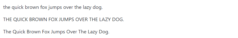
You can also transform the text to lowercase, uppercase or make them capitalize.
Example
<p class="text-lowercase">The quick brown fox jumps over the lazy dog.</p>
<p class="text-uppercase">The quick brown fox jumps over the lazy dog.</p>
<p class="text-capitalize">The quick brown fox jumps over the lazy dog.</p>
— The output of the above example will look something like this:
Text Coloring
Colors are the powerful method of conveying important information in website design.
Bootstrap has handful of emphasis utility classes that can be used for this purpose such as showing success message in green color, warning or error message in red color, etc.
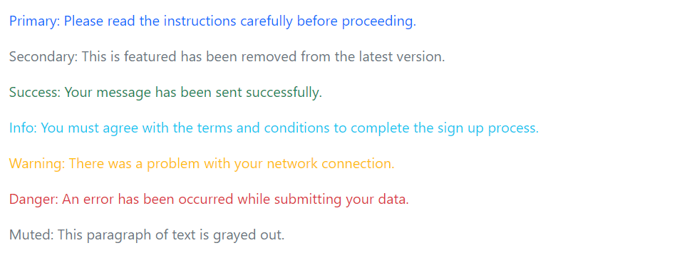
Example
<p class="text-primary">Primary: Please read the instructions carefully before proceeding.</p>
<p class="text-secondary">Secondary: This is featured has been removed from the latest version.</p>
<p class="text-success">Success: Your message has been sent successfully.</p>
<p class="text-info">Info: You must agree with the terms and conditions to complete the sign up process.</p>
<p class="text-warning">Warning: There was a problem with your network connection.</p>
<p class="text-danger">Danger: An error has been occurred while submitting your data.</p>
<p class="text-muted">Muted: This paragraph of text is grayed out.</p>
— The output of the above example will look something like this:
Please, check out the Bootstrap helper classes chapter to learn about other text coloring and background coloring classes, as well as various other utility classes.
Styling Blockquotes
You can also give pretty look to your blockquotes — Just define the blockquotes using the standard <blockquote> element and bootstrap’s style sheet will do the rest.
Example
<blockquote class="blockquote">
<p>Imagination is more important than knowledge.</p>
</blockquote>
— The output of the above example will look something like this:
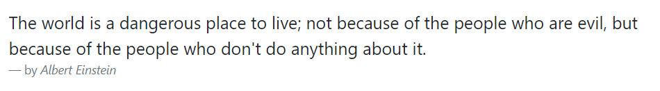
When providing attribution, wrap your <blockquote> in a <figure> element and use a <figcaption> or a block level element (e.g., <p>) with the .blockquote-footer class, like this:
Example
<figure>
<blockquote class="blockquote">
<p>The world is a dangerous place to live; not because of the people who are evil, but because of the people who don't do anything about it.</p>
</blockquote>
<figcaption class="blockquote-footer">by <cite>Albert Einstein</cite></figcaption>
</figure>
— The output of the above example will look something like this:
You can also align blockquotes to the right or center by simply applying the text alignment classes .text-end or .text-center on the <blockquote> or <figure> element.
Truncating Long Text
For longer text, you can use the class .text-truncate to truncate the text with an ellipsis. The display property value of the element must be inline-block or block.
It is particularly helpful in a situation where you want to display a piece of text in a single line but there is no enough space available. Let’s try out an example and see how it works:
Example
<!-- Block level element -->
<div class="row">
<div class="col-2 text-truncate">
The quick brown fox jumps over the lazy dog.
</div>
You can use the class .text-wrap to wrap the text within an element by overwriting its white-space property if it is set to pre or nowrap, such as Bootstrap badge components.
Similarly, you can use the class .text-nowrap to prevent text from wrapping within an element.
Let’s try out the following example to understand how it basically works:
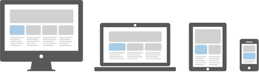
Responsive web design is a process of designing and building websites to provide better accessibility and optimal viewing experience to the user by optimizing it for different devices.
With the growing trend of smart phones and tablets, it has become almost unavoidable to ignore the optimization of sites for mobile devices. Responsive web design is a preferable alternative and an efficient way to target a wide range of devices with much less efforts.
Responsive layouts automatically adjust and adapts to any device screen size, whether it is a desktop, a laptop, a tablet, or a mobile phone. See the following Illustration.
Creating Responsive Layout with Bootstrap
With the Bootstrap powerful mobile first flexbox grid system creating the responsive and mobile friendly websites and applications has become much easier.
Bootstrap is responsive and mobile friendly from the start. Its six tier grid classes provides better control over the layout as well as how it will be rendered on different types of devices like mobile phones, tablets, laptops and desktops, large screen devices, and so on.
The following example will create a responsive layout that is rendered as 4 column layout in extra-large devices (viewport ≥ 1200px), and 3 column layout in large devices (992px ≤ viewport < 1200px), whereas 2 column layout in medium devices (768px ≤ viewport < 992px), and 1 column layout in small and extra-small devices (viewport < 768px). Let’s try it out and see how it works:
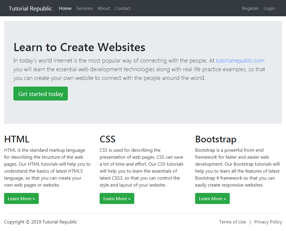
In Bootstrap you can use the class .container-fluid to create fluid layouts to utilize the 100% width of the viewport across all devices (extra small, small, medium, large, extra large, and extra-extra large).
The class .container-fluid simply applies the width: 100% instead of different width for different viewport sizes. However, the layout will still responsive and you can use the grid classes as usual. See the tutorial on Bootstrap grid system to learn more about grid classes.
The following example will create a fluid layout that covers 100% width of the screen.
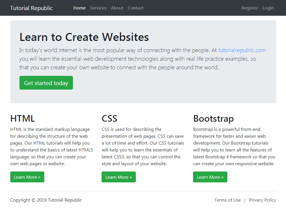
<div class="p-5 my-4 bg-light rounded-3">
<h1>Learn to Create Websites</h1>
<p class="lead">In today's world internet is the most popular way of connecting with the people. At <a href="https://www.tutorialrepublic.com" class="text-success" target="_blank">tutorialrepublic.com</a> you will learn the essential web development technologies along with real life practice examples, so that you can create your own website to connect with the people around the world.</p>
<p><a href="https://www.tutorialrepublic.com" target="_blank" class="btn btn-success btn-lg">Get started today</a></p>
</div>
<div class="row">
<div class="col-md-4">
<h2>HTML</h2>
<p>HTML is the standard markup language for describing the structure of the web pages. Our HTML tutorials will help you to understand the basics of latest HTML5 language, so that you can create your own web pages or website.</p>
<p><a href="https://www.tutorialrepublic.com/html-tutorial/" target="_blank" class="btn btn-success">Learn More &raquo;</a></p>
</div>
<div class="col-md-4">
<h2>CSS</h2>
<p>CSS is used for describing the presentation of web pages. CSS can save a lot of time and effort. Our CSS tutorials will help you to learn the essentials of latest CSS3, so that you can control the style and layout of your website.</p>
<p><a href="https://www.tutorialrepublic.com/css-tutorial/" target="_blank" class="btn btn-success">Learn More &raquo;</a></p>
</div>
<div class="col-md-4">
<h2>Bootstrap</h2>
<p>Bootstrap is a powerful front-end framework for faster and easier web development. Our Bootstrap tutorials will help you to learn all the features of latest Bootstrap 4 framework so that you can easily create responsive websites.</p>
<p><a href="https://www.tutorialrepublic.com/twitter-bootstrap-tutorial/" target="_blank" class="btn btn-success">Learn More &raquo;</a></p>
</div>
</div>
<hr>
<footer>
<div class="row">
<div class="col-md-6">
<p>Copyright &copy; 2021 Tutorial Republic</p>
</div>
<div class="col-md-6 text-md-end">
<a href="#" class="text-dark">Terms of Use</a>
<span class="text-muted mx-2">|</span>
<a href="#" class="text-dark">Privacy Policy</a>
</div>
</div>
</footer>
</div>
</body>
</html>
— The output of the above example will look something like this:
With Bootstrap you can still create web page layouts based on fixed number of pixels, however the container width vary depending on the viewport width and the layout is responsive too.
The process of creating the fixed yet responsive layout basically starts with the .container class. After that you can create rows with the .row class to wrap the horizontal groups of columns. Rows must be placed within a .container for proper alignment and padding.
Further columns can be created inside a row using the predefined grid classes such as .col, col-{xs|sm|md|lg|xl|xxl}-*, where * represent grid number and should be from 1 to 12. Please check out the tutorial on Bootstrap grid system to learn more about grid classes..
Note: Actual content like text, images, videos, tables, etc. should be placed within columns, and only columns may be the immediate children of rows.
The following example will create a fixed width responsive layout that is 720px pixels wide on medium devices like tablets (viewport ≥ 768px), whereas 960px wide on large devices like small laptops (viewport ≥ 992px), 1140px wide on extra large devices like desktops (viewport ≥ 1200px), and 1320px wide on extra-extra large devices like large desktops (viewport ≥ 1400px).
However, on small devices such as mobile phones (576px ≤ viewport < 768px) the layout will be 540px wide. But, on extra-small devices (viewport < 576px) the layout will cover 100% width. Also, columns will be stacked vertically and navbar will be collapsed in both cases.
<div class="p-5 my-4 bg-light rounded-3">
<h1>Learn to Create Websites</h1>
<p class="lead">In today's world internet is the most popular way of connecting with the people. At <a href="https://www.tutorialrepublic.com" class="text-success" target="_blank">tutorialrepublic.com</a> you will learn the essential web development technologies along with real life practice examples, so that you can create your own website to connect with the people around the world.</p>
<p><a href="https://www.tutorialrepublic.com" target="_blank" class="btn btn-success btn-lg">Get started today</a></p>
</div>
<div class="row">
<div class="col-md-4">
<h2>HTML</h2>
<p>HTML is the standard markup language for describing the structure of the web pages. Our HTML tutorials will help you to understand the basics of latest HTML5 language, so that you can create your own web pages or website.</p>
<p><a href="https://www.tutorialrepublic.com/html-tutorial/" target="_blank" class="btn btn-success">Learn More &raquo;</a></p>
</div>
<div class="col-md-4">
<h2>CSS</h2>
<p>CSS is used for describing the presentation of web pages. CSS can save a lot of time and effort. Our CSS tutorials will help you to learn the essentials of latest CSS3, so that you can control the style and layout of your website.</p>
<p><a href="https://www.tutorialrepublic.com/css-tutorial/" target="_blank" class="btn btn-success">Learn More &raquo;</a></p>
</div>
<div class="col-md-4">
<h2>Bootstrap</h2>
<p>Bootstrap is a powerful front-end framework for faster and easier web development. Our Bootstrap tutorials will help you to learn all the features of latest Bootstrap 4 framework so that you can easily create responsive websites.</p>
<p><a href="https://www.tutorialrepublic.com/twitter-bootstrap-tutorial/" target="_blank" class="btn btn-success">Learn More &raquo;</a></p>
</div>
</div>
<hr>
<footer>
<div class="row">
<div class="col-md-6">
<p>Copyright &copy; 2021 Tutorial Republic</p>
</div>
<div class="col-md-6 text-md-end">
<a href="#" class="text-dark">Terms of Use</a>
<span class="text-muted mx-2">|</span>
<a href="#" class="text-dark">Privacy Policy</a>
</div>
</div>
</footer>
</div>
</body>
</html>
— The output of the above example will look something like this:
We’ve used the margin utility classes such as .mb-3, .ml-auto, mx-2 etc. to adjust spacing between the elements. Whereas the classes .text-dark, .text-muted, .text-md-right are text utility classes to adjust color and alignment of text. You’ll learn about them in later chapters.
Bootstrap grid system provides an easy and powerful way to create responsive layouts of all shapes and sizes. It is built with flexbox with mobile-first approach. Also, it is fully responsive and uses twelve column system (12 columns available per row) and six default responsive tiers.
You can use the Bootstrap’s predefined grid classes for quickly making the layouts for different types of devices like mobile phones, tablets, laptops, desktops, and so on. For example, you can use the .col-* classes to create grid columns for extra small devices like mobile phones in portrait mode, and the .col-sm-* classes for mobile phones in landscape mode.
Similarly, you can use the .col-md-* classes to create grid columns for medium screen devices like tablets, the .col-lg-* classes for devices like small laptops, the .col-xl-* classes for laptops and desktops, and the .col-xxl-* classes for large desktop screens.
The following table summarizes the key features of the Bootstrap’s grid system.
FeaturesBootstrap Grid System
X-Small (xs)<576px
Small (sm)≥576px
Medium (md)≥768px
Large (lg)≥992px
X-Large (xl)≥1200px
XX-Large (xxl)≥1400px
Container max-width
None (auto)
540px
720px
960px
1140px
1320px
Class prefix
.col-
.col-sm-
.col-md-
.col-lg-
.col-xl-
.col-xxl-
Number of columns
12
Gutter width
1.5rem (.75rem on left and right)
Custom gutters
Yes
Nestable
Yes
Column ordering
Yes
Above table demonstrates one important thing, applying any .col-sm-* class to an element will not only have an effect on small devices, but also on medium, large and extra large devices (viewport width ≥768px), if a .col-md-*, .col-lg-*, .col-xl-*, or .col-xxl-* class is not present.
Similarly, the .col-md-* class will not only have an effect on medium devices, but also on large and extra large devices if a .col-lg-*, .col-xl-*, or .col-xxl-* class is not present.
Now the question arises how to create rows and columns using this 12 column responsive grid system. The answer is pretty simple, at first create a container that acts as a wrapper for your rows and columns using any container classes such as .container, after that create rows inside the container using the .row class, and to create columns inside any row you can use the .col-*, .col-sm-*, .col-md-*, .col-lg-*, .col-xl-* and .col-xxl-* classes.
The columns are actual content area where we will place our contents. In the following sections we will put all these things into real action and see how it actually works:
Creating Two Column Layouts
The following example will show you how to create two column layouts for medium, large and extra large devices like tables, laptops and desktops etc. However, on mobile phones (screen width less than 768px), the columns will automatically become horizontal (2 rows, 1 column).
Example
<div class="container">
<!--Row with two equal columns-->
<div class="row">
<div class="col-md-6">Column left</div>
<div class="col-md-6">Column right</div>
</div>
<!--Row with two columns divided in 1:2 ratio-->
<div class="row">
<div class="col-md-4">Column left</div>
<div class="col-md-8">Column right</div>
</div>
<!--Row with two columns divided in 1:3 ratio-->
<div class="row">
<div class="col-md-3">Column left</div>
<div class="col-md-9">Column right</div>
</div>
</div>
Note: In a grid layout, content must be placed inside the columns (.col and .col-*) and only columns may be the immediate children of rows (.row). Also, rows should be placed inside a container (either fixed or fluid) for proper padding and alignment.
Tip: Grid column widths are set in percentages, so they’re always fluid and sized relative to their parent element. In addition, each column has horizontal padding (called a gutter) for controlling the space between individual columns.
Since the Bootstrap grid system is based on 12 columns, therefore to keep the columns in a one line (i.e. side by side), the sum of the grid column numbers within a single row should not be greater than 12. If you go through the above example code carefully you will find the numbers of grid columns (i.e. col-md-*) add up to twelve (6+6, 4+8 and 3+9) for every row.
Creating Three Column Layouts
Similarly, you can create other layouts based on the above principle. For instance, the following example will typically create three column layouts for laptops and desktops screens. It also works in tablets in landscape mode if screen resolution is more than or equal to 992 pixels (e.g. Apple iPad). However, in portrait mode the grid columns will be horizontal as usual.
Example
<div class="container">
<!--Row with three equal columns-->
<div class="row">
<div class="col-lg-4">Column left</div>
<div class="col-lg-4">Column middle</div>
<div class="col-lg-4">Column right</div>
</div>
<!--Row with three columns divided in 1:4:1 ratio-->
<div class="row">
<div class="col-lg-2">Column left</div>
<div class="col-lg-8">Column middle</div>
<div class="col-lg-2">Column right</div>
</div>
<!--Row with three columns divided unevenly-->
<div class="row">
<div class="col-lg-3">Column left</div>
<div class="col-lg-7">Column middle</div>
<div class="col-lg-2">Column right</div>
</div>
</div>
Note: If more than 12 grid columns are placed within a single row, then each group of extra columns, as a whole, will wrap onto a new line. See column wrapping behavior.
Bootstrap Auto-layout Columns
You can also create equal width columns for all devices (x-small, small, medium, large, x-large, and xx-large) through simply using the class .col, without specifying any column number.
Let’s try out the following example to understand how it exactly works:
Example
<div class="container">
<!--Row with two equal columns-->
<div class="row">
<div class="col">Column one</div>
<div class="col">Column two</div>
</div>
<!--Row with three equal columns-->
<div class="row">
<div class="col">Column one</div>
<div class="col">Column two</div>
<div class="col">Column three</div>
</div>
</div>
Additionally, you can also set the width of one column and let the sibling columns automatically resize around it equally. You may use the predefined grid classes or inline widths.
If you try the following example you’ll find columns in a row with class .col has equal width.
Example
<div class="container">
<!--Row with two equal columns-->
<div class="row">
<div class="col">Column one</div>
<div class="col">Column two</div>
</div>
<!--Row with three columns divided in 1:2:1 ratio-->
<div class="row">
<div class="col">Column one</div>
<div class="col-sm-6">Column two</div>
<div class="col">Column three</div>
</div>
</div>
Column Wrapping Behavior
Now we are going to create more flexible layouts that changes the column orientation based on the viewport size. The following example will create a three column layout on large devices like laptops and desktops, as well as on tablets (e.g. Apple iPad) in landscape mode, but on medium devices like tablets in portrait mode (768px ≤ screen width < 992px), it will change into a two column layout where the third column moves at the bottom of the first two columns.
As you can see in the example above the sum of the medium grid column numbers (i.e. col-md-*) is 3 + 9 + 12 = 24 > 12, therefore the third <div> element with the class .col-md-12 that is adding the extra columns beyond the maximum 12 columns in a .row, gets wrapped onto a new line as one contiguous unit on the medium screen size devices.
Similarly, you can create even more adaptable layouts for your websites using the Bootstrap’s grid column wrapping feature. Here’re some ready to use Bootstrap grid examples.
Creating Multi-Column Layouts with Bootstrap
With the new Bootstrap mobile first flexbox grid system you can easily control how your website layout will render on different types of devices that have different screen or viewport sizes like mobile phones, tablets, desktops, etc. Let’s consider the following illustration.
In the above illustration there are total 12 content boxes in all devices, but its placement varies according to the device screen size, like in mobile device the layout is rendered as one column grid layout which has 1 column and 12 rows placed above one another, whereas in tablet it is rendered as two column grid layout which has 2 columns and 6 rows.
Further, in large screen size devices like laptops and desktops it is rendered as three column grid layout which has 3 columns and 4 rows and finally in extra large screen devices like large desktops it is rendered as four column grid layout which has 4 columns and 3 rows.
Now the question is how we can create such responsive layouts using this Bootstrap flexbox grid system. Let’s start with the primary target device. Suppose our primary target device is laptop or normal desktop. Since our laptop layout has 3 columns and 4 rows i.e. 3×4 grid layout, so the HTML code for making such grid structure would look something like this.
Tip: The .container-lg class makes the container 100% wide if the width of the viewport is less than 992px, thus utilizing the full available width on smaller screens.
If you see the output of the above example in a large device such as a laptop or desktop which has screen or viewport width greater than or equal to 1200px but less than 1400px, you will find the layout has 4 rows where each row has 3 equal columns resulting in 3×4 grid layout.
Now it’s time to customize our layout for other devices. Let’s first start by customizing it for medium devices like tablets (768px ≤ viewport width < 1200px). Since on tablet our layout rendered as 2×6 grids (i.e. 2 columns and 6 rows). So, go ahead and add the class .col-md-6 on every column.
Tip: For convenience choose your primary target device and create layout for that device first after that add classes to make it responsive for other devices.
Similarly, you can customize the layout for extra extra large devices such as a large desktop screen by adding the class .col-xxl-3 on each column, as every row in that layout contains 4 columns (i.e. 4×3 grids layout). Here’s the final code after combining the whole process.
Tip: According to the above illustration there is no need to customize the layout for mobile phones; since columns on extra small devices will automatically become horizontal and rendered as 1×12 column grid layout in absence of .col-* or .col-sm-* classes.
Nesting of Grid Columns
The Bootstrap grid columns are also nestable, that means you can put rows and columns inside an existing column. However, the formula for placing the columns will be the same, i.e. the sum of column numbers should be equal to 12 or less within a single row.
Example
<div class="container">
<div class="row">
<div class="col-sm-8">Column left</div>
<div class="col-sm-4">
<!--Column right with nested rows and columns-->
<div class="row">
<div class="col-12"></div>
</div>
<div class="row">
<div class="col-6"></div>
<div class="col-6"></div>
</div>
</div>
</div>
</div>
Creating Variable Width Columns
You can use the col-{breakpoint}-auto classes to size columns based on the natural width of their content. Try out the following example to see how it works:
You can use the flexbox alignment utilities to vertically and horizontally align grid columns inside a container. Try out the following examples to understand how it works:
Vertical Alignment of Grid Columns
You can use the classes .align-items-start, .align-items-center, and .align-items-end to align the grid columns vertically at the top, middle and bottom of a container, respectively.
Note: You can skip the number in .col-* grid class and just use the .col class to create equal size columns for all devices (extra small, small, medium, large, and extra large).
Horizontal Alignment of Grid Columns
You can use the classes .justify-content-start, .justify-content-center, and .justify-content-end to align the grid columns horizontally at the left, center and right of a container, respectively. Let’s check out the following example to see how it works:
Alternatively, you can use the class .justify-content-around to distribute grid columns evenly with half-size spaces on either end, whereas you can use the class .justify-content-between to distribute the grid columns evenly where the first column placed at the start and the last column placed at the end. Try out the following example to see how it actually works:
Please check out the tutoiral on css3 flexbox to learn more about flex items alignment.
Reordering of Grid Columns
You can even change the visual order of your grid columns without changing their order in actual markup. Use the class .order-last to order the column in last, whereas use the class .order-first to order the column at first place. Let’s checkout an example:
Example
<div class="container">
<div class="row">
<div class="col order-last">First, but ordered at last</div>
<div class="col">Second, but unordered</div>
<div class="col order-first">Last, but ordered at first</div>
</div>
</div>
You can also use the .order-* classes to order the grid columns depending on the order numbers. Grid column with higher order number comes after the grid column with lower order number or grid column with no order classes. It includes support for 1 through 12 across all five grid tiers.
Example
<div class="container">
<div class="row">
<div class="col order-4">First, but ordered at last</div>
<div class="col">Second, but ordered at first</div>
<div class="col order-1">Last, but ordered at second</div>
</div>
</div>
Offsetting the Grid Columns
You can also move grid columns to the right for alignment purpose using the column offset classes like .offset-sm-*, .offset-md-*, .offset-lg-*, and so on.
These classes offset the columns by simply increasing its left margin by specified number of columns. For example, the class .offset-md-4 on column .col-md-8 moves it to the right over four columns from its original position. Try out the following example to see how it works:
You can also offset columns using the margin utility classes. These classes are useful in the situations where the width of the offset is not fixed. Here’s an example:
Example
<div class="container">
<div class="row">
<div class="col-md-4"></div>
<div class="col-md-4 ms-auto"><!--Offset this column to right--></div>
</div>
<div class="row">
<div class="col-auto me-auto"></div>
<div class="col-auto"><!--Move this column away from previous column--></div>
</div>
</div>
Note: You can use the class .col-auto to create columns that only take up as much space as needed, i.e. the column sizes itself based on the contents.
Creating Compact Columns
You can remove the default gutters between columns to create compact layouts by adding the class .g-0 on .row. This class removes the negative margins from row and the horizontal padding from all immediate children columns. Here’s an example:
You can also create equal-width columns that span multiple rows by inserting a <div> with .w-100 class where you want the columns to break to a new line. Additionally, you can make these breaks responsive by combining the .w-100 class with responsive display utility classes.
Example
<div class="container">
<!-- Break columns on all devices -->
<div class="row">
<div class="col">.col</div>
<div class="col">.col</div>
<div class="w-100"></div>
<div class="col">.col</div>
<div class="col">.col</div>
</div>
<!-- Break columns on all devices except extra large devices -->
<div class="row">
<div class="col">.col</div>
<div class="col">.col</div>
<div class="w-100 d-xl-none"></div>
<div class="col">.col</div>
<div class="col">.col</div>
</div>
</div>
We hope you’ve understood the basics of new Bootstrap 5 grid system. In next few chapters you’ll learn how to create basic web page layouts using this flexbox grid system.
Containers are the most basic layout element in Bootstrap and are required when using the grid system. Containers are basically used to wrap content with some padding. They are also used to align the content horizontally center on the page in case of fixed width layout.
Bootstrap provides three different types containers:
.container, which has a max-width at each responsive breakpoint.
.container-fluid, which has 100% width at all breakpoints.
.container-{breakpoint}, which has 100% width until the specified breakpoint.
The table below illustrates how each container’s max-width changes across each breakpoint.
For example, when using the .container class the actual width of the container will be 100% if the viewport width is <576px, 540px if the viewport width is ≥576px but <768px, 720px if the viewport width is ≥768px but <992px, 960px if the viewport width is ≥992px but <1200px, 1140px if the viewport width is ≥1200px but <1400px, and 1320px if the viewport width is ≥1400px.
Similarly, when you use the .container-lg class the actual width of the container will be 100% until the viewport width is <992px, 960px if the viewport width is ≥992px but <1200px, 1140px if the viewport width ≥1200px but <1400px, and 1320px if the viewport width is ≥1400px.
ClassesBootstrap Grid System
X-Small<576px
Small≥576px
Medium≥768px
Large≥992px
X-Large≥1200px
XX-Large≥1400px
.container
100%
540px
720px
960px
1140px
1320px
.container-sm
100%
540px
720px
960px
1140px
1320px
.container-md
100%
100%
720px
960px
1140px
1320px
.container-lg
100%
100%
100%
960px
1140px
1320px
.container-xl
100%
100%
100%
100%
1140px
1320px
.container-xxl
100%
100%
100%
100%
100%
1320px
.container-fluid
100%
100%
100%
100%
100%
100%
Creating Responsive Fixed-width Containers
You can simply use the .container class to create a responsive, fixed-width container. The width of the container will change at different breakpoints or screen sizes, as shown above.
Example
<div class="container">
<h1>This is a heading</h1>
<p>This is a paragraph of text.</p>
</div>
Creating Fluid Containers
You can use the .container-fluid class to create a full width container. The width of the fluid container will always be 100% irrespective of the devices or screen sizes.
Example
<div class="container-fluid">
<h1>This is a heading</h1>
<p>This is a paragraph of text.</p>
</div>
Specify Responsive Breakpoints for Containers
Since Bootstrap v4.4, you can also create containers that is 100% wide until the specified breakpoint is reached, after which max-width for each of the higher breakpoints will be applied.
For example, .container-xl will be 100% wide until the xl breakpoint is reached (i.e., viewport width ≥ 1200px), after which max-width for xl breakpoint is applied, which is 1140px.
Example
<div class="container-sm">100% wide until screen size less than 576px</div>
<div class="container-md">100% wide until screen size less than 768px</div>
<div class="container-lg">100% wide until screen size less than 992px</div>
<div class="container-xl">100% wide until screen size less than 1200px</div>
Adding Background and Borders to Containers
By default, container doesn’t have any background-color or border. But if you need you can apply your own styles, or simply use the Bootstrap background-color and border utility classes to add background-color or border on them, as shown in the following example.
Example
<!-- Container with dark background and white text color -->
<div class="container bg-dark text-white">
<h1>This is a heading</h1>
<p>This is a paragraph of text.</p>
</div>
<!-- Container with light background -->
<div class="container bg-light">
<h1>This is a heading</h1>
<p>This is a paragraph of text.</p>
</div>
<!-- Container with border -->
<div class="container border">
<h1>This is a heading</h1>
<p>This is a paragraph of text.</p>
</div>
Applying Paddings and Margins to Containers
By default, containers have padding of 12px on the left and right sides, and no padding on the top and bottom sides. To apply extra padding and margins you can use the spacing utility classes.
Example
<!-- Container with border, extra paddings and margins -->
<div class="container border py-3 my-3">
<h1>This is a heading</h1>
<p>This is a paragraph of text.</p>
In this tutorial you will learn how easy it is to create a web page using Bootstrap. But before begin, be sure to have a code editor and some working knowledge of HTML and CSS.
If you’re just starting out in the world of web development, start learning from here »
Well, let’s get started creating our first Bootstrap powered web page.
Creating Your First Web Page with Bootstrap
Now we’re going to create a basic Bootstrap template by including the Bootstrap CSS and JS files via CDN. Bootstrap requires a third-party library Popper.js for some of its components like popovers and tooltips. You can either include it separately or simply include Bootstrap JS bundled with Popper.
We recommend adding Bootstrap in your project via CDN (Content Delivery Network) because CDN offers performance benefit by reducing the loading time, since they are hosting the files on multiple servers spread across the globe so that when a user requests the file it will be served from the server nearest to them. We’re also using the CDN links in our examples:
Let’s walk through the following steps. At the end of this tutorial, you’ll have made a simple Bootstrap powered web page that displays “Hello world” message in your web browser.
Step 1: Creating a Basic HTML file
Open up your favorite code editor and create a new HTML file. Start with an empty window and type the following code and save it as “basic.html” on your desktop.
Example
<!DOCTYPE html>
<html lang="en">
<head>
<meta charset="utf-8">
<meta name="viewport" content="width=device-width, initial-scale=1">
<title>Basic HTML File</title>
</head>
<body>
<h1>Hello, world!</h1>
</body>
</html>
Tip: Always include the viewport <meta> tag inside the <head> section of your document to enable touch zooming and ensure proper rendering on mobile devices.
Step 2: Making this HTML File a Bootstrap Template
In order to make this plain HTML file a Bootstrap template, just include the Bootstrap CSS and JS files using their CDN links. Also, you should include JavaScript files at the bottom of the page, right before the closing </body> tag to improve the performance of your web pages.
And we’re all set! After adding the Bootstrap’s CSS and JS files to our HTML page, we can begin to develop any responsive site or application with the Bootstrap framework.
The attributes integrity and crossorigin have been added to CDN links to implement Subresource Integrity (SRI). It is a security feature that enables you to mitigate the risk of attacks originating from compromised CDNs, by ensuring that the files your website fetches (from a CDN or anywhere) have been delivered without unexpected or malicious modifications. It works by allowing you to provide a cryptographic hash that a fetched file must match.
Note: The biggest change in Bootstrap 5 is it doesn’t require jQuery anymore. However, you can still use jQuery to quickly implement Bootstrap component’s methods and options. If Bootstrap detects jQuery in the window object it’ll add all of its components in jQuery’s plugin system. You will learn about them in advanced section of this tutorial series.
Tip: If the visitor to your website has already downloaded the Bootstrap’s CSS and JS files from the same CDN while visiting the other sites, it will be loaded from the browser’s cache instead of re-downloading, which leads to faster loading time.
Step 3: Saving and Viewing the File
Now save the file on your desktop as “bootstrap-template.html”.
To open this file in a web browser, navigate to it, then right click on it, and select your favorite web browser. Alternatively, you can open your browser and drag this file to it.
Note: It is important that the extension .html is specified, some text editors, such as Notepad on Windows, will automatically save it as .txt otherwise.
Downloading the Bootstrap Files
Alternatively, you can also download the Bootstrap’s CSS and JS files from their official website and include in your project. There are two versions available for download, compiled Bootstrap and Bootstrap source files. You can download Bootstrap 5 files from here.
Compiled download contains compiled and minified version of CSS and JavaScript files for faster and easier web development. The compiled version also includes optional JavaScript dependencies such as Popper bundled with Bootstrap JS (bootstrap.bundle.*). Whereas, the source download contains original source files for all CSS and JavaScript, along with a local copy of the docs.
Download and unzip the compiled Bootstrap. Now if you look inside the folders you’ll find it contains the compiled CSS and JS files (bootstrap.*), as well as the compiled and minified CSS and JS (bootstrap.min.*). Use the bootstrap.min.css and bootstrap.bundle.min.js files.
Using the minified version of CSS and JS files will improve the performance of your website and saves the precious bandwidth because of lesser HTTP request and download size.
Tip: There’s no need to include the required Popper.js (in order to make the Bootstrap’s tooltip and popover components work) separately, as it is already included in the “bootstrap.bundle.js” and minified “bootstrap.bundle.min.js” files.