CSS box-decoration-break property specifies how the background, border, border-image, box-shadow, margin, padding and clip-path of an element should behave when the content is broken across multiple lines or columns. It controls whether these properties should be continuous or fragmented across the line breaks.
It means that the padding, border, and background of the element will be rendered as if the content were not broken, resulting in continuous rendering across line breaks. Default Value
clone
Each box fragment is rendered individually with its defined border, padding, and margin wrapping it. The border-radius and box-shadow are applied to each fragment separately.
initial
It sets the property to its default value.
inherit
It inherits the property from the parent element.
Examples of CSS Box Decoration Break Property
The following examples explain the box-decoration-break property with different values.
Box Decoration Break Property with Slice Value
To let the box decoration properties be rendered continuously such that they break at the edges of the element fragment, we use the slice value. This is shown in the following example.
CSS
<br>
box-decoration-break property
<br>
with slice
<br>
Value.
<br>
See how the
<br>
properties are applied
<br>
to the elements.
</span></body></html>
Box Decoration Break Property with Clone Value
To let each individual element fragment have individual box decoration properties separately, we use the clone value. The value treats each element broken across multiple lines as individual element and applies the properties to each of them. This is shown in the following example.
CSS box-shadow property adds a shadow effect around an element. One or more shadow effects can be added, separated by commas. The box shadow is described by horizontal and vertical offsets relative to the element, blur, spread radius and color.
It defines the horizontal offset. Positive values place the shadow to the right of box, negative values place the shadow to the left of box. Required.
v-offset
It defines the vertical offset. Positive values place the shadow below the box, negative values place the shadow above the box. Required
blur
It defines the blur radius. Higher values have higher blur. Optional.
spread
It defines the spread radius. Positive values increases size of shadow, negative values decreases size of shadow. Optional
color
It defines the color of the shadow. Different formats of color can be used. Default is color of text. Optional
inset
It changes the outer shadow to inner shadow.
initial
It sets the property to its default value.
inherit
It inherits the property from the parent element.
Examples of CSS Box Shadow Property
The following examples explain the box-shadow property with different values.
Box Shadow Property with Box Shadow
To set a shadow to a box, we require to specify atleast two values, one for the horizontal offset and the other for the vertical offset. Depending on the signs of the values, the position of the shadow changes accordingly. This is shown in the following example.
Example
<!DOCTYPE html><html><head><style>
.container {
display: grid;
justify-content: center;
align-items: center;
gap: 30px;
}
.boxes {
padding: 50px;
text-align: center;
font-weight: bold;
}
.first {
background-color: lightcoral;
box-shadow: 10px 10px;
}
.second {
background-color: lightblue;
box-shadow: 10px -10px;
}
.third {
background-color: lightgreen;
box-shadow: -10px 10px;
}
.fourth {
background-color: lightgrey;
box-shadow: -10px -10px;
}
</style></head><body><h2>
CSS box-shadow property
</h2><p>
Positive horizontal offset places the shadow
to the right of box and negative horizotal offset
places the shadow to the left of box.
</p><p>
Positive vertical offset places the
shadow below the box and negative values places
it above the box.
</p><div class="container"><p class="first boxes">
box-shadow: 10px 10px
</p><p class="second boxes">
box-shadow: 10px -10px
</p><p class="third boxes">
box-shadow: -10px 10px
</p><p class="fourth boxes">
box-shadow: -10px -10px
</p></div></body></html></pre>
Box Shadow Property with Blur
To set a blur to the shadow of a box, we require to specify three values. The first two values are the horizontal and vertical offsets while the third value is for the blur, higher the third value greter will be the blur. This is shown in the following example.
.third {
background-color: lightcoral;
box-shadow: 10px 10px 40px;
}
</style></head><body><h2>
CSS box-shadow property
</h2><p>
The third value decides the blur,
greater the value more is the blur.
</p><div class="container"><p class="first boxes">
box-shadow: 10px 10px 10px
</p><p class="second boxes">
box-shadow: 10px -10px 20px
</p><p class="third boxes">
box-shadow: -10px 10px 40px
</p></div></body></html></pre>
Box Shadow Property with Spread Value
To set the size of the shadow of a box, we require to specify four values. The first two values are the horizontal and vertical offsets while the third value is for the blur, the fourth value decides the size of the shadow, positive values result in larger shadows while negative values result in smaller shadows. This is shown in the following example.
.second {
background-color: lightblue;
box-shadow: 10px 10px 20px 15px;
}
.third {
background-color: lightblue;
box-shadow: 10px 10px 40px -5px;
}
</style></head><body><h2>
CSS box-shadow property
</h2><p>
The fourth value decides the size of the shadow,
positive value results in larger shadow while negative
value results in smaller shadow.
</p><div class="container"><p class="first boxes">
box-shadow: 10px 10px 10px 5px
</p><p class="second boxes">
box-shadow: 10px -10px 20px 14px
</p><p class="third boxes">
box-shadow: -10px 10px 40px -5px
</p></div></body></html></pre>
Box Shadow Property with Color Value
To set a color to the shadow of a box, we require to specify atleast three values. The first two values are the horizontal and vertical offsets while the third value is for the color, the color can be specified along with blur and spread as well. The color can be specified in different format (eg. color names, hexadecimal values, rgb values etc.). This is shown in the following example.
.third {
background-color: lightcoral;
box-shadow: 10px 10px 40px -5px hsl(225, 100%, 50%);
}
</style></head><body><h2>
CSS box-shadow property
</h2><p>
The color can be specified as third parameter,
fourth parameter of even fifth parameter.
The specified color will be applied to the shadow.
</p><div class="container"><p class="first boxes">
box-shadow: 10px -10px grey
</p><p class="second boxes">
box-shadow: 10px 10px 20px rgb(51, 204, 0)
</p><p class="third boxes">
box-shadow: 10px 10px 40px -5px hsl(225, 100%, 50%)
</p></div></body></html></pre>
Box Shadow Property with Inset Value
To let the box shadow appear inside the element and not outside the element, we use the inset value. This is shown in the following example
.first {
background-color: lightgreen;
box-shadow: 10px -10px red inset;
}
.second {
background-color: lightgreen;
box-shadow: 10px 10px 20px rgb(51, 204, 0) inset;
}
</style></head><body><h2>
CSS box-shadow property
</h2><p>
The inset value places the
shadow within the elment.
</p><div class="container"><p class="first boxes">
box-shadow: 10px -10px red inset
</p><p class="second boxes">
box-shadow: 10px 10px 20px rgb(51, 204, 0) inset
</p></div></body></html></pre>
Box Shadow Property with Multiple Shadows
To have multiple shadows for a box, each style must be comma separated. The shadows will appear in the order specified in box-shadow property. This is shown in the following example.
.second {
background-color: lightgreen;
box-shadow: 5px 5px red,
10px 10px blue,
15px 15px green;
}
</style></head><body><h2>
CSS box-shadow property
</h2><p>
Number of shadows can be altered by
specifying the different styles and
separating them by commas.
</p><div class="container"><p class="first boxes">
box-shadow: multiple shadows
</p><p class="second boxes">
box-shadow: multiple shadows
</p></div></body></html></pre>
CSS gradients allows to design custom colors for HTML elements by creating a smooth transition between two or more colors.
What is CSS Gradient?
In CSS, gradient is a special type of user defined images that can be used for background or borders of element.
We can set a gradient to background property of any HTML elements using function gradient(type, color1, color2, color3);
Zooming a image gradient does not loose it’s quality as this are defined by browsers according to developers code.
Table of Contents
Types of CSS Gradients
Linear Gradients
Radial Gradients
Conic Gradients
Gradients for Borders
Positioning Color Stops
Creating Hard Lines
Color Bands Using Gradients
Stacked Gradients
Related Functions
Types of CSS Gradients
CSS defines three types of gradients
Linear Gradient: Goes from left to right, up to down or diagonally.
Radial Gradient: Start from center to edges.
Conic Gradient: Revolve around a center point.
Linear GradientRadial GradientConic Gradient
Choose a gradient for background
Linear Gradients
The linear gradient creates a color band that flows in a single direction, i.e. from left-to-right, top-to-bottom, or at any angle.
Syntax
linear-gradient(direction, color1, color2, ...);/* Gradient from bottom right to top left */linear-gradient(to top left, color1, color2, ...);/* Gradient at an angle 45 degree */linear-gradient(45deg, red, yellow);
The direction parameter specifies the angle or direction ( [to left | to right] || [to top | to bottom]) of the gradient.
Example
In order to create a basic linear gradient, you just need two colors, which are known as color stops. You must have minimum two, but can have more than two as well.
</style></head><body><h1>Linear gradient</h1><h3>Top to Bottom ( Default )</h3><div class="topBottom"></div><h3>Right to left</h3><div class="RightLeft"></div></body></html>
Radial Gradients
A radial gradient is a type of gradient that consists of colors radiating outward from a central point.
In a radial gradient, the colors smoothly transition from one color at the center to another color at the outer edges in a circular or elliptical pattern.
The shape parameter defines the shape of the gradient (circle or ellipse).
The size parameter specifies the size of the shape.
The position parameter sets the center of the gradient
Example
In order to create a basic radial gradient, you just need two colors. The center of the gradient is at 50% 50% mark, by default; where the gradient is elliptical matching with the aspect ratio of its box.
A conic gradient, also known as a conical gradient or angular gradient, is a type of gradient in which colors are arranged in a circular or conical pattern, radiating out from a central point in a 360-degree arc.
Syntax
conic-gradient(from 'angle' at 'position','color-list')
position (optional): Specifies the position of the starting point of the gradient. It can be a percentage or a keyword like center.
angle (optional): Specifies the starting angle of the gradient in degrees.
color-list : Defines the colors and their positions in the gradient.
Example
In this example we will create a conic gradient pie chart with four different colors, then align gradient at different locations of diagram.
<!DOCTYPE html><html lang="en"><head><style>
div {
height: 80px;
width: 110px;
border-radius: 50%;
}
.gradient1{
background: conic-gradient(
from 45deg at 50% 50%,
red, yellow, green,
blue, red);
}
.gradient2{
background: conic-gradient(
from 45deg at 20% 40%,
red, yellow, green,
blue, red);
}
</style></head><body><h1>Conic Gradient Example</h1><h3>Align at center</h3><div class="gradient1"></div><h3>Align at 20-40</h3><div class="gradient2"></div></body></html></pre>
Gradients for Borders
The CSS gradients can be used to create fancy borders as well. You can use the gradients in wide variety to create effects in the border patterns.
Syntax
border-image:linear-gradient('color-list')
You can also use radial and conical gradients for borders.
Example
Here is an example of use of gradients in creation of borders:
A hard line can be created in between two colors, such that no smooth transition can be seen. This effect can be achieved by carefully positioning color stops in CSS gradients. Check out following example
Example
In this example we will create hard line using gradient function.
One gradient can be stacked over other gradients. Just make sure the gradient at the top should not be completely opaque, so that the gradients below it can be seen.
Example
Lets see an example of stacked gradients.
<html><head><style>
div {
height: 200px;
width: 100%;
}
.stacked-linear {
background:
linear-gradient(90deg, green, yellow),
linear-gradient(220deg, white 70.71%, black 38%),
linear-gradient(217deg, orange, grey 70.71%);
}
CSS uses color values to specify a color. Typically, these are used to set a color either for the foreground of an element (i.e. its text) or else for the background of the element. They can also be used to affect the color of borders and other decorative effects.
You can specify your color values in various formats. Following table lists all the possible formats −
Format
Syntax
Description
Example
Keyword
<property>: <colorname>
CSS has a set of predefined color names that you can use directly.
red, blue, green, yellow, black, white, etc.
Hexadecimal Code
#RRGGBB
Starts with a hash (#) followed by six hexadecimal digits.
#FF0000 – red
Short Hexadecimal Code
#RGB
Shorter version of hexadecimal format where each of the RGB components is represented by a single digit, and the value is duplicated.
#F00 – red
RGB
rgb(red,green,blue)
Colors can be defined using the rgb() function, which takes three parameters representing the red, green, and blue values.
rgb(0, 0, 255) – blue
RGBA
rgba()
Similar to RGB, with an additional parameter for the alpha (transparency) value. 0 (fully transparent) and 1 (fully opaque)
rgba(0,0,255,0.5) – translucent blue
HSL
hsl()
Colors can be defined using the rgb() function which stands for Hue (0 to 360 degree), Saturation (%), and Lightness (%).
hsl(120, 100%, 50%) – pure green
HSLA
hsla()
Similar to HSL, with an additional parameter for the alpha (transparency) value.
hsl(120, 100%, 50%, 0.5) – translucent green
currentcolor Keyword
currentcolor
It refers to the value of the color property of the element.
color: red; /* Red text color */ border: 10px solid currentcolor; /* Red border color */
System color
as per OS or browser
CSS allows usage of system colors defined by the user’s OS or browser.
ButtonText, Window, WindowText
These formats are explained in more detail in the following sections −
CSS Colors – Keyword
CSS supports the color names to be directly passed to the property background-color and color. 140 standard color names are supported by CSS.
Few of the examples are listed in the table below:
Color
Color Name
Black
Red
Blue
Green
Aquamarine
Here is an example:
Open Compiler
<html><head><style>
   #colorkeyword{
  background-color: aqua;
  padding: 10px;   }
</style></head><body><h3>Color Keyword - example</h3><p>As the keyword passed is aqua, the background will appear as aqua colored..</p><div id="colorkeyword">
  This div element has a colored background based on the color keyword passed, i.e aqua.   </div></body></html>
CSS Colors – Hexadecimal Codes
A hexadecimal is a 6 digit representation of a color. The first two digits(RR) represent a red value, the next two are a green value(GG), and the last are the blue value(BB).
A hexadecimal value can be taken from any graphics software like Adobe Photoshop, Jasc Paintshop Pro, or even using Advanced Paint Brush.
Each hexadecimal code will be preceded by a pound or hash sign ‘#’. Following are the examples of hexadecimal notation.
Note: To specify the hexadecimal codes, you can use upper case or lower case letters.
Color
Color Hexadecimal Code
#000000
#FF0000
#00FF00
#0000FF
#FFFF00
#00FFFF
#FF00FF
#C0C0C0
#FFFFFF
Here is an example:
Open Compiler
<html><head><style>
#hexcode {
background-color: #00ff00;
padding: 10px;
}
</style></head><body><h3>Hexadecimal code - example</h3><p>As the hexadecimal code is #00ff00 the background will appear green.</p><div id="hexcode">
This div element has a green background.
</div></body></html></pre>
CSS Colors - Short Hexadecimal Codes
This is a shorter form of the six-digit notation. In this format, each digit is replicated to arrive at an equivalent six-digit value. For example: #6A7 becomes #66AA77.
A hexadecimal value can be taken from any graphics software like Adobe Photoshop, Jasc Paintshop Pro, or even using Advanced Paint Brush.
Each short hexadecimal code will be preceded by a pound or hash sign '#'. Following are the examples of short hexadecimal notation.
Note: To specify the hexadecimal codes, you can use upper case or lower case letters.
Color
Short Hexadecimal Code
#000
#F00
#0F0
#0FF
#FF0
#0FF
#F0F
#FFF
Here is an example:
Open Compiler
<html><head><style>
#shorthex {
background-color: #00f;
padding: 10px;
}
</style></head><body><h3>Short Hexadecimal code - example</h3><p>As the short hexadecimal code is #00f the background will appear blue.</p><div id="shorthex">
This div element has a blue background.
</div></body></html></pre>
CSS Colors - RGB Values
This color value is specified using the rgb( ) property.
It takes three values, one each for red, green, and blue.
The value can be an integer between 0 and 255 or a percentage.
NOTE: All the browsers does not support rgb() property of color so it is recommended not to use it.
Following is the example to show few colors using RGB values.
Color
Color RGB
rgb(0,0,0)
rgb(255,0,0)
rgb(0,255,0)
rgb(0,0,255)
rgb(255,255,0)
rgb(0,255,255)
rgb(255,0,255)
rgb(192,192,192)
rgb(255,255,255)
Here is an example:
Open Compiler
<html><head><style>
   #rgbvalue {
  background-color: rgb(255,0,255);
  padding: 10px;   }
</style></head><body><h3>RGB - example</h3><p>As the rgb(255,0,255) is set the background will appear accordingly.</p><div id="rgbvalue">
  This div element has a colored background based on the rgb values.   </div></body></html>
CSS Colors - RGBA Values
This color value is specified using the rgba( ) property.
It takes four values, one each for red, green, and blue and the last value as the alpha (transparency) value.
The alpha value can be any value between 0 and 1.
NOTE: All the browsers do not support rgba() property of color so it is not recommended.
Following is the example to show few colors using RGBA values.
}
</style></head><body><h3>RGBA - example</h3><p>As the rgba(255,0,255,0.2) is set the background will appear with transparency value of 0.2.</p><div id="rgbavalue">
This div element has a colored background based on the rgba values.
</div></body></html>
CSS Colors - HSL Values
This color value is specified using the hsl() function.
HSL stands for hue, saturation and lightness.
Hue is represented in degrees (0-360), saturation and lightness are represented as percentages (0% - 100%).
Following is the example to show few colors using HSL property.
}
</style></head><body><h3>HSL - example</h3><p>As the hsl(355,70%,50%) is set the background will appear based on the hsl values passed.</p><div id="hslvalue">
This div element has a colored background based on the hsl values hsl(355,70%,50%).
</div></body></html>
CSS Colors - HSLA Values
This color value is specified using the hsl() function.
HSLA stands for hue, saturation, lightness and alpha.
It takes four values, first for hue, second for saturation, third for lightness and fourth is the alpha (transparency) value.
Hue is represented in degrees (0-360), saturation and lightness are represented as percentages (0% - 100%), and alpha value can be in between 0 and 1.
Following is the example to show few colors using HSLA property.
}
</style></head><body><h3>HSLA - example</h3><p>As the hsla(355,70%,50%,0.4) is set the background will appear based on the hsla values passed, with high transparency.</p><div id="hslavalue">
This div element has a colored background based on the hsl values hsla(355,70%,50%,0.4).
</div></body></html>
CSS Colors - currentcolor keyword
The currentcolor keyword signifies the value of the color property of an element. It can be passed to any other styling property using the keyword currentcolor.
Here is an example:
<html><head><style>
   #currcolor {
  color: red;
  border: 5px solid currentcolor;   }
</style></head><body><h2>The currentcolor Keyword</h2><p>As the currentcolor keyword is used for border after color property is set as red, the border will also appear red.</p><div id="currcolor">
  This div element has a red text color and a red border.   </div></body></html>
CSS Colors - Building Color Codes
You can build millions of color codes using our Color Code Builder. Check the HTML Color Code Builder.
To use this tool, you would need a Java Enabled Browser.
CSS Colors - Browser Safe Colors
Here is the list of 216 colors which are supposed to be most safe and computer independent colors. These colors vary from hexa code 000000 to FFFFFF. These colors are safe to use because they ensure that all computers would display the colors correctly when running a 256 color palette −
000000
000033
000066
000099
0000CC
0000FF
003300
003333
003366
003399
0033CC
0033FF
006600
006633
006666
006699
0066CC
0066FF
009900
009933
009966
009999
0099CC
0099FF
00CC00
00CC33
00CC66
00CC99
00CCCC
00CCFF
00FF00
00FF33
00FF66
00FF99
00FFCC
00FFFF
330000
330033
330066
330099
3300CC
3300FF
333300
333333
333366
333399
3333CC
3333FF
336600
336633
336666
336699
3366CC
3366FF
339900
339933
339966
339999
3399CC
3399FF
33CC00
33CC33
33CC66
33CC99
33CCCC
33CCFF
33FF00
33FF33
33FF66
33FF99
33FFCC
33FFFF
660000
660033
660066
660099
6600CC
6600FF
663300
663333
663366
663399
6633CC
6633FF
666600
666633
666666
666699
6666CC
6666FF
669900
669933
669966
669999
6699CC
6699FF
66CC00
66CC33
66CC66
66CC99
66CCCC
66CCFF
66FF00
66FF33
66FF66
66FF99
66FFCC
66FFFF
990000
990033
990066
990099
9900CC
9900FF
993300
993333
993366
993399
9933CC
9933FF
996600
996633
996666
996699
9966CC
9966FF
999900
999933
999966
999999
9999CC
9999FF
99CC00
99CC33
99CC66
99CC99
99CCCC
99CCFF
99FF00
99FF33
99FF66
99FF99
99FFCC
99FFFF
CC0000
CC0033
CC0066
CC0099
CC00CC
CC00FF
CC3300
CC3333
CC3366
CC3399
CC33CC
CC33FF
CC6600
CC6633
CC6666
CC6699
CC66CC
CC66FF
CC9900
CC9933
CC9966
CC9999
CC99CC
CC99FF
CCCC00
CCCC33
CCCC66
CCCC99
CCCCCC
CCCCFF
CCFF00
CCFF33
CCFF66
CCFF99
CCFFCC
CCFFFF
FF0000
FF0033
FF0066
FF0099
FF00CC
FF00FF
FF3300
FF3333
FF3366
FF3399
FF33CC
FF33FF
FF6600
FF6633
FF6666
FF6699
FF66CC
FF66FF
FF9900
FF9933
FF9966
FF9999
FF99CC
FF99FF
FFCC00
FFCC33
FFCC66
FFCC99
FFCCCC
FFCCFF
FFFF00
FFFF33
FFFF66
FFFF99
FFFFCC
FFFFFF
CSS Colors - Related Properties
All the properties related to color are listed in the table below:
Property
Description
opacity
Sets the transparency level of an element.
hue
Represents the hue angle of an element.
color
Sets the foreground of an element's text and text decoration.
In CSS, you can use multiple background images for an element. First background should be layered on top, and the last background should be layered behind. Only the last background can have a background color.
Syntax
.multibackgrounds {
background:
background1,
background2,
/* , */ backgroundN;
}
You can use shorthand and individual background properties, excluding background-color.
The following background properties can be provided as a list, one for each background: background, background-attachment, background-clip, background-image, background-origin, background-position, background-repeat, background-size.
CSS Multiple Backgrounds – Using background-image property
The following example demonstrates adding two background images using background-image property, where the first image is stacked on top and the second is behind it −
<html><head><style>
   .multibackgrounds {
  background-image: url(images/logo.png), url(images/see.jpg);
  background-position: left top, right top;
  background-repeat: no-repeat, repeat;
  padding: 70px;   }
</style></head><body><div class="multibackgrounds"><p>Lorem Ipsum is simply dummy text of the printing and typesetting industry. Lorem Ipsum has been the industry's standard dummy text ever since the 1500s, when an unknown printer took a galley of type and scrambled it to make a type specimen book.</p></div></body></html>
CSS Multiple Backgrounds – Using background-size Property
The following example demonstrates the use of multiple background images of different sizes using background-size property. The first image’s size is 150px, and the second image’s size is 300px −
<html><head><style>
   .multibackgrounds{
  background-image: url(images/logo.png), url(images/see.jpg);
  background-position: left top, right top;
  background-repeat: no-repeat, repeat;
  padding: 70px;   }
   .multibackgrounds-size {
  background-image: url(images/logo.png), url(images/see.jpg);
  background-position: left top, right top;
  background-repeat: no-repeat, repeat;
  background-size: 150px, 300px;
  padding: 70px;   }
</style></head><body><h3>Without Sizing</h3><div class="multibackgrounds"><p>Lorem Ipsum is simply dummy text of the printing and typesetting industry. Lorem Ipsum has been the industry's standard dummy text ever since the 1500s, when an unknown printer took a galley of type and scrambled it to make a type specimen book.</p></div><br><h3>With Sizing</h3><div class="multibackgrounds-size"><p>Lorem Ipsum is simply dummy text of the printing and typesetting industry. Lorem Ipsum has been the industry's standard dummy text ever since the 1500s, when an unknown printer took a galley of type and scrambled it to make a type specimen book.</p></div></body></html>
CSS Multiple Backgrounds – Using background Property
The following example demonstrates addition of three background images using the shorthand property background −
<html><head><style>
   .multibackgrounds-size {
  background: url(images/logo.png),  url(images/pink-flower.jpg), url(images/see.jpg);
  background-position: left top, center, right top;
  background-repeat: no-repeat, no-repeat, no-repeat;
  background-size: 150px, 100px, 550px;
  padding: 70px;
  color: yellow;   }
</style></head><body><div class="multibackgrounds-size"><p>Lorem Ipsum is simply dummy text of the printing and typesetting industry. Lorem Ipsum has been the industry's standard dummy text ever since the 1500s, when an unknown printer took a galley of type and scrambled it to make a type specimen book.</p></div></body></html>
CSS Multiple Backgrounds – Full Size Image
The following example demonstrates full sized background image, set using background-size: cover property −
<html><head><style>
   html {
  background: url(images/red-flower.jpg) no-repeat center fixed;
  background-size: cover;
  color: yellow;    }
</style></head><body><h1>Red Flower Image</h1><p>Lorem ipsum dolor sit amet, consectetuer adipiscing elit, sed diam nonummy nibh euismod tincidunt ut laoreet dolore magna aliquam erat volutpat. Ut wisi enim ad minim veniam, quis nostrud exerci tation ullamcorper suscipit lobortis nisl ut aliquip ex ea commodo consequat.</p></body></html>
CSS Multiple Backgrounds – Hero Image
The following example demonstrates the setting of a hero image, refers to a large image with text using different background properties on <div> −
}
</style></head><body><div class="background-img"><div class="background-text"><h1>See Image</h1><p>Lorem Ipsum is simply dummy text of the printing and typesetting industry. Lorem Ipsum has been the industry's standard dummy text ever since the 1500s.</p><button>Click Me</button></div></div></body></html>
CSS Multiple Backgrounds – Using background-origin Property
The following example demonstrates how the background image is positioned within a box using background-origin property −
}
</style></head><body><div class="box1"><h3>background-origin: padding-box</h3><p>Background image is positioned relative to the padding box.</p></div><div class="box2"><h3>background-origin: border-box</h3><p>Background image is positioned relative to the border box.</p></div><div class="box3"><h3>background-origin: content-box</h3><p>Background image is positioned relative to the content box.</p></div></body></html>
CSS Multiple Backgrounds – Using background-clip Property
The following example demonstrates how the background image should be displayed within box using background-clip property −
}
</style></head><body><p class="box1">Background image is applied to the entire element.</p><p class="box2">Background image is applied to the padding area.</p><p class="box3">Background image is applied only to the content area.</p></body></html>
CSS Multiple Backgrounds – Related Properties
All the properties related to background are listed in the table below:
Properties
Description
background
Shorthand for background related properties.
background-attachment
Specifies the position of the background relative to the viewport, either fixed or scrollable.
background-clip
Controls how far a background image extends beyond the element’s padding or content box.
background-image
Sets one or more background image(s) on an element.
background-origin
Sets the origin of the background.
background-position
Sets the initial position of each image in a background.
background-repeat
Controls the repetition of an image in the background.
CSS border-images properties are used to create custom borders by setting image as border around any element.
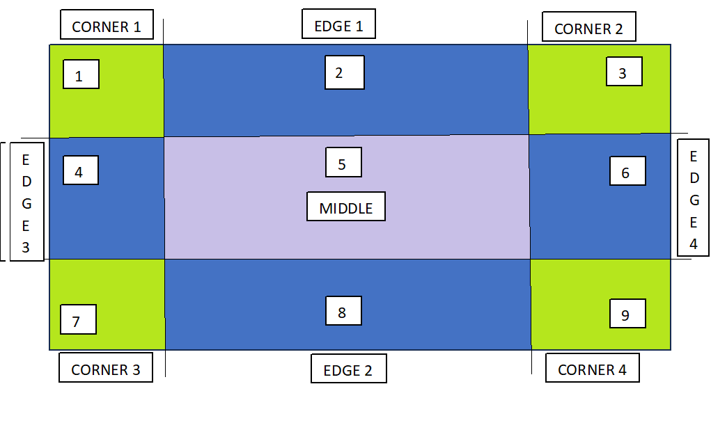
The border-image property takes the image and slices it into nine sections(3×3). It then places the corners at the corner of the border, and the edges are repeated or stretched as you specify. Middle part of image will be ignored.
Border Image
Table of Contents
Example of Image as Border
CSS Border Image Source
CSS Border Image Slice
CSS Border Image Width
CSS Border Image Outset
CSS Border Image Repeat
Border Image Shorthand
CSS Gradient as Border Images
Border Image All Properties
Example of Image as Border
The following code shows a basic example of how to set image as border.
Example
<!DOCTYPE html><html><head><style>
div{
background-color: #f0f0f0;
border: 20px solid transparent;
border-image: url(/css/images/border.png) 40;
padding: 20px;
}
</style></head><body><div><p>
This is an example of setting a
border image using CSS
</p></div></body></html></pre>
CSS Border Image Source
The CSS border-image-source property specifies the source (url) of an image to be passed as a border to an element.
Example
<!DOCTYPE html><html><head><style>
div{
background-color: #f0f0f0;
border: 20px solid transparent;
border-image-source: url(/css/images/border.png);
padding: 20px;
}
</style></head><body><div><p>
This is an example of setting border image using
border image source.
</p></div></body></html></pre>
CSS Border Image Slice
The border-image-slice property defines how the image is sliced into regions, which are then used to draw the borders.
The following diagram demonstrates how image is sliced to make border. The image is divided into 9 sections: four corners, four edges, and the center.
The value in the 'border-image-slice' property specifies how far inward from the edges of the image the slicing should occur. It essentially defines the size of the areas that will be used to create the border.
The offset for border-image-slice can be provided in terms of percentage or length units but percentages are highly recommended.
Example
<!DOCTYPE html><html><head><style>
div{
background-color: #f0f0f0;
border: 20px solid transparent;
border-image-source: url(/css/images/scenery2.jpg);
border-image-slice: 25%;
padding: 15px;
width: 50%
}
</style></head><body><div><p>
See how border is set for this div...
</p></div><p> Here is full image for your reference: </p><img src="/css/images/scenery2.jpg" height="160px"></body></html></pre>
CSS Border Image Width
The border-image-width property is used to specify the width of the image to be set as a border.
The border-image-outset property is used to specify gap between element and border-image. This property pushes the border image outside, beyond the border box.
The border-image-repeat property in used to repeating and stretching nature of image around border. By default the border image gets stretched along the sides.
The value repeat for this property, repeats the image specified along the sides of the border until the whole length and width got filled.
It can also take the value as round, apart from stretch and repeat.
div{
background-color: #f0f0f0;
border: 20px solid transparent;
border-image: url('/css/images/border.png') 30 round;
padding: 20px;
}
</style></head><body><div><p>
This is an example of border shorthand property....
</p></div></body></html></pre>
CSS Gradient as Border Images
CSS gradients can also be used to set the border of an element. There are three types of gradients supported: linear, radial and conic.
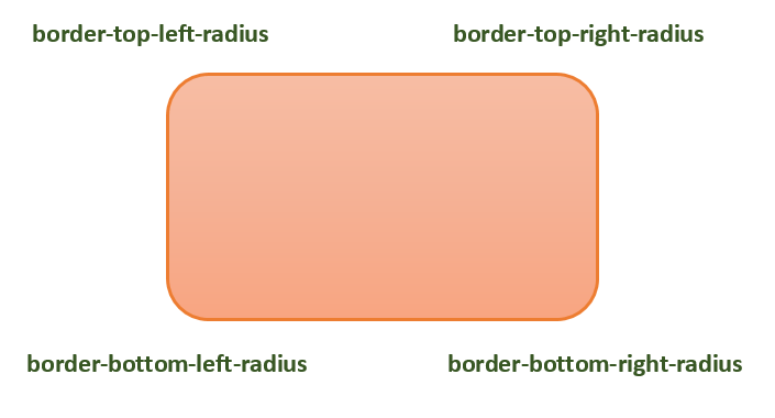
CSS rounded corners are created using the border-radius property. This property allows you to specify the radius of the corners of an element’s outer border edge.
Possible Values
<length>: Size of circle radius is denoted, using length values. Negative values are not valid.
<percentage>: Size of circle radius is denoted, using percentage values.
Horizontal axis percentage is referred to the width of the box.
Vertical axis percentage is referred to the height of the box.
Negative values are not valid.
Applies to
All the HTML elements, except for table and inline-table elements with border-collapse set to collapse. Applies to ::first-letter.
DOM Syntax
object.style.borderRadius = "length";
The following diagram demonstrates the different border-radius corners for reference:
The following table shows the possible values for rounded corners as follows −
Value
Description
radius
Is a <length> or a <percentage> that sets the radius for all four corners of the element. It is used only in the one-value syntax.
top-left and bottom-right
Is a <length> or a <percentage> that sets the radius for the top-left and bottom-right corners of the element. It is used only in the two-value syntax.
top-right and bottom-left
Is a <length> or a <percentage> that sets the radius for the top-right and bottom-left corners of the element. It is used only in the two- and three-value syntaxes.
top-left
Is a <length> or a <percentage> that sets the radius for the top-left corner of the element. It is used on three and four value syntaxes.
top-right
Is a <length> or a <percentage> that sets the radius for the top-right corners of the element. It is used only in the four-value syntax.
bottom-right
Is a <length> or a <percentage> that sets the radius for the bottom-right corners of the element. It is used only in the three and four-value syntaxes.
bottom-left
Is a <length> or a <percentage> that sets the radius for the bottom-left corners of the element. It is used only in the four-value syntax.
Individual border radius properties, such as border-top-left-radius, cannot inherit from their parent element. Instead, you must use the individual longhand properties to set the border radius of each corner.
CSS Border Radius – Length Value
The following example demostrates how to use the border-radius property to create rounded corners for all four corners of a box −
CSS data types define the types of values that can be used for various CSS properties. Each CSS property expects a specific type of value, and understanding these data types is essential for properly styling and formatting web content.
The types listed below are the most common, however it is not a complete list of all types defined in any CSS specification.
Syntax
selector {
   property: <unit-data-type>;
}
CSS syntax uses a keyword between the inequality signs “<” and “>” to indicate data types.
Textual Data Types
These types include keywords, identifiers, strings, and URLs.
Pre-defined Keywords
Represents a predefined keyword that is specific to the property it’s used with (e.g., auto, inherit, none).
CSS-wide keywords
The table given below lists all the CSS-wide keywords:
Property
Description
<custom-ident>
A user-defined identifier, such as a name given with the grid-area property.
<dashed-ident>
Using CSS Custom Properties, a <custom-ident> begin with two dashes.
<string>
A string that has been quoted, such as the value for the content property.
url()
A reference to a resource, such the background-image value.
Numeric Data Types
These data types represent quantities, indexes, and positions. The following table lists all the numeric data types:
Property
Description
<integer>
One or more decimal units (09).
<number>
Real numbers may include a fractional component, such as 1 or 1.54.
<dimension>
A numerical value that includes a unit, such as 23px or 15em.
<percentage>
A numerical value that includes a percentage symbol, such as 15%.
<ratio>
A ratio is represented as <number> / <number>.
<flex>
CSS Grid Layout introduces a flexible length, represented by a <number> with the fr unit attached for grid track sizing.
Quantities
Distance and other quantities are defined using these types. The following table lists all the quantities:
Property
Description
<length>
Lengths are a dimension that refers to distances.
<angle>
Angles are represented as a <dimension> with deg, grad, rad, or turn units, and used in properties such as linear-gradient().
<time>
Duration units are represented as a <dimension> with a s or ms unit.
<resolution>
This is a <dimension> with the unit identifier dpi, dpcm, dppx, or x.
Combinations of Types
CSS properties that accept both a dimension and a percentage value fall in this category. The percentage value will be converted to a quantity relative to the allowable dimension. Properties that take both a percentage and a dimension will use one of the following types:
Property
Description
<length-percentage>
A type that can take a a length or a percentage value.
<angle-percentage>
A type that can take a a angle or a percentage value.
<time-percentage>
A type that can take a a time or a percentage value.
Color
Color related properties define the <color> data type and additional types related to colors.
The following table lists all the color related data types:
Property
Description
<color>
A color represented as a keyword or a numerical value.
<color-interpolation-method>
Determines the color space used when creating a transition between different <color> values.
<hex-color>
Describes the hexadecimal color syntax of an sRGB color using the primary color components (red, green, blue) denoted as hexadecimal numbers, along with its transparency.
<system-color>
Commonly linked to the default color selections for different components on a webpage.
<alpha-value>
Represents the transparency of a color. The value can be either a <number> (0 is fully transparent, 1 is fully opaque) or a <percentage> (0 is fully transparent, 100% is fully opaque).
<hue>
Define the <angle> of the color wheel for the <absolute-color-functions> component using units such as, deg, grad, rad, turn, or a unitless number (interpreted as deg).
<hue-interpolation-method>
Determines the algorithm that is used for interpolation between hue values. This method specifies how to find a midpoint between two hue values based on a color wheel. It is a component of the <color-interpolation-method> data type.
<named-color>
Specified as a <ident> in syntax, depicts colors by names such as red, blue, black, or light green.
Images
CSS Images Specification defines image-related data types, such as gradients. The following table lists all the images related data types:
Property
Description
<image>
A URL pointing to an image or color gradient.
2D Positioning
The following table lists all the 2D Positioning related data types:
Property
Description
<position>
Determines the position of an object region by providing a keyword value, such as top or left, or a <length-percentage>.
Calculation Data Types
CSS math functions use these data types in calculations. The following table lists all the calculation data types:
Property
Description
<calc-sum>
A calculation is a series of calculated values separated by addition (+) and subtraction (-) operators. This data type requires that both values contain units.
<calc-constant>
Defines CSS keywords for numeric constants such as e and , which can be used in CSS math functions.
Display
The table given below lists all the display related data types:
Property
Description
<display-box>
Determines if an element creates display boxes or not.
<display-inside>
Determines the inner display of an element, which specifies the formatting context type, for a non-replaced element.
<display-internal>
Determines the internal display values, which have relevance only to that particular layout model.
<display-legacy>
A single-keyword syntax has been used for display property in CSS 2, which required separate keywords for block-level and inline-level variants of the same layout model.
<display-listitem>
The keyword list-item makes the element to generate a ::marker pseudo-element with the content that is specified by the list-style properties, along with a main box of the specified type for its own contents.
<display-outside>
An element’s outer display type, which is essential in flow layout, is determined by the <display-outside> keywords.
Other Data Types
The table given below lists some more data types:
Property
Description
<absolute-size>
Defines absolute font size in the font shorthand and font-size properties.
<basic-shape>
Defines different shapes used for properties such as clip-path, shape-outside, and offset-path.
<blend-mode>
Specifies the color scheme that should be used when elements overlap.
<box-edge>
Defines different box edges, such as content-box and border-box.
<easing-function>
Control the speed of a transition or animation between two states of an element.
<filter-function>
Signifies a graphical effect, which changes the appearance of an input image.
<generic-family>
Signifies the keyword values for generic font families.
<gradient>
Demonstrates a progressive transition between two or more colors.
<ident>
Signifies an arbitrary string that is used as an identifier.
<line-style>
Specifying how a line appears or doesn’t appear in a certain context are included in the <line-style> enumerated value type.
<overflow>
The keyword values used in relation to the shorthand overflow property and the longhand overflow-block, overflow-inline, overflow-x, and overflow-y properties are indicated by the enumerated value type <overflow>.
<relative-size>
Define a relative size to the calculated size of the parent element.
<transform-function>
The transformation functions are responsible for rotating, scaling (resizing), skewing (distorting), or moving an element in two-dimensional (2D) and three-dimensional (3D) space.
CSS !important rule is used to add more priority to a property than normal. In this tutorial we will learn !important rule and how to use it in CSS. Following is syntax of important rule.
Syntax
selector{property: value !important;}
Table of Contents
What is CSS !important Rule?
Specificity in CSS
CSS !important Rule Example
CSS !important and Specificity
Override Inline Styles
Multiple Important Keyword
Custom Properties !important
Shorthand Properties !important
What is CSS !important Rule?
An exclamation mark (!) followed by the word important (without space) tells the browser to prioritize that value for the property above all other declaration.
The !important rule will be applied regardless of specificity of property. We will discuss specificity later in this tutorial.
If multiple selectors use important keyword for a property, then the selector with high specificity will be considered to be applied.
Specificity in CSS
Specificity in CSS determines which styles are applied to an element when multiple rules could apply. For example, inline styles have highest priority, then id selector, then class selectors and then element selector.
/* Element selector Styles */p{color: black;}/* Override the above style, Class have higher specificity */p.special{color: blue;}/* Using !important to force an override */p{color: red !important;}
The above declaration make the text color of paragraph as red. The style of element selector is overridden by class selector, which then again overridden by important keyword.
Keep in mind that while ‘!important’ can be handy in specific cases, it’s best to use it only when truly needed.
Using ‘!important’ too frequently can make your code harder to manage and debug.
It’s a good practice to rely on proper CSS specificity and structure to prevent the excessive use of ‘!important’.
CSS !important Rule Example
The following example demonstrates the use of ‘!important’ which we saw above.
Example
<!DOCTYPE html><html><head><style>
/* Element Selector Styles */
p {
color: black;
font-weight: bold;
}
/* Using !important to force a color override */
p {
color: red <strong>!important</strong>;
}
</style></head><body><p>
This paragraph will be red. Because the style of element
selector is overridden by important keyword.
</p></body></html></pre>
CSS !important and Specificity
According to CSS specificity inline styles have highest priority, then id selector, then class selectors and then element selector. Which means the style written by element selectors can be override by class selectors, id selector and inline style respectively.
Following example uses multiple selectors to apply color property to a paragraph but the element selector property having important keyword is applied to paragraph.
Example
<!DOCTYPE html><html><head><style>
/*Multiple selectors for paragraph */
p {
color: black;
font-weight: bold;
}
.special {
color: blue;
}
#unique {
color: darkgreen;
}
p {
color: red <strong>!important</strong>;
}
</style></head><body><p id="unique" class="special">
This paragraph will be red. Because element selector
will set color as black, class selector ".special"
will override this color to blue and id selector will
make it green. Finally important keyword is used at
last so this have more priority.
</p></body></html></pre>
Override Inline Styles
Inline style have most priority over any selector in CSS. But important keyword can override inline CSS also. Lets see an example.
Example
<!DOCTYPE html><html><head><style>
p {
color: black <strong>!important</strong>;
font-weight: bold;
}
</style></head><body><p style="color:red">
Paragraph is black. Inline style is overridden by
important keyword
</p></body></html></pre>
Multiple Important Keyword
When we apply multiple important keyword for a property in CSS using multiple selectors, the property which is inside the selector with high specificity is applied. Lets look at an example for this.
Example
<!DOCTYPE html><html><head><style>
/*Multiple selectors for paragraph */
p {
color: black <strong>!important</strong>;
font-weight: bold;
}
.special {
color: blue <strong>!important</strong>;
}
p {
color: red <strong>!important</strong>;
}
</style></head><body><p id="unique" class="special">
This paragraph will be darkgreen. Since important keyword
is present at every selectors, high priority selector
will be chosen. In this case it is id "#unique"
</p></body></html></pre>
CSS !important for Custom Properties
When you add '!important' to a custom property, it means that this value is really important. The '!important' flag is not passed as part of the custom property value to the var() function.
Example
<!DOCTYPE html><html><head><style>
:root {
--primary-color: blue <strong>!important</strong>;
--primary-color: red ;
}
.box {
background-color: var(--primary-color) ;
width: 200px;
height: 200px;
}
p {
color: var(--primary-color);
}
</style></head><body><div class="box"></div><p> Primary Color variable is Blue </p></body></html></pre>
CSS !important on Shorthand Properties
When you use '!important' with a shorthand property, it also applies importance to all its individual properties. The following examples are identical.This example:
Example
<!DOCTYPE html><html><head><style>
p {
/* Applies to all */
font: 15px Arial, sans-serif <strong>!important</strong>;
}
</style></head><body><p style="font-size: 100px;">
The font will set as per in CSS declaration. The font size of
100px will not be applied because important keyword is used
for shorthand property font.
</p></body></html></pre>
CSS Image Sprite combines multiple images into a single image file(the sprite image) and displays the images using coordinates inside the sprite image. It helps in reducing the number of server requests and improves the website performance.
Image sprites are generally used for icons, buttons, and other smaller graphics on a website. CSS is then used to display specific parts of the sprite image as needed.
How to Implement Image Sprite in CSS?
We will follow the steps mentioned below to implement image sprites in CSS.
Create Sprite Image: First, we create an image containing all the individual images that you want to use as a sprite by using photo editing tools like Adobe Photoshop.
Determine Position of Images: Precisely note down the coordinates of the top-left corner of all the sub-images inside the main sprite image. This can later be used in CSS, to render that part of the image.
Display the Image: We have used CSS background-image property to display the sprite image on a webpage.
Adjust the position: We have used background-position to specify the top left corner of the inner image in the sprite image. Then we have used CSS height and width properties for specifying the dimensions from the top left corner that should be rendered.
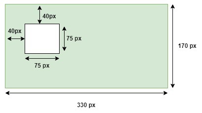
.sprite-icon{width: 75px;/* Set the width of the displayed image */height: 75px;/* Set the height of the displayed image */background-image:url('sprites.png');/* Path to sprite image */background-position: -40px -40px;/* Position of the individual image within the sprite */}
In the above example, first we specified height and width sub image as 75px. Then we specified URL of sprite image, which contain all the inner images. Then we specified position of top-left corner of inner image using the background-position property as (-40px, -40px). Following diagram shows how inner image will be selected based on above values.
CSS Image Sprites Basic Example
The following example demonstrates how to use CSS image sprites to display multiple images from a single image file.