Category: Responsive

  • Frameworks

    CSS has various frameworks which are specialized in web development. These frameworks such as bootstrap, Tailwind CSS, and various more, have inbuilt classes and packages for commonly used UI components such as navigation bars, menu bars, buttons, image galleries, etc.

    In this chapter, we will learn and understand some of the most popular and freely available CSS frameworks for responsive web development.

    Responsive Web Designing Frameworks

    Here is a list of popular frameworks commonly used for responsive web designing.

    • Bootstrap
    • Tailwind CSS
    • Skeleton
    • Semantic UI

    Bootstrap Framework

    Bootstrap is a widely used open-source front-end framework used for creating responsive, mobile-first websites and web applications. Bootstrap provides a collection of CSS and JavaScript components, such as grids, forms, buttons, and navigation bars. These components can be easily implemented and customized. The common features of the bootstrap framework are mentioned below.

    Features For Responsive Design

    Here are some of the features of Bootstrap for responsive design.

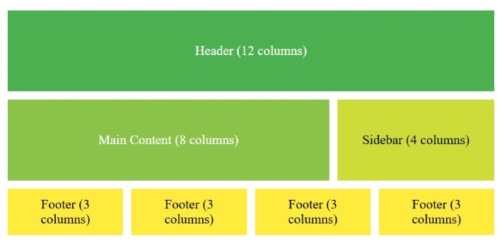
    • Bootstrap provides a 12-column grid layout, making it easily adaptable to various screen sizes.
    • Bootstrap comes with utility classes. These utility classes help in applying margin, padding, and alignment adjustments for responsiveness.
    • Bootstrap includes responsive navigation, carousels, and models that adapt to screen sizes automatically.

    Example

    <!DOCTYPE html><html lang="en"><head><link href=
    "https://cdn.jsdelivr.net/npm/[email protected]/dist/css/bootstrap.min.css" 
    
          rel="stylesheet"&gt;&lt;script src=
    "https://cdn.jsdelivr.net/npm/[email protected]/dist/js/bootstrap.bundle.min.js"></script></head><body><div class="container-fluid p-5 bg-secondary text-white text-center"><h1>Bootstrap Framework</h1><p>Resize the screen to see the effect</p></div><div class="container mt-4"><div class="row"><div class="col-sm-4"><h2>Column 1</h2><p>
                Tutorialspoint - Simple and Easy Learning
            &lt;p&gt;  
                Tutorialspoint - Simple and Easy Learning
            &lt;/p&gt;&lt;/div&gt;&lt;div class="col-sm-4"&gt;&lt;h3&gt;Column 2&lt;/h3&gt;&lt;p&gt;Tutorialspoint - Simple and Easy Learning&lt;/p&gt;&lt;p&gt;Tutorialspoint - Simple and Easy Learning&lt;/p&gt;&lt;/div&gt;&lt;div class="col-sm-4"&gt;&lt;h3&gt;Column 3&lt;/h3&gt;&lt;p&gt;Tutorialspoint - Simple and Easy Learning&lt;/p&gt;&lt;p&gt;Tutorialspoint - Simple and Easy Learning&lt;/p&gt;&lt;/div&gt;&lt;/div&gt;&lt;/div&gt;&lt;/body&gt;&lt;/html&gt;</pre>

    Tailwind CSS

    Tailwind CSS is a utility-first CSS framework with lots of predefined classes. It has various customization options to design responsive web pages. With tailwind CSS, developers can style elements directly in the HTML. Tailwind supports purging unused CSS, which optimizes load times by removing unnecessary styles.

    Features For Responsive Design

    Here are some of the features of Tailwind CSS for responsive design.

    • Tailwind's utility classes provide precise control over design elements. It makes it easy to adjust the layout and manage spacing, and alignment based on screen size.
    • Tailwind is designed with a mobile-first approach i.e., developers can apply styles for smaller screens and can build up for larger screens.
    • Tailwind provides support for adding custom breakpoints. It offers flexibility in defining responsive behaviors designed to specific project needs.

    Example

    <!DOCTYPE html><html lang="en"><head><link href=
    "https://cdn.jsdelivr.net/npm/[email protected]/dist/tailwind.min.css" 
    
          rel="stylesheet"&gt;&lt;/head&gt;&lt;body class="bg-gray-100"&gt;&lt;div class="text-center py-10 bg-purple-600 text-white"&gt;&lt;h1 class="text-3xl font-bold"&gt;Tailwind CSS Framework&lt;/h1&gt;&lt;p class="text-lg"&gt;
            Resize the screen to see responsive behavior
        &lt;/p&gt;&lt;/div&gt;&lt;div class="container mx-auto mt-8"&gt;&lt;div class="grid grid-cols-1 md:grid-cols-3 gap-4"&gt;&lt;div class="bg-white p-6 rounded-lg shadow-md"&gt;&lt;h2 class="text-xl font-semibold"&gt;Column 1&lt;/h2&gt;&lt;p&gt;
                    Tutorialspoint - Simple and Easy Learning
                &lt;/p&gt;&lt;/div&gt;&lt;div class="bg-white p-6 rounded-lg shadow-md"&gt;&lt;h2 class="text-xl font-semibold"&gt;Column 2&lt;/h2&gt;&lt;p&gt;
                    Tutorialspoint - Simple and Easy Learning
                &lt;/p&gt;&lt;/div&gt;&lt;div class="bg-white p-6 rounded-lg shadow-md"&gt;&lt;h2 class="text-xl font-semibold"&gt;Column 3&lt;/h2&gt;&lt;p&gt;
                    Tutorialspoint - Simple and Easy Learning
                &lt;/p&gt;&lt;/div&gt;&lt;/div&gt;&lt;/div&gt;&lt;/body&gt;&lt;/html&gt;</pre>

    Skeleton Framework

    Skeleton is a lightweight CSS framework that provides a basic structure for responsive web design. It focuses on simplicity and speed, making it ideal for small projects and quick prototypes.

    Features For Responsive Design

    • Skeleton's grid is based on a 12-column structure that adjusts accurately to fit different screen sizes.
    • Skeleton's smaller file size makes it fast-loading and easily customizable.
    • Skeleton includes responsive typography, forms, buttons, and other basic elements.

    Example

    Open Compiler

    <!DOCTYPE html><html lang="en"><head><link href=
    "https://cdnjs.cloudflare.com/ajax/libs/skeleton/2.0.4/skeleton.min.css" 
    
          rel="stylesheet"&gt;&lt;/head&gt;&lt;body&gt;&lt;div class="container"&gt;&lt;h1&gt;Skeleton Framework&lt;/h1&gt;&lt;p&gt;Resize the screen to see responsive layout adjustments&lt;/p&gt;&lt;div class="row"&gt;&lt;div class="one-third column"&gt;&lt;h3&gt;Column 1&lt;/h3&gt;&lt;p&gt;Tutorialspoint - Simple and Easy Learning&lt;/p&gt;&lt;/div&gt;&lt;div class="one-third column"&gt;&lt;h3&gt;Column 2&lt;/h3&gt;&lt;p&gt;Simple and Easy Learning&lt;/p&gt;&lt;/div&gt;&lt;div class="one-third column"&gt;&lt;h3&gt;Column 3&lt;/h3&gt;&lt;p&gt;Tutorialspoint - Simple and Easy Learning&lt;/p&gt;&lt;/div&gt;&lt;/div&gt;&lt;/div&gt;&lt;/body&gt;&lt;/html&gt;</pre>

    Semantic UI

    Semantic UI is a CSS framework that uses human-friendly HTML for creating responsive and visually appealing layouts. It includes a lot of libraries for themes and components. The common features of semantic UI are mentioned below.

    Features For Responsive Design

    Here are some of the features of semantic UI for responsive design.

    • Semantic UI includes a flexible grid that adjusts to various screen sizes.
    • It offers various responsive UI components such as buttons, forms, and menus.
    • It uses user-friendly HTML and Simple classes, making it easy to create responsive layouts.

    Example

    <!DOCTYPE html><html lang="en"><head><link href=
    "https://cdnjs.cloudflare.com/ajax/libs/semantic-ui/2.4.1/semantic.min.css" 
    
          rel="stylesheet"&gt;&lt;/head&gt;&lt;body&gt;&lt;div class="ui container"&gt;&lt;h1 class="ui header"&gt;Semantic UI Framework&lt;/h1&gt;&lt;p&gt;Responsive design with Semantic UI&lt;/p&gt;&lt;div class="ui three column grid"&gt;&lt;div class="column"&gt;&lt;h3&gt;Column 1&lt;/h3&gt;&lt;p&gt;Tutorialspoint - Simple and Easy Learning&lt;/p&gt;&lt;/div&gt;&lt;div class="column"&gt;&lt;h3&gt;Column 2&lt;/h3&gt;&lt;p&gt;Simple and Easy Learning&lt;/p&gt;&lt;/div&gt;&lt;div class="column"&gt;&lt;h3&gt;Column 3&lt;/h3&gt;&lt;p&gt;Tutorialspoint - Simple and Easy Learning&lt;/p&gt;&lt;/div&gt;&lt;/div&gt;&lt;/div&gt;&lt;/body&gt;&lt;/html&gt;</pre>

  • Videos

    In responsive web design, its important to make sure videos are fitting properly to the layout. Videos should expand to fill the entire content area while keeping their original aspect ratio.

    When a fixed width or height of a video is specified, it may cause layout issue in very large or very small screens, such as breaking page layouts, distorting the shape, or displaying black bars around the video. The black bars around the video are called letterboxing (on top and bottom of the video), pillarboxing (on left and right of the video), and windowboxing (on all sides of the video).

    So, it’s important to use relative units for the width and height property such as percentage, instead of absolute values, such as pixels. Absolute values restrict the video getting responsive.

    Responsive Videos Using width Property

    To make an video scale according to screen size, we need to set width property of the video to 100% and height to auto.

    video{width: 100%;height: auto;}

    Setting style in this way makes the video take up 100% of the width of its parent element, and the height will be adjusted to maintain the video’s aspect ratio. This setup allows the video to scale with the screen size. However, on very large screens, the video may stretch beyond its natural width, making it appear distorted.

    Example

    In this example, the video displayed will scale according to screen size of output window. Run this code in Tutorialspoint HTML Compiler to adjust output window width and verify.

    <!DOCTYPE html><html><head><style>
    
        video {
            width: 100%;
            height: auto;
        }
    &lt;/style&gt;&lt;/head&gt;&lt;body&gt;&lt;p&gt;
        The video will cover 100% width
    &lt;/p&gt;&lt;video width="400" controls&gt;&lt;source src="/css/foo.mp4" type="video/mp4"&gt;&lt;/video&gt;&lt;/body&gt;&lt;/html&gt;</pre>

    Responsive Videos Using max-width Property

    The above mentioned method has a drawback, on large screens the video will get stretched beyond it's natural dimension. To prevent this, we can use max-width property instead of 'width' property.

    video{max-width: 100%;height: auto;}

    By setting video properties in this way, the video will scale down if it has to, but never scale up to be larger than its original size.

    Example

    In this example, the video displayed will scale according to screen size of output window but never scale more than it's natural size. Run this code in Tutorialspoint HTML Compiler to adjust output window width and verify.

    <!DOCTYPE html><html><head><style>
    
        video {
            max-width: 100%;
            height: auto;
        }
    &lt;/style&gt;&lt;/head&gt;&lt;body&gt;&lt;p&gt;
        The video will cover 100% width if natural width is less than
        output screen width
    &lt;/p&gt;&lt;video width="400" controls&gt;&lt;source src="/css/foo.mp4" type="video/mp4"&gt;&lt;/video&gt;&lt;/body&gt;&lt;/html&gt;</pre>

    Add a Video to the Example Web Page

    The following example demonstrates the use of a responsive video in a webpage. Based on the max-width value of the video, the video gets scaled down as per the screen size.

    Example

    <!DOCTYPE html><html><head><style>
    
    * {
        box-sizing: border-box;
    }
    .title {
        border: 2px solid black;
        padding: 10px;
        background-color: blanchedalmond;
    }
    .grid-one {
        width: 60%;
        float: left;
        padding: 10px;
        border: 2px solid black;
        background-color: darkseagreen;
    }
    .grid-two {
        width: 40%;
        float: left;
        padding: 15px;
        border: 2px solid black;
        background-color: lightgreen;
    }
    ul {
        list-style-type: none;
    }
    li {
        background-color: aqua;
        padding: 5px;
        border: 1px solid black;
        margin: 5px;
    }
    video {
        max-width: 100%;
        height: auto;
    }
    &lt;/style&gt;&lt;/head&gt;&lt;body&gt;&lt;div class="title"&gt;&lt;h1&gt;Responsive Web Design&lt;/h1&gt;&lt;/div&gt;&lt;div class="grid-two"&gt;&lt;ul&gt;&lt;li&gt;Viewport&lt;/li&gt;&lt;li&gt;Grid view&lt;/li&gt;&lt;li&gt;Media queries&lt;/li&gt;&lt;li&gt;Images&lt;/li&gt;&lt;li&gt;Videos&lt;/li&gt;&lt;li&gt;Frameworks&lt;/li&gt;&lt;/ul&gt;&lt;/div&gt;&lt;div class="grid-one"&gt;&lt;h1&gt;Responsive Videos&lt;/h1&gt;&lt;p&gt;
            Alike images, videos can be made responsive too, such 
            that the video should expand to fill the entire content 
            area, while maintaining its original aspect ratio.
        &lt;/p&gt;&lt;video width="400" controls&gt;&lt;source src="/css/foo.mp4" type="video/mp4"&gt;&lt;/video&gt;&lt;p&gt;
            Resize the browser window to see how the content gets 
            responsive to the resizing.
        &lt;/p&gt;&lt;/div&gt;&lt;/body&gt;&lt;/html&gt;</pre>

  • Images

    In responsive web design, its important to make sure images fit well on all screen sizes and resolutions. By using properties like max-width and min-width, images can automatically resize to fit different screens. In this chapter, well learn how to make images responsive, look at key properties for responsive images, and see how to create a responsive image gallery.

    When an image is uploaded to a webpage, it will be displayed in it’s default width and height. We can change these dimensions in CSS so that the image fits according to available space in our layout. One of the popular approach to set image dimension, is to keep a fixed width for image (such 50% of screen or 25% of screen) and height will be set automatically according to aspect ratio of the image.

    For better adaptability, we should always use relative units for the width property such as percentage, instead of absolute values, such as pixels. Absolute values restrict the image getting responsive.

    Responsive Image Using width Property

    To make an image scale according to screen size, we need to set width property of the image to 100% and height to auto.

    img{width: 100%;height: auto;}

    Setting style in this way makes the image take up 100% of the width of its parent element, and the height will be adjusted to maintain the image’s aspect ratio. This setup allows the image to scale with the screen size. However, on very large screens, the image may stretch beyond its natural width, making it appear distorted.

    Example

    In this example, the image displayed will scale according to screen size of output window. Run this code in Tutorialspoint HTML Compiler to adjust output window width and verify.

    <!DOCTYPE html><html><head><style>
    
        img {
            width: 100%;
            height: auto;
        }
    &lt;/style&gt;&lt;/head&gt;&lt;body&gt;&lt;p&gt;
        The image will cover 100% width
    &lt;/p&gt;&lt;img src="/css/images/border.png"&gt;&lt;/body&gt;&lt;/html&gt;</pre>

    Responsive Image Using max-width Property

    The above mentioned method has a drawback, on large screens the image will get stretched beyond it's natural dimension. To prevent this, we can use max-width property instead of 'width' property.

    img{max-width: 100%;height: auto;}

    By setting image properties in this way, the image will scale down if it has to, but never scale up to be larger than its original size.

    Example

    In this example, the image displayed will scale according to screen size of output window but never scale more than it's natural size. Run this code in Tutorialspoint HTML Compiler to adjust output window width and verify.

    <!DOCTYPE html><html><head><style>
    
        img {
            max-width: 100%;
            height: auto;
        }
    &lt;/style&gt;&lt;/head&gt;&lt;body&gt;&lt;p&gt;
        The image will cover 100% width if natural width is less than
        output screen width
    &lt;/p&gt;&lt;img src="/css/images/border.png"&gt;&lt;/body&gt;&lt;/html&gt;</pre>

    CSS Image Gallery is used to organize and display multiple images in responsive and visually appealing format. CSS properties can be used to control the layout of images, size, shape, spacing, spanning and lot of other visual effects.

    CSS grid layout is most commonly used layout system for designing image gallery, with this we can align images in 2 dimensional manner.

    Example

    <!DOCTYPE html><html><head><style>
    
        /* Gallery container */
        .gallery {
            display: grid;
            gap: 10px;
            padding: 10px;
            font-family: Arial, sans-serif;
        }
        /* style image items */
        .gallery img {
            width: 100%;
            height: 100px; /* Set a same height for all images */
            object-fit: fit;
            display: block;
            border-radius: 8px;
            border: 3px solid #ccc;
            transition: all 0.3s ease;
        }
        /* Spanning the first image across two rows */
        .gallery img:first-child {
            grid-row: span 2;
            height: 210px; /* Double the height of regular images */
        }
        /* Spanning the sixth image across two columns */
        .gallery img:nth-child(6) {
            grid-column: span 2;
        }
        /* Hover effect */
        .gallery img:hover {
            transform: scale(1.02);
            border-color: #555 ; 
        }
    &lt;/style&gt;&lt;/head&gt;&lt;body&gt;&lt;div class="gallery"&gt;&lt;img src="/w3css/images/w3css_pdfcover.jpg" alt="Gallery Image 1"&gt;&lt;img src="/css/images/html.png" alt="Gallery Image 2"&gt;&lt;img src="/css/images/css.png" alt="Gallery Image 3"&gt;&lt;img src="/css/images/html.png" alt="Gallery Image 4"&gt;&lt;img src="/css/images/css.png" alt="Gallery Image 5"&gt;&lt;img src="/html/images/logo.png" alt="Gallery Image 6"&gt;&lt;/div&gt;&lt;/body&gt;&lt;/html&gt;</pre>

    We can use CSS media queries to create a responsive image gallery that scales and rearranges its content based on the screen width. Following is simple media query that define number of column is image gallery for large screen and small screen.

    /* 4 columns in case of large screen */@media (min-width: 600px){.gallery{grid-template-columns:repeat(4, 1fr);}}/* 1 column in case of small screen */@media (max-width: 599px){.gallery{grid-template-columns: 1fr;}}

    With media queries we can also define style for specific orientation (landscape or portrait) of user device. The default value for this is portrait.

    Example

    This is example of designing a responsive image gallery.

    <!DOCTYPE html><html><head><style>
    
        /* Gallery container */
        .gallery {
            display: grid;
            gap: 10px;
            padding: 10px;
            font-family: Arial, sans-serif;
        }
        /* 4 columns in case of large screen */
        @media (min-width: 600px) {
            .gallery {
                grid-template-columns: repeat(4, 1fr);
            }
        }
        /* 1 column in case of small screen */
        @media (max-width: 599px) {
            .gallery {
                grid-template-columns: 1fr;
            }
        }
        /* Individual image items */
        .gallery img {
            width: 100%;
            height: 100px; /* Set a same height for all images */
            object-fit: fit; /* Ensure images fits the area */
            display: block;
            border-radius: 8px;
            border: 3px solid #ccc; /* Default border color */
            transition: all 0.3s ease;
        }
        /* Spanning the first image across two rows */
        .gallery img:first-child {
            grid-row: span 2;
            height: 210px; /* Double the height of regular images */
        }
        /* Spanning the sixth image across two columns */
        .gallery img:nth-child(6) {
            grid-column: span 2;
        }
        /* Hover effect */
        .gallery img:hover {
            transform: scale(1.02);
            border-color: #555 ; 
        }
    &lt;/style&gt;&lt;/head&gt;&lt;body&gt;&lt;div class="gallery"&gt;&lt;img src="/w3css/images/w3css_pdfcover.jpg" alt="Gallery Image 1"&gt;&lt;img src="/css/images/html.png" alt="Gallery Image 2"&gt;&lt;img src="/css/images/css.png" alt="Gallery Image 3"&gt;&lt;img src="/css/images/html.png" alt="Gallery Image 4"&gt;&lt;img src="/css/images/css.png" alt="Gallery Image 5"&gt;&lt;img src="/html/images/logo.png" alt="Gallery Image 6"&gt;&lt;/div&gt;&lt;/body&gt;&lt;/html&gt;</pre>
  • Media Query

    In Responsive Web Designing, media queries rules are used to conditionally apply styles for specific screen widths, aspect ratios and resolutions. In this chapter, we will learn how to design a responsive web page using media query rule.

    What is Media Query?

    Media queries in CSS are used to apply different CSS styles based on the screen size, resolution, and other characteristics of the users device. Media queries use the @media rule to include an extra block of CSS properties when certain conditions are met.

    Adding a Breakpoint

    In responsive design, a breakpoint is a specific screen width where the layout changes to suit better to the screen size. We can add breakpoint by defining a media query with a maximum or minimum width. Following code shows the exact syntax.

    /* Example of a breakpoint for screens smaller than 768px */@media (max-width: 768px){.container{flex-direction: column;}}

    In this example, when the screen width is 768px or smaller, the .container layout changes to a column direction.

    Media Query Setting Width Limit

    We can set the width limit in media queries for applying styles only within specific screen width ranges. We define a minimum and a maximum width, to control the layout and appearance of elements within the desired screen size range.

    Example

    Here is an example, in which the body’s background color changes to plum when the viewport width is wider than 35em and narrower than 85em.

    <!DOCTYPE html><html><head><style>
    
    body {
        background-color: white; /* Default background */
    }
    @media (min-width: 35em) and (max-width: 85em) {
        body {
            background-color: plum; 
        }
    }
    </style></head><body><h1>Media Query Width Limit Example</h1><p>
        Resize the browser window to see the background 
        color change.
    &lt;/p&gt;&lt;p&gt;&lt;b&gt; Note: &lt;/b&gt;
        If you can't resize here, Run in Tutorials point HTML compiler
    &lt;/p&gt;&lt;/body&gt;&lt;/html&gt;</pre>

    Media Query Multiple Breakpoints

    We can use multiple breakpoints in media queries to design layout styling for different screen sizes, and condition of user devices. Let's understand this with an example.

    Example

    In this example, we have defined three breakpoints to adjust the font size and layout for small, medium, and large screens.

    <!DOCTYPE html><html><head><style>
    
    body {
        font-size: 16px; /* Default font size */
    }
    /* Small screens (up to 600px wide) */
    @media (max-width: 600px) {
        body {
            font-size: 14px;
        }
    }
    /* Medium screens (601px to 900px wide) */
    @media (min-width: 601px) and (max-width: 900px) {
        body {
            font-size: 16px;
        }
    }
    /* Large screens (901px and up) */
    @media (min-width: 901px) {
        body {
            font-size: 18px;
        }
    }
    </style></head><body><h1>Multiple Breakpoints Example</h1><p>
        Resize the browser window to see the background 
        color change.
    &lt;/p&gt;&lt;p&gt;&lt;b&gt; Note: &lt;/b&gt;
        If you can't resize here, Run in Tutorials point HTML compiler
    &lt;/p&gt;&lt;/body&gt;&lt;/html&gt;</pre>

    CSS Media Queries For Screen Orientation

    We can define style for specific orientation (landscape or portrait) of user device. The default value for this is portrait.

    @media (orientation: portrait){/* Styles */}

    Example

    The following example demonstrates that when the screen width is greater than 500px and the device is in landscape orientation, the text color changes to blue.

    <!DOCTYPE html><html><head><style>
    
        body {
            color: red;
        }
        @media (min-width: 500px) and (orientation: landscape) {
            body {
                color: blue;
            }
        }
    &lt;/style&gt;&lt;/head&gt;&lt;body&gt;&lt;h3&gt;Resize the browser window to see the effect.&lt;/h3&gt;&lt;p&gt;
        The text color changed to blue when the viewport width is 
        at least 500px and the device is in landscape orientation.
    &lt;/p&gt;&lt;p&gt;&lt;b&gt; Note: &lt;/b&gt;
        If you can't resize here, Run in Tutorials point HTML compiler
    </p></body></html>
  • Grid view

    A responsive webpage always uses grid layout structure, as it can be easily adapted to different screen sizes and devices. In this chapter we will discuss grid view in responsive web development and how to design a grid based responsive website.

    What is Grid View?

    In responsive web design, a grid view is a layout structure that uses a grid-based system to arrange layout elements in rows and columns. A typical grid-view may have 12 columns, and has a total width of 100%. The grid will shrink and expand as the size of the browser changes.

    Building a Responsive Grid-View

    • Set Border Box: First of all we need to set box-sixing property as `border-box’ for all the elements in webpage. This will ensure padding and border are included in the total width and height of all elements. Use the following code to set:
    *{box-sizing: border-box;}

    Set Width of Column: Next we have to decide how many columns are needed in our webpage layout. For Example we need a 3 column layout, for that width of one column will be 100% / 3 columns = 33.33%.Use Media Queries: To ensure responsiveness, we have to use media queries for screen dependent stylings. With this we can add breakpoints for screen widths, at which layout need to be changed.

    Grid Rows and Columns

    In CSS, we can define the number of columns and rows required in our layout. Each cell will represent a grid item. Following code shows how to define rows and columns in grid.

    Example

    In this example we will create two grid layout one is for row and another one is for column, each grid has row and column.

    <!DOCTYPE html><html lang="en"><head><style>
    
        .grid-container {
            display: grid;
            gap: 10px;
            padding: 10px;
            width: 75%;
        }
        .grid-item {
            background-color: #4CAF50;
            border: 1px solid #ddd;
            padding: 20px;
            text-align: center;
            font-size: 1.2em;
            color: white;
        }
        .row{
            grid-template-columns: 1fr;
            grid-template-rows: repeat(3, 1fr);
        }
        .column{
            grid-template-columns: repeat(3, 1fr);
            grid-template-rows: 1fr;
        }
    &lt;/style&gt;&lt;/head&gt;&lt;body&gt;&lt;h1&gt;Grid Layout Example&lt;/h1&gt;&lt;h3&gt;Grid Rows&lt;/h3&gt;&lt;div class="grid-container row"&gt;&lt;div class="grid-item item1"&gt;
         Item 1
      &lt;/div&gt;&lt;div class="grid-item item2"&gt;
         Item 2
      &lt;/div&gt;&lt;div class="grid-item item3"&gt;
         Item 3
      &lt;/div&gt;&lt;/div&gt;&lt;h3&gt;Grid Columns&lt;/h3&gt;&lt;div class="grid-container column"&gt;&lt;div class="grid-item item1"&gt;
         Item 1
      &lt;/div&gt;&lt;div class="grid-item item2"&gt;
         Item 2
      &lt;/div&gt;&lt;div class="grid-item item3"&gt;
         Item 3
      &lt;/div&gt;&lt;/div&gt;&lt;/body&gt;&lt;/html&gt;</pre>

    Grid 12 Column Layout

    The 12 column layout structure involve dividing the container into 12 equal-width columns, So that each individual elements can span across a specified number of columns to create different sections. Following image shows an example of 12 column layout.

    12 column Layout example

    Example

    Following code shows example of designing a responsive 12 column layout. Run this in Tutorialspoint HTML Compiler to see how layout changes with width.

    <!DOCTYPE html><html lang="en"><head><title>12-Column Grid Layout</title><style>
    
        /* Basic Grid Container Styling */
        .grid-container {
            display: grid;
            grid-template-columns: repeat(12, 1fr); /* 12 equal-width columns */
            gap: 10px; /* Space between items */
            padding: 10px;
        }
        /* Column Spans */
        .col-span-12 {
            grid-column: span 12;
            background-color: #4CAF50;
            color: white;
            padding: 20px;
            text-align: center;
        }
        .col-span-8 {
            grid-column: span 8;
            background-color: #8BC34A;
            color: white;
            padding: 20px;
            text-align: center;
        }
        .col-span-4 {
            grid-column: span 4;
            background-color: #CDDC39;
            color: white;
            padding: 20px;
            text-align: center;
        }
        .col-span-3 {
            grid-column: span 3;
            background-color: #FFEB3B;
            color: black;
            padding: 20px;
            text-align: center;
        }
        /* Responsive Adjustments */
        @media (max-width: 400px) {
            .col-span-8, .col-span-4, .col-span-3 {
                grid-column: span 12; /* Make all elements full-width on smaller screens */
            }
        }
    &lt;/style&gt;&lt;/head&gt;&lt;body&gt;&lt;div class="grid-container"&gt;&lt;!-- Header --&gt;&lt;div class="col-span-12"&gt;Header (12 columns)&lt;/div&gt;&lt;!-- Main Content and Sidebar --&gt;&lt;div class="col-span-8"&gt;Main Content (8 columns)&lt;/div&gt;&lt;div class="col-span-4"&gt;Sidebar (4 columns)&lt;/div&gt;&lt;!-- Footer Links --&gt;&lt;div class="col-span-3"&gt;Footer Link 1 (3 columns)&lt;/div&gt;&lt;div class="col-span-3"&gt;Footer Link 2 (3 columns)&lt;/div&gt;&lt;div class="col-span-3"&gt;Footer Link 3 (3 columns)&lt;/div&gt;&lt;div class="col-span-3"&gt;Footer Link 4 (3 columns)&lt;/div&gt;&lt;/div&gt;&lt;/body&gt;&lt;/html&gt;</pre>

  • Viewport

    viewport, in the context of responsive web design, is a virtual area used by the browser to render a web page. The viewport is essential to web development and creation of responsive designs that adapt to various devices and screen sizes.

    What is a Viewport?

    Viewport is the visible area for a user in the web page. It will vary with the device, and will be smaller on a mobile phone than on a computer screen. On a desktop, the viewport is the window’s size, excluding the toolbar and other elements that are not the part of the web page. And on a mobile device, it is the size of the screen.

    Types of Viewport

    There are mainly two types of viewport, which are as follows:

    • Layout Viewport: It is the virtual area used by the browser to display the web page. The layout viewport is controlled by adding the meta viewport tag in the HTML head section.
    • Visual Viewport: It represents the part of the layout viewport that is currently visible on the screen. The visual viewport can be changed on zooming in and out.

    Both the viewports are mutable, which means, the dimensions of both can be altered after loading of the page.

    Setting The Viewport

    As mentioned above, we can control viewport width using <meta> tag. You should include the following <meta> viewport element inside head section of all your web pages for ensuring responsiveness.

    <meta name="viewport" content="width=device-width, initial-scale=1.0">

    In the above syntax, “content = width=device-width:” Set the width of the viewport same as the width of the device screen. And, “initial-scale = 1.0:” is used to set the initial zoom level to 100%.

    In the below section, we provided example of a web page without the viewport meta tag, and the same web page with the viewport meta tag.

    Example With Meta Tag

    The code below includes the viewport meta tag, which sets the layout viewport width equal to the device’s screen width. As a result, the page is responsive and adapts to different screen sizes.

    <!DOCTYPE html><html lang="en"><head><meta name="viewport" content="width=device-width, initial-scale=1"><style>
    
        body {
            font-family: Arial, sans-serif;
            margin: 0;
            padding: 0;
        }
        .container {
            width: 90%;
            background-color: lightblue;
            padding: 20px;
            text-align: center;
        }
        .content {
            width: 90%;
            margin: auto;
            background-color: lightcoral;
            padding: 10px;
        }
    &lt;/style&gt;&lt;/head&gt;&lt;body&gt;&lt;div class="container"&gt;&lt;h1&gt;Responsive Layout with Viewport Meta Tag&lt;/h1&gt;&lt;div class="content"&gt;&lt;p&gt;
                This layout adapts to the device screen width, 
                thanks to the viewport meta tag.
            &lt;/p&gt;&lt;/div&gt;&lt;/div&gt;&lt;/body&gt;&lt;/html&gt;</pre>

    Example Without Viewport Meta Tag

    The code below does not include viewport meta tag, as a result the entire viewport will not be visible in smaller screens. A horizontally scroll option will appear on smaller screen reducing user experience.

    <!DOCTYPE html><html lang="en"><head><style>
    
        body {
            font-family: Arial, sans-serif;
            margin: 0;
            padding: 0;
        }
        .container {
            width: 100%;
            background-color: lightblue;
            padding: 20px;
            text-align: center;
        }
        .content {
            width: 90%;
            margin: auto;
            background-color: lightcoral;
            padding: 10px;
        }
    &lt;/style&gt;&lt;/head&gt;&lt;body&gt;&lt;div class="container"&gt;&lt;h1&gt;Non-Responsive Layout Without Viewport Meta Tag&lt;/h1&gt;&lt;div class="content"&gt;&lt;p&gt;   
                This layout does not adapt to the device screen width, 
                because it lacks the viewport meta tag.
            &lt;/p&gt;&lt;/div&gt;&lt;/div&gt;&lt;/body&gt;&lt;/html&gt;</pre>

    CSS Units Related to Viewports

    In CSS, we can specify dimension of elements relative to viewport dimensions, such as to occupy 50% width of viewport or 100% height viewport. Following are popular units.

    • vw (viewport width): This unit is based on 1% of the viewport's width. For example, 'width: 10vw' would equal 10% of the viewport's total width.
    • vh (viewport height): This unit is based on 1% of the viewport's height. For example, 'height: 50vh' would be half the viewport's height.
    • vmin: This unit takes the smaller value between the viewport's width and height. It's helpful when you want the size to adapt to both portrait and landscape orientations.
    • vmax: This unit takes the larger value between the viewport's width and height, useful for designs that need to maximize space in larger viewports.
  • RWD Introduction

    Responsive Web Design (RWD) is an approach of designing web applications that render accurately on various devices with different screen sizes and resolutions.

    Responsive structure

    What is Responsive Web Design?

    • Responsive web design ensure the webpage to look good in any user devices such as mobile, tablets, smart TVs and PCs.
    • To make a webpage responsive we can just use HTML and CSS. We don’t need to use programming languages like JavaScript.
    • CSS frameworks like bootstrap and tailwind CSS can simplify the process of making responsive designs.

    Example of Responsive Webpage

    Here is a complete example code explaining how to develop a simple responsive webpage using HTML and CSS. In the code given below, we have used media queries to define style for small screens.

    <!DOCTYPE html><html lang="en"><head><style>
    
        .grid-container {
            display: grid;
            grid-template-rows: 100px 200px 50px;
            grid-template-columns: 100px 1fr 1fr;
            grid-template-areas:
                "header header header"
                "sidebar content content"
                "footer footer footer";
            gap: 10px;
            background-color: lightgray;
            padding: 10px;
        }
        .grid-item {
            background-color: lightcoral;
            padding: 20px;
            text-align: center;
        }
        .header {
            grid-area: header;
        }
        .sidebar {
            grid-area: sidebar;
        }
        .content {
            grid-area: content;
        }
        .footer {
            grid-area: footer;
        }
        /* Responsive design for screens smaller than 768px */
        @media (max-width: 768px) {
            .grid-container {
                grid-template-columns: 1fr;
                grid-template-rows: auto;
                grid-template-areas:
                    "header"
                    "content"
                    "sidebar"
                    "footer";
            }
        }
    &lt;/style&gt;&lt;/head&gt;&lt;body&gt;&lt;div class="grid-container"&gt;&lt;div class="grid-item header"&gt;Header&lt;/div&gt;&lt;div class="grid-item sidebar"&gt;Sidebar&lt;/div&gt;&lt;div class="grid-item content"&gt;Content Area&lt;/div&gt;&lt;div class="grid-item footer"&gt;Footer&lt;/div&gt;&lt;/div&gt;&lt;/body&gt;&lt;/html&gt;</pre>

    Output

    RWD Example

    Responsive Web Design Concepts

    We have mentioned below a list of concepts and techniques that are used in CSS for responsive web designing.

    • Media Queries: We use media queries to apply CSS rules based on device characteristics, such as screen width, height, or orientation (landscape or portrait). We can define different styles for different devices by using media queries.
    • Responsive Grid Layouts: We use responsive grid layouts, to alter the number of columns in layout dynamically based on dimensions of user devices. CSS frameworks such as Bootstrap, provide inbuilt grid systems that can automatically adjust the layout based on the screen size.
    • Responsive Images & Videos: To ensure images and videos are rendered properly in all user devices, we have to set a max-width property. It prevents stretching of media in large screens.
    • Viewport Meta Tag: The viewport meta tag is used in the HTML <head> section. It controls the viewport behavior and scale on mobile devices. It is important for proper rendering based on various screen sizes.