Category: Advanced

  • Data Types

    CSS data types define the types of values that can be used for various CSS properties. Each CSS property expects a specific type of value, and understanding these data types is essential for properly styling and formatting web content.

    The types listed below are the most common, however it is not a complete list of all types defined in any CSS specification.

    Syntax

    selector {
       property: <unit-data-type>;
    }      
    

    CSS syntax uses a keyword between the inequality signs “<” and “>” to indicate data types.

    Textual Data Types

    These types include keywords, identifiers, strings, and URLs.

    Pre-defined Keywords

    Represents a predefined keyword that is specific to the property it’s used with (e.g., auto, inherit, none).

    CSS-wide keywords

    The table given below lists all the CSS-wide keywords:

    PropertyDescription
    <custom-ident>A user-defined identifier, such as a name given with the grid-area property.
    <dashed-ident>Using CSS Custom Properties, a <custom-ident> begin with two dashes.
    <string>A string that has been quoted, such as the value for the content property.
    url()A reference to a resource, such the background-image value.

    Numeric Data Types

    These data types represent quantities, indexes, and positions. The following table lists all the numeric data types:

    PropertyDescription
    <integer>One or more decimal units (09).
    <number>Real numbers may include a fractional component, such as 1 or 1.54.
    <dimension>A numerical value that includes a unit, such as 23px or 15em.
    <percentage>A numerical value that includes a percentage symbol, such as 15%.
    <ratio>A ratio is represented as <number> / <number>.
    <flex>CSS Grid Layout introduces a flexible length, represented by a <number> with the fr unit attached for grid track sizing.

    Quantities

    Distance and other quantities are defined using these types. The following table lists all the quantities:

    PropertyDescription
    <length>Lengths are a dimension that refers to distances.
    <angle>Angles are represented as a <dimension> with deg, grad, rad, or turn units, and used in properties such as linear-gradient().
    <time>Duration units are represented as a <dimension> with a s or ms unit.
    <resolution>This is a <dimension> with the unit identifier dpi, dpcm, dppx, or x.

    Combinations of Types

    CSS properties that accept both a dimension and a percentage value fall in this category. The percentage value will be converted to a quantity relative to the allowable dimension. Properties that take both a percentage and a dimension will use one of the following types:

    PropertyDescription
    <length-percentage>A type that can take a a length or a percentage value.
    <angle-percentage>A type that can take a a angle or a percentage value.
    <time-percentage>A type that can take a a time or a percentage value.

    Color

    Color related properties define the <color> data type and additional types related to colors.

    The following table lists all the color related data types:

    PropertyDescription
    <color>A color represented as a keyword or a numerical value.
    <color-interpolation-method>Determines the color space used when creating a transition between different <color> values.
    <hex-color>Describes the hexadecimal color syntax of an sRGB color using the primary color components (red, green, blue) denoted as hexadecimal numbers, along with its transparency.
    <system-color>Commonly linked to the default color selections for different components on a webpage.
    <alpha-value>Represents the transparency of a color. The value can be either a <number> (0 is fully transparent, 1 is fully opaque) or a <percentage> (0 is fully transparent, 100% is fully opaque).
    <hue>Define the <angle> of the color wheel for the <absolute-color-functions> component using units such as, deg, grad, rad, turn, or a unitless number (interpreted as deg).
    <hue-interpolation-method>Determines the algorithm that is used for interpolation between hue values. This method specifies how to find a midpoint between two hue values based on a color wheel. It is a component of the <color-interpolation-method> data type.
    <named-color>Specified as a <ident> in syntax, depicts colors by names such as red, blue, black, or light green.

    Images

    CSS Images Specification defines image-related data types, such as gradients. The following table lists all the images related data types:

    PropertyDescription
    <image>A URL pointing to an image or color gradient.

    2D Positioning

    The following table lists all the 2D Positioning related data types:

    PropertyDescription
    <position>Determines the position of an object region by providing a keyword value, such as top or left, or a <length-percentage>.

    Calculation Data Types

    CSS math functions use these data types in calculations. The following table lists all the calculation data types:

    PropertyDescription
    <calc-sum>A calculation is a series of calculated values separated by addition (+) and subtraction (-) operators. This data type requires that both values contain units.
    <calc-constant>Defines CSS keywords for numeric constants such as e and , which can be used in CSS math functions.

    Display

    The table given below lists all the display related data types:

    PropertyDescription
    <display-box>Determines if an element creates display boxes or not.
    <display-inside>Determines the inner display of an element, which specifies the formatting context type, for a non-replaced element.
    <display-internal>Determines the internal display values, which have relevance only to that particular layout model.
    <display-legacy>A single-keyword syntax has been used for display property in CSS 2, which required separate keywords for block-level and inline-level variants of the same layout model.
    <display-listitem>The keyword list-item makes the element to generate a ::marker pseudo-element with the content that is specified by the list-style properties, along with a main box of the specified type for its own contents.
    <display-outside>An element’s outer display type, which is essential in flow layout, is determined by the <display-outside> keywords.

    Other Data Types

    The table given below lists some more data types:

    PropertyDescription
    <absolute-size>Defines absolute font size in the font shorthand and font-size properties.
    <basic-shape>Defines different shapes used for properties such as clip-path, shape-outside, and offset-path.
    <blend-mode>Specifies the color scheme that should be used when elements overlap.
    <box-edge>Defines different box edges, such as content-box and border-box.
    <easing-function>Control the speed of a transition or animation between two states of an element.
    <filter-function>Signifies a graphical effect, which changes the appearance of an input image.
    <generic-family>Signifies the keyword values for generic font families.
    <gradient>Demonstrates a progressive transition between two or more colors.
    <ident>Signifies an arbitrary string that is used as an identifier.
    <line-style>Specifying how a line appears or doesn’t appear in a certain context are included in the <line-style> enumerated value type.
    <overflow>The keyword values used in relation to the shorthand overflow property and the longhand overflow-block, overflow-inline, overflow-x, and overflow-y properties are indicated by the enumerated value type <overflow>.
    <relative-size>Define a relative size to the calculated size of the parent element.
    <transform-function>The transformation functions are responsible for rotating, scaling (resizing), skewing (distorting), or moving an element in two-dimensional (2D) and three-dimensional (3D) space.
  • important Rule

    CSS !important rule is used to add more priority to a property than normal. In this tutorial we will learn !important rule and how to use it in CSS. Following is syntax of important rule.

    Syntax

    selector{property: value !important;}

    Table of Contents

    • What is CSS !important Rule?
    • Specificity in CSS
    • CSS !important Rule Example
    • CSS !important and Specificity
    • Override Inline Styles
    • Multiple Important Keyword
    • Custom Properties !important
    • Shorthand Properties !important

    What is CSS !important Rule?

    • An exclamation mark (!) followed by the word important (without space) tells the browser to prioritize that value for the property above all other declaration.
    • The !important rule will be applied regardless of specificity of property. We will discuss specificity later in this tutorial.
    • If multiple selectors use important keyword for a property, then the selector with high specificity will be considered to be applied.

    Specificity in CSS

    Specificity in CSS determines which styles are applied to an element when multiple rules could apply. For example, inline styles have highest priority, then id selector, then class selectors and then element selector.

    /* Element selector Styles */p{color: black;}/* Override the above style, Class have higher specificity */p.special{color: blue;}/* Using !important to force an override */p{color: red !important;}

    The above declaration make the text color of paragraph as red. The style of element selector is overridden by class selector, which then again overridden by important keyword.

    • Keep in mind that while ‘!important’ can be handy in specific cases, it’s best to use it only when truly needed.
    • Using ‘!important’ too frequently can make your code harder to manage and debug.
    • It’s a good practice to rely on proper CSS specificity and structure to prevent the excessive use of ‘!important’.

    CSS !important Rule Example

    The following example demonstrates the use of ‘!important’ which we saw above.

    Example

    <!DOCTYPE html><html><head><style>
    
        /* Element Selector Styles */
        p {
            color: black;
            font-weight: bold;
        }
        /* Using !important to force a color override */
        p {
            color: red <strong>!important</strong>;
        }
    &lt;/style&gt;&lt;/head&gt;&lt;body&gt;&lt;p&gt; 
        This paragraph will be red. Because the style of element 
        selector is overridden by important keyword.
    &lt;/p&gt;&lt;/body&gt;&lt;/html&gt;</pre>

    CSS !important and Specificity

    According to CSS specificity inline styles have highest priority, then id selector, then class selectors and then element selector. Which means the style written by element selectors can be override by class selectors, id selector and inline style respectively.

    Following example uses multiple selectors to apply color property to a paragraph but the element selector property having important keyword is applied to paragraph.

    Example

    <!DOCTYPE html><html><head><style>
    
        /*Multiple selectors for paragraph */
        p {
            color: black;
            font-weight: bold;
        }
        .special {
            color: blue;
        }
        #unique {
            color: darkgreen;
        }
        p {
            color: red <strong>!important</strong>;
        }
    &lt;/style&gt;&lt;/head&gt;&lt;body&gt;&lt;p id="unique" class="special"&gt;
        This paragraph will be red. Because element selector  
        will set color as black, class selector ".special" 
        will override this color to blue and id selector will 
        make it green. Finally important keyword is used at 
        last so this have more priority.
    &lt;/p&gt;&lt;/body&gt;&lt;/html&gt;</pre>

    Override Inline Styles

    Inline style have most priority over any selector in CSS. But important keyword can override inline CSS also. Lets see an example.

    Example

    <!DOCTYPE html><html><head><style>
    
            p {
                color: black <strong>!important</strong>; 
                font-weight: bold;
            }
    &lt;/style&gt;&lt;/head&gt;&lt;body&gt;&lt;p style="color:red"&gt;
        Paragraph is black. Inline style is overridden by 
        important keyword
    &lt;/p&gt;&lt;/body&gt;&lt;/html&gt;</pre>

    Multiple Important Keyword

    When we apply multiple important keyword for a property in CSS using multiple selectors, the property which is inside the selector with high specificity is applied. Lets look at an example for this.

    Example

    <!DOCTYPE html><html><head><style>
    
        /*Multiple selectors for paragraph */
        p {
            color: black <strong>!important</strong>;
            font-weight: bold;
        }
        .special {
            color: blue <strong>!important</strong>;
        }
        #unique {
            color: darkgreen <strong>!important</strong>;
        }
        p {
            color: red <strong>!important</strong>;
        }
    &lt;/style&gt;&lt;/head&gt;&lt;body&gt;&lt;p id="unique" class="special"&gt;
        This paragraph will be darkgreen. Since important keyword 
        is present at every selectors, high priority selector 
        will be chosen. In this case it is id "#unique"
    &lt;/p&gt;&lt;/body&gt;&lt;/html&gt;</pre>

    CSS !important for Custom Properties

    When you add '!important' to a custom property, it means that this value is really important. The '!important' flag is not passed as part of the custom property value to the var() function.

    Example

    <!DOCTYPE html><html><head><style>
    
        :root {
            --primary-color: blue <strong>!important</strong>;
            --primary-color: red ;
        }
        .box {
            background-color: var(--primary-color) ;
            width: 200px;
            height: 200px;
        }
        p {
            color: var(--primary-color);
        }
    &lt;/style&gt;&lt;/head&gt;&lt;body&gt;&lt;div class="box"&gt;&lt;/div&gt;&lt;p&gt; Primary Color variable is Blue &lt;/p&gt;&lt;/body&gt;&lt;/html&gt;</pre>

    CSS !important on Shorthand Properties

    When you use '!important' with a shorthand property, it also applies importance to all its individual properties. The following examples are identical.This example:

    Example

    <!DOCTYPE html><html><head><style>
    
        p {
            /* Applies to all */
            font: 15px Arial, sans-serif <strong>!important</strong>;
        }
    &lt;/style&gt;&lt;/head&gt;&lt;body&gt;&lt;p style="font-size: 100px;"&gt;
        The font will set as per in CSS declaration. The font size of 
        100px will not be applied because important keyword is used 
        for shorthand property font. 
    &lt;/p&gt;&lt;/body&gt;&lt;/html&gt;</pre>

  • Image Sprites

    CSS Image Sprite combines multiple images into a single image file(the sprite image) and displays the images using coordinates inside the sprite image. It helps in reducing the number of server requests and improves the website performance.

    Image sprites are generally used for icons, buttons, and other smaller graphics on a website. CSS is then used to display specific parts of the sprite image as needed.

    How to Implement Image Sprite in CSS?

    We will follow the steps mentioned below to implement image sprites in CSS.

    • Create Sprite Image: First, we create an image containing all the individual images that you want to use as a sprite by using photo editing tools like Adobe Photoshop.
    • Determine Position of Images: Precisely note down the coordinates of the top-left corner of all the sub-images inside the main sprite image. This can later be used in CSS, to render that part of the image.
    • Display the Image: We have used CSS background-image property to display the sprite image on a webpage.
    • Adjust the position: We have used background-position to specify the top left corner of the inner image in the sprite image. Then we have used CSS height and width properties for specifying the dimensions from the top left corner that should be rendered.
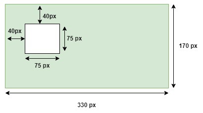
    .sprite-icon{width: 75px;/* Set the width of the displayed image */height: 75px;/* Set the height of the displayed image */background-image:url('sprites.png');/* Path to sprite image */background-position: -40px -40px;/* Position of the individual image within the sprite */}

    In the above example, first we specified height and width sub image as 75px. Then we specified URL of sprite image, which contain all the inner images. Then we specified position of top-left corner of inner image using the background-position property as (-40px, -40px). Following diagram shows how inner image will be selected based on above values.

    img-sprite

    CSS Image Sprites Basic Example

    The following example demonstrates how to use CSS image sprites to display multiple images from a single image file.

    Example

    <!DOCTYPE html><html><head><style>
    
        img{
            height: 60px;
            width: auto;
            border: 3px solid;
        }
        .main{
            display: flex;
            justify-content: space-around;
        }
        .bootstrap, .html, .css {
            width: 150px;
            height: 150px;
            background-image: url('/css/images/devices.png');
            background-repeat: no-repeat;
            border: 5px solid;
        }
        .bootstrap {
            background-position: -5px -5px;
        }
        .html {
            background-position: -155px -5px;
        }
        .css {
            background-position: -277px -5px;
        }
    &lt;/style&gt;&lt;/head&gt;&lt;body&gt;&lt;h3&gt;Original Image&lt;/h3&gt;&lt;img src="/css/images/devices.png"/&gt;&lt;h3&gt;Image sprites&lt;/h3&gt;&lt;div class="main"&gt;&lt;div class="bootstrap"&gt;&lt;/div&gt;&lt;div class="html"&gt;&lt;/div&gt;&lt;div class="css"&gt;&lt;/div&gt;&lt;/div&gt;&lt;/body&gt;&lt;/html&gt;</pre>

    CSS Image Sprites Hover Effect

    The following example demonstrates the use of hover effects on image sprites where the images become slightly transparent when you hover over them.

    Example

    <!DOCTYPE html><html><head><style>
    
        img{
            height: 60px;
            width: auto;
            border: 3px solid;
        }
        .main{
            display: flex;
            justify-content: space-around;
        }
        .bootstrap, .html, .css {
            width: 150px;
            height: 150px;
            background-image: url('/css/images/devices.png');
            background-repeat: no-repeat;
            border: 5px solid;
        }
        .bootstrap {
            background-position: -5px -5px;
        }
        .html {
            background-position: -155px -5px;
        }
        .css {
            background-position: -277px -5px;
        }
        .bootstrap:hover, .html:hover, .css:hover {
            opacity: 0.7;
         }
    &lt;/style&gt;&lt;/head&gt;&lt;body&gt;&lt;h3&gt;Original Image&lt;/h3&gt;&lt;img src="/css/images/devices.png"/&gt;&lt;h3&gt;Image sprites&lt;/h3&gt;&lt;div class="main"&gt;&lt;div class="bootstrap"&gt;&lt;/div&gt;&lt;div class="html"&gt;&lt;/div&gt;&lt;div class="css"&gt;&lt;/div&gt;&lt;/div&gt;&lt;/body&gt;&lt;/html&gt;</pre>

  • Validations

    CSS Validation refer to process to checking correctness of CSS rules in a webpage. Validation is the process of checking something against a rule. When you are a beginner, it is very common that you will commit many mistakes in writing your CSS rules. How you will make sure whatever you have written is 100% accurate and up to the W3 quality standards?

    W3C CSS Validator is official CSS validator developed by World Wide Web Consortium. This validator checks your css by either file upload, direct input, or using URL.

    CSS Validation Example

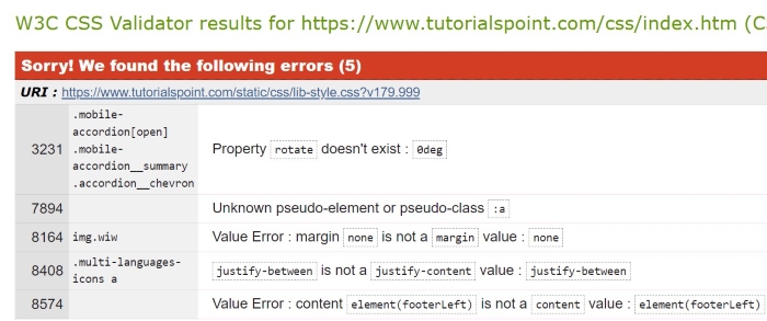
    The image below shows css validation done by W3C:

    CSS Validation

    Validation Warnings

    When you validate your CSS, you may see warnings. These warnings do not stop your CSS from working, but they indicate that something is not perfect. Here are some common validation warnings:

    • Deprecated Properties: Some CSS properties are old and should not be used anymore. Its better to use newer alternatives.
    • Invalid Values: If you use a value that does not fit with the property, a warning will show up. Make sure to check the correct values for each property.
    • Redundant Code: Warnings may point out code that is not needed because it does not change anything. Cleaning this up can help your CSS be more efficient.
    • Selectors Too Specific: If your CSS selectors are too specific, they can make your code harder to read and maintain. Try to keep selectors simple.

    Why Validate Your CSS Code?

    Validating the stylesheet of a webpage is important for ensuring that website displays and functions correctly across different browsers and devices.

    • Improves Browser Compatibility: Validation makes sure your CSS follows the rules, so your webpage looks good on all browsers.
    • Enhances Performance: Clean and correct CSS helps your webpage load faster, while mistakes or extra code can slow it down.
    • Debugging Made Easier: Validating your CSS helps you find and fix mistakes, making it easier to manage your code.
    • SEO Benefits: Well-organized and correct CSS can improve the user experience and make your site faster. This way your site can get ranked easily in search engines.

  • Layouts

    CSS Layout is essential for defining the visual structure, organization, and responsiveness of a website. In this tutorial, we will explore various CSS techniques to create effective website layouts.

    Structure of Webpage Layout

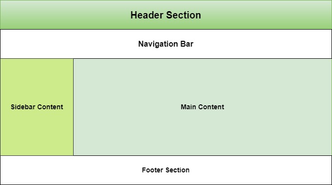
    A webpage is made up of various sections like header, menus, content, and footer based on which there are many different layout designs available for developers.

    webpage-layout

    To know how to define a webpage structure, checkout our tutorial on HTML Layout. Here we explained each and every elements of a webpage layout. In this tutorial we will see how to style a webpage layout using CSS.

    Table of Contents

    • CSS Normal Layout Flow
    • CSS Float Layout
    • CSS Flex Layout
    • CSS Grid Layouts
    • CSS Positioning
    • CSS Responsive Layout

    CSS Normal Layout Flow

    Normal flow is the default layout mode where elements are positioned in the order they appear in the HTML document.

    • Block level elements like <div>, <p>, headings will stack vertically and takes up full width if not specified.
    • Inline elements like <span>, <strong> stack horizontally. You cannot alter height and width of these elements.
    • Inline block elements will behave like both inline and block. They will start from current line but you can alter it’s size.

    Let’s see an example for CSS normal layout flow

    Example

    <!DOCTYPE html><html><head><style>
    
        div, span{
            border: 2px solid;
            margin: 10px;
        }
        .inlineBlock{
            display: inline-block;
            height: 100px;
            width: 100px;
        }
    &lt;/style&gt;&lt;/head&gt;&lt;body&gt;&lt;div&gt; Block Element &lt;/div&gt;&lt;div&gt; Block Element &lt;/div&gt;&lt;span&gt; Inline element &lt;/span&gt;&lt;span&gt; Inline element &lt;/span&gt;&lt;div&gt; Block Element &lt;/div&gt;&lt;span&gt; Inline element &lt;/span&gt;&lt;div class="inlineBlock"&gt;
        Inline Block Element
    &lt;/div&gt;&lt;/body&gt;&lt;/html&gt;</pre>

    CSS Float Layout

    Float Layout is used to position elements left or right in document flow. Main use of this layout system is to create two column layout and to wrap texts to either sides of image in webpage.

    .sidebar{float: left;width: 25%;}.main-content{float: right;width: 75%;}

    This layout create a sidebar at left side of the page occupying 25% of available width and main content at right with 75% width.

    In this example we will see how float is used with images to wrap text.

    Example

    <!DOCTYPE html><html><head><style>
    
        .float-left {
            float: left;
            margin-bottom: 20px;
            margin-right: 10px;
            border: 3px solid;
        }
        h3{
            clear: left;
        }
    &lt;/style&gt;&lt;/head&gt;&lt;body&gt;&lt;img src="/css/images/logo.png" class="float-left" &gt;&lt;p&gt;This text will wrap around the floated image.&lt;/p&gt;&lt;h3&gt;This text with float cleared&lt;/h3&gt;&lt;/body&gt;&lt;/html&gt;</pre>

    CSS Flex Layout

    CSS Flex Layout organizes elements within a container along a single dimension, which can be either horizontally or vertically aligned.

    Following example uses flex-direction as row, means items will be arranged horizontally. For vertical arrangement you need to set flex direction as column.

    Example

    <!DOCTYPE html><html lang="en"><head><style>
    
        .container {
            display: flex;
            flex-direction: row;
            justify-content: space-between;
            align-items: center;
            height: 200px;
        }
        .item {
            background-color: lightcoral;
            padding: 20px;
            margin: 10px;
            border: 3px solid #ccc;
        }
    &lt;/style&gt;&lt;/head&gt;&lt;body&gt;&lt;div class="container"&gt;&lt;div class="item"&gt;Item 1&lt;/div&gt;&lt;div class="item"&gt;Item 2&lt;/div&gt;&lt;div class="item"&gt;Item 3&lt;/div&gt;&lt;/div&gt;&lt;/body&gt;&lt;/html&gt;</pre>

    CSS Grid Layouts

    CSS Grid Layout is a two-dimensional layout system used for organizing elements horizontally and vertical while developing responsive webpages.

    In the following example we define columns as '2fr 1fr 1fr', this means that first column should take 2 fraction of available space and rest two columns take 1 fraction of available space.

    Example

    <!DOCTYPE html><html lang="en"><head><style>
    
      .grid-container {
         display: grid;
         grid-template-columns: 2fr 1fr 1fr;
         grid-template-rows: 100px 100px 100px;
         gap: 20px; 
      }
      .grid-item {
         background-color: #4CAF50;
         border: 4px solid black;
         padding: 20px;
         text-align: center;
         color: white;
      }
    </style></head><body><div class="grid-container"><div class="grid-item"> Item 1 </div><div class="grid-item"> Item 2 </div><div class="grid-item"> Item 3 </div><div class="grid-item"> Item 4 </div><div class="grid-item"> Item 5 </div></div></body></html>

    CSS Positioning

    CSS Positioning helps to manipulate position of any element in a web page.

    Along with position property, other properties like top, bottom, left and right are used to control its exact position on the page. They specify the offsets of an element from its edges.

    Example

    <!DOCTYPE html><html lang="en"><head><style>
    
        *{
            padding: 15px;
        }
        .container {
            border: 1px solid #ccc;
        }
        .static-element {
            position: static;
            background-color: lightblue;
        }
        .relative-element {
            position: relative;
            top: 20px;  
            left: 30px; 
            background-color: lightgreen;
        }
        .normal-flow {
            background-color: lightcoral;
            margin: 10px 0;
        }
    &lt;/style&gt;&lt;/head&gt;&lt;body&gt;&lt;div class="container"&gt;&lt;div class="static-element"&gt;
            This is a static element (default position).
        &lt;/div&gt;&lt;div class="relative-element"&gt;
            This element is relatively positioned 20px 
            down and 30px right.
        &lt;/div&gt;&lt;div class="normal-flow"&gt;
            This element is in the normal document 
            flow, after the relative element.
        &lt;/div&gt;&lt;/div&gt;&lt;/body&gt;&lt;/html&gt;</pre>

    CSS Responsive Layout

    A Responsive webpage layout looks good in all the end user devices like phones, tablets and desktops. It will automatically adjust size and other features accordance with user device.

    In CSS the Media Queries are used to apply different CSS styles based on the screen size, resolution, and other characteristics of the user device.

    @media (width > 700px){/* Styles for screens that are at least 700px wide */}

    The following example demonstrates that when the screen width is between 600px and 800px, the background color changes to yellow and text color changes to red.

    Example

    <html><head><style>
    
    p {
        color: blue;
    }
    @media (600px &lt; width &lt; 800px) {
        p {
            background-color: yellow;
            color: red;
        }
    }
    &lt;/style&gt;&lt;/head&gt;&lt;body&gt;&lt;h1&gt; TutorialsPoint &lt;/h1&gt;&lt;p&gt; CSS Media Type - Screen &lt;/p&gt;&lt;p&gt; 
        Resize the browser size to see the effect. (Open HTML 
        compiler of TutorialsPoint and try there )
    &lt;/p&gt;&lt;/body&gt;&lt;/html&gt;</pre>
  • Printing

    CSS printing involves using specific CSS rules and properties to control how a webpage is formatted when printed. Generally for any printable versions of webpage, the styling will be done with light colors. Because the dark color like black, red will consume more ink from printer. In this tutorial we will learn how to design a printer friendly webpage using CSS.

    Table of Contents

    • Styles For Printer-Friendly Pages
    • Using a Print Style Sheet
    • Using Media Queries and @page
    • Detecting Print Requests

    Styles For Printer-Friendly Pages

    Here are the key styles that can be applied for creating printer-friendly pages:

    • Simplify the Layout: Remove unnecessary elements like sidebars, navigation menus, advertisement sections and interactive content by setting display as none
    • Remove Background Colors: It is recommended to remove background color (or set light color) and set text color as black for printable version of pages. This helps to save ink.
    • Adjust Font Sizes and Styles: Use readable font sizes and styles, typically larger and more legible fonts like serif fonts.
    • Display URLs for Links: When you print a page containing hyperlinks, the exact URL for that will not be visible. So you need to replace this with exact link on printable version.
    • Manage Page Breaks: Make sure to control where content breaks between pages to avoid splitting important sections or headings across pages.

    There are multiple ways we can style printer version of pages. We can explicitly declare an external stylesheet for printer version or we can use media queries inside internal stylesheet. Let’s look into that.

    Using a Print Style Sheet

    You can have a external stylesheet explicitly for printing needs and link it to your code. You just need to set the value for media attribute as “print” for link tag. Add the following tag to head section of your HTML document.

    <link href="/path/to/print.css" media="print" rel="stylesheet" />

    The print.css will look like this:

    body{background-color: white;color: black;}.navbar{display: none;}

    Using Media Queries and @page

    CSS media queries can be used to style printable versions in internal stylesheet itself.

    @media print{body{background-color: white;color: black;}.navbar{display: none;}}

    CSS @page rule is used to control aspects like the size, orientation, and margins of the printed content. This can be useful for setting a consistent page size and margin for all printed pages and creating booklets or documents with specific page layouts.

    @page{size: A4 portrait;/* A4 size, portrait orientation */margin: 2cm;/* 2cm margins on all sides */}/* First page has different styling */@page :first{margin: 5cm;}

    Let see an example for this two.

    Example

    <!DOCTYPE html><html><head><style>
    
        body{
            background-color: black;
            color: white;
            padding: 10px;
        }
        @media print {
            body { 
                background-color: white;
                color: black;
                padding: 10px;
            }
        }
        @page {
            size: A4 portrait; 
            margin: 2cm; 
        }
        button {
            background-color: aqua;
            padding: 5px;
        }
    &lt;/style&gt;&lt;/head&gt;&lt;body&gt;&lt;h3&gt; Tutorialspoint &lt;/h3&gt;&lt;p&gt;CSS Media Type - Print&lt;/p&gt;&lt;p&gt;
        Background is white for printable version of this page.
        Check out...
    &lt;/p&gt;&lt;button onclick="printPage()"&gt;Print Page&lt;/button&gt;&lt;script&gt;
        function printPage() {
            window.print();
        }
    &lt;/script&gt;&lt;/body&gt;&lt;/html&gt;</pre>

    Detecting Print Requests

    Browsers trigger 'beforeprint' and 'afterprint' events to identify when printing is about to happen or has just occurred. You can use these events to modify the user interface during the print process, such as showing or hiding specific elements while printing, or even change style after printing.

    <script>
    
    window.addEventListener("afterprint", () =&gt; self.close);   
    </script>

    The above declaration will automatically close the current window, after printing its contents. Let's see an example for this.

    Example

    <!DOCTYPE html><html><head><style>
    
        button{
            background-color: green; 
            color: white; 
            font-size: 1em;
        }
        @media screen {
            h2 {
                font-size: large;
                font-family: sans-serif;
                color: blue;
                font-style: normal;
            }
        }
        @media print {
            h2 {
                font-family: cursive;
                font-style: italic;
                color: red;
            }
        }
        @media print {
            button {display: none;}
        }
    &lt;/style&gt;&lt;/head&gt;&lt;body&gt;&lt;article&gt;&lt;section&gt;&lt;h2&gt;Header1&lt;/h2&gt;&lt;p&gt;
            Section one
        &lt;/p&gt;&lt;/section&gt;&lt;/article&gt;&lt;button &gt;Print&lt;/button&gt;&lt;script&gt;
        const button = document.querySelector("button");
        button.addEventListener("click", () =&gt; {
        window.print();
        });
        window.addEventListener("afterprint", () =&gt; self.close);
    &lt;/script&gt;&lt;/body&gt;&lt;/html&gt;</pre>
  • Paged Media

    CSS paged media refers to a set of properties, @rules and pseudo-class selectors that are used for styling of documents for printing.

    • CSS paged media provides additional features and properties specifically made for printed documents.
    • With these properties we can control page breaks, margins, headers, footers, and more.
    • Some of the key properties of paged media are @page, orphans, widows, break-after, break-before, and break-inside.
    • Paged Media properties prevent uneven and awkward printing of webpages.

    CSS Paged Media Related Properties

    Following is the list of CSS properties related to paged media:

    PropertyDescriptionExample
    break-afterUsed to forcefully break the page after a section in print document.Try It
    break-beforeUsed to forcefully break the page before a section in print document.Try It
    break-insideUsed to forcefully break the page or avoid breaking of page inside a section in print documentTry It
    orphansSpecify minimum number of lines placed at the bottom of a page when whole paragraph can’t be placed at bottom of the page.Try It
    widowsSpecify minimum number of lines placed at the top of a page when whole paragraph can’t be placed at top of the page.Try It

    CSS Paged Media @rules

    Following is the list of CSS at-rules related to paged media:

    PropertyDescriptionExample
    @pageThis is media query, used to specify different css styles for printed pages.Try It

    CSS Paged Media Pseudo-Classes

    Following is the list of CSS pseudo-classes related to paged media:

    PropertyDescriptionExample
    :firstThis pseudo class selects first page of a document for styling separately.Try It
    :leftThis pseudo class selects all the left-handed pages of a document for styling separately.Try It
    :rightThis pseudo class selects all the right-handed pages of a document for styling separately.Try It
  • Text Effects

    CSS text effects are used to manage styles of text by setting overflow rules, wrapping rules, line-breaking rules and writing modes to text. The text effects allow us to apply different types of effects on text used in an HTML document. In this chapter, we will learn how to add effects to texts in CSS.

    What are Text Effects in CSS?

    The following are the text effects commonly used in CSS:

    1. text-overflow: It specifies how to manage the text that is overflowing the container.
    2. word-wrap: It specifies to break the long words that are overflowing from the container.
    3. word-break: It specifies to break the words that are separated by the hyphens when the text is overflowing container.
    4. writing-mode: It specifies the horizontal and vertical writing modes of the text.

    We will see examples for all of these properties in upcoming sections. There are several other properties related to the text in CSS, we have covered all of those in the CSS Text Styling chapter.

    Text Overflow

    The text-overflow property is used to control the text that exceeds the parent’s width. You can clip the text that exceeds the width of the parent or add an ellipsis(…) to indicate text continues.

    Syntax

    The syntax for the CSS text-overflow property is as follows:

    p{text-overflow: clip | ellipsis;}

    Example

    The following example demonstrates the use of text-overflow property with clip and ellipsis values on the paragraph element.

    <html><head><style>
    
        p{
            white-space: nowrap; 
            border: 2px solid;
            width: 40%; 
            overflow: hidden;
            padding: 2%;
        }
        .txt1{
            text-overflow: clip;
        }
        .txt2 {
            text-overflow: ellipsis;
        }
    &lt;/style&gt;&lt;/head&gt;&lt;body&gt;&lt;h3&gt; Text overflow clip &lt;/h3&gt;&lt;p class="txt1"&gt; 
        This is some large amount of text to understand text 
        overflow property
    &lt;/p&gt;&lt;h3&gt; Text overflow ellipsis &lt;/h3&gt;&lt;p class="txt2"&gt; 
        This is some large amount of text to understand text 
        overflow property 
    &lt;/p&gt;&lt;/body&gt;&lt;/html&gt;</pre>

    Word Wrap

    The word-wrap property is used to allow long words to be able to be broken and wrapped onto the next line. This ensures that the content fits within its container, preventing overflow.

    Syntax

    The syntax for the CSS word-wrap property is as follows:

    p{word-wrap: normal | break-word;}

    Example

    In this example, we have used word-wrap property with normal and break-word. The text with normal overflows the container, while with word-break, the word is broken to fit the container.

    <html><head><style>
    
        p{
            border: 2px solid;
            width: 40%; 
            padding: 2%;
        }
        .txt1{
            word-wrap: normal;
        }
        .txt2 {
            word-wrap: break-word;
        }
    &lt;/style&gt;&lt;/head&gt;&lt;body&gt;&lt;h3&gt; Word wrap normal &lt;/h3&gt;&lt;p class="txt1"&gt; 
        ThisIsAVeryLongWordThatWillNotBreakAndWillOverflowItsContainer 
    &lt;/p&gt;&lt;h3&gt; Word wrap break-word &lt;/h3&gt;&lt;p class="txt2"&gt; 
        ThisIsAVeryLongWordThatWillBreakAndWrapOntoTheNextLine 
    &lt;/p&gt;&lt;/body&gt;&lt;/html&gt;</pre>

    Word Break

    The word-break property is used to specify how words should break when reaching the end of a line. This property is particularly useful for handling text that doesn't naturally wrap well, such as long words or URLs.

    Syntax

    The syntax for the CSS word-break property is as follows:

    p{word-break: normal | break-all | keep-all;}

    Example

    In this example, we have used the word-break property with 'normal', 'break-all', and 'keep-all' property values on the paragraph element.

    <html><head><style>
    
        p{
            border: 2px solid;
            width: 40%; 
            padding: 2%;
        }
        .txt1{
            word-break: break-all;
        }
        .txt2 {
            word-break: keep-all;
        }
    &lt;/style&gt;&lt;/head&gt;&lt;body&gt;&lt;h3&gt; Word break break-all &lt;/h3&gt;&lt;p class="txt1"&gt; 
        This-paragraph-contains-some-text.-This-line-will-not-
        break-at-hyphens.
    &lt;/p&gt;&lt;h3&gt; Word break keep-all &lt;/h3&gt;&lt;p class="txt2"&gt; 
        This-paragraph-contains-some-text.-This-line-will-break
        -at-hyphens.
    &lt;/p&gt;&lt;/body&gt;&lt;/html&gt;</pre>

    Writing Mode

    The writing-mode property is used to define the direction in which text is written within a block. This property is especially useful for supporting languages that are written vertically or for creating rotated text effects.

    Syntax

    The syntax for the CSS writing-mode property is as follows:

    p{writing-mode: horizontal-tb | vertical-rl | vertical-lr;}

    Example

    The following example uses the writing-mode property to define the direction of the text of the paragraph element.

    <html><head><style>
    
        p{
            border: 2px solid;
            width: 200px; 
            padding: 2%;
        }
        .txt1{
            writing-mode: horizontal-tb;
        }
        .txt2 {
            writing-mode: vertical-rl;
        }
        .txt3 {
            writing-mode: vertical-lr;
        }
    &lt;/style&gt;&lt;/head&gt;&lt;body&gt;&lt;h3&gt; Writing mode horizontal-tb &lt;/h3&gt;&lt;p class="txt1"&gt; 
        This text is written in the traditional horizontal 
        direction from left to right
    &lt;/p&gt;&lt;h3&gt; Writing mode vertical-rl &lt;/h3&gt;&lt;p class="txt2"&gt; 
        This text is written vertically from top to bottom, 
        with lines stacked right to left
    &lt;/p&gt;&lt;h3&gt; Writing mode vertical-lr &lt;/h3&gt;&lt;p class="txt3"&gt; 
        This text is written vertically from top to bottom, 
        with lines stacked left to right
    &lt;/p&gt;&lt;/body&gt;&lt;/html&gt;</pre>

    CSS Text Effects Related Properties

    Following is the list of CSS properties of styling text:

    PropertyDescriptionExample
    text-overflowSpecifies how to manage the text that are overflowing the container.Try It
    word-wrapSpecifies to break the long words that are overflowing container.Try It
    word-breakSpecifies to break the words that are separated by the hyphens when text is overflowing container.Try It
    writing-modeSpecifies horizontal and vertical writing modes of text.Try It
    text-justifySpecifies the justification method of text when text-align is set to "justify".Try It
  • Rules

    CSS at-rules are special instructions or statements beginning with the “@” symbol. They are used to control or modify the behavior of the stylesheet and are typically used for tasks such as defining media queries, importing external stylesheets, or specifying font faces.

    CSS at-rules improves the CSS capabilities beyond basic selectors and property-value pairs. An at-rule begins with an at (@) sign, followed by an identifier, and further includes everything up to the next semicolon (;) or next CSS block.

    Syntax

    /* General structure */
    @identifier (RULE);
    

    Types of @ Rules

    Regular

    CSS provides different regular at-rules, based on the identifier and each has a different syntax.

    • @charset: Specifies the character encoding of an external stylesheet.
    • @import: Used to import an external CSS file into the current stylesheet.
    • @namespace: Used to declare and define XML namespaces within a CSS stylesheet.

    Nested

    A subset of nested statements that serve as both standalone style sheet statements and components within conditional group rules.

    • @media: Content of conditional group rule gets applied, if the device meets the criteria of the condition defined using media query.
    • @supports: Content of conditional group rule gets applied, if the given condition is met by the browser.
    • @page: Defines the layout of printed pages.
    • @font-face: Defines custom fonts to be used in a web page.
    • @keyframes: Defines the aspect of intermediate steps in a CSS animation sequence.
    • @counter-style: Defines the different custom counter styles that are not predefined.
    • @font-feature-values: Defines the common names in font-variant-alternates for feature activated in OpenType. It deals with the usage of alternate glyphs and these glyphs are defined in @font-feature-values
    • @property: Defines the usage of custom properties and variables.
    • @layer: Defines a layer and sets the order of precedence, when there are multiple cascade layers.

    CSS @ Rules – @page Example

    Here is an example of usage of @page:

    <html><head><style>
       @page :first {
    
      margin-left: 80%;
      margin-top: 80%;
    } p { page-break-after: always; } </style></head><body><p>Page One.</p><p>Page Two.</p><button>Print</button><script>
      document.querySelector("button").addEventListener("click", () =&gt; {
      window.print();
      });
    </script></body></html>

    CSS @ Rules – @keyframes Example

    Here is an example of usage of @keyframes:

    <html><head><style>
       p {
    
      animation-duration: 3s;
      animation-name: slidein;
    } @keyframes slidein {
      from {
         margin-left: 100%;
         width: 300%;
      }
      to {
         margin-left: 0%;
         width: 100%;
      }
    } </style></head><body><p>
      The text appears from right to left
      &lt;/p&gt;&lt;/body&gt;&lt;/html&gt;</pre>

    CSS @ Rules - @property Example

    Here is an example of usage of @property:

    <html><head><style>
       @property --item-size {
    
      syntax: "&lt;percentage&gt;";
      inherits: true;
      initial-value: 40%;
    } .container {
      display: flex;
      height: 100px;
      border: 3px dotted black;
    /* set custom property values on parent */
      --item-size: 50%;
      --item-color: tomato;
      --item-border: 5px solid green;
    } /* use custom properties to set item size and background color */ .item {
      width: var(--item-size);
      height: var(--item-size);
      border: var(--item-border);
      background-color: var(--item-color);
    } /* set custom property values on element itself */ .second {
      --item-size: initial;
      --item-color: inherit;
    } </style></head><body><div class="container"><div class="first item">First Item</div><div class="second item">Second Item</div></div><script>
      window.CSS.registerProperty({
      name: "--item-color",
      syntax: "&lt;color&gt;",
      inherits: false,
      initialValue: "peachpuff",
    }); </script></body></html>

    CSS @ Rules - Rule List

    The table given below lists all the CSS @ Rules:

    @RuleExample
    @charset@charset "UTF-8";
    @container@container (width > 400px) { h1 {font-size: 2em;} }
    @counter-style@counter-style sample {}
    @font-face@font-face { font-family: "CustomFont"; src: url("customfont.woff2") format("woff2"); }
    @font-feature-value@font-feature-values "CustomFont" {@swash { fancy: 2; }}
    @font-palette-values@font-palette-values One { font-family: "Bungee Spice";}
    @import@import ur();
    @keyframes@keyframes sample-slide { from { transform: translateY(100%) } }
    @layer@layer sample-layer{ .margin-lg { margin: 5px; } }
    @media@media screen and (max-width: 600px) {}
    @namespace@namespace svg url();
    @page@page { size: 5in 6in; margin-left: 4in }
    @property@property sample-property { rules }
    @supports@supports (transform-origin: 10% 10%) {}

  • Pseudo Elements

    CSS pseudo-elements are used to style specified parts of an element. While browsing a webpage, you might have noticed that the first letter of some paragraphs is larger than rest of letters. This type of styling for a specific part of elements is done using pseudo-elements in CSS. In this tutorial we will explain all the pseudo-elements and their functioning.

    Table of Contents

    • What is Pseudo-Element?
    • Insertion Pseudo-Elements
    • CSS Backdrop Pseudo-Element
    • CSS Cue Pseudo-Element
    • CSS First-Letter Pseudo-Element
    • CSS First-Line Pseudo-Element
    • CSS File-Selector-Button
    • CSS Marker Pseudo-Element
    • CSS Placeholder Pseudo-Element
    • CSS Selection Pseudo-Element
    • Multiple Pseudo-elements
    • All CSS Pseudo-Elements

    What is Pseudo-Element?

    A pseudo-element in CSS, is used to style a specific part of an element that are not the part of the DOM (Document Object Model) and do not exist in the HTML markup. For Example first letter of a paragraph, placeholder text inside input element or selected part in a document.

    • Pseudo-elements are denoted by a double colon (::) notation.
    • Only one pseudo-element can be used in a selector.
    • A pseudo-element in a selector must appear after all the other components. For example, p::last-line:hover is invalid.
    • Pseudo-elements can be used to add decorative styles, create special effects, and modify the appearance of certain parts of an element, that has a state already applied to it. For example, p:hover::last-line is a valid statement and selects the last line of the paragraph when the paragraph is hovered

    Syntax

    selector::pseudo-element{property: value;}

    The single colon syntax is supported by the browsers for the four original pseudo-elements, i.e., ::before, ::after, ::first-line, and ::first-letter.

    Content Insertion Pseudo-Elements

    In CSS, pseudo-elements ::before and ::after are used to insert text contents or images before and after any element.

    Example

    This example shows how to insert text and images at start and end of a paragraph using CSS.

    <!DOCTYPE html><html><head><style>
    
        p:before {
            content: "NOTE:";
            font-weight: bold;
        }
        p:after {
            content: url(/css/images/smiley.png);
        }       
    &lt;/style&gt;&lt;/head&gt;&lt;body&gt;&lt;p&gt;
        We inserted intro at start and emoji at end.
    &lt;/p&gt;&lt;/body&gt;&lt;/html&gt;</pre>

    CSS Backdrop Pseudo-Element

    In CSS the ::backdrop pseudo-element is used to style the backdrop of an element that is in a modal context, such as the backdrop behind a <dialog> element when it is shown.

    Example

    Following example demonstrates use of ::backdrop pseudo-element.

    <!DOCTYPE html><html><head><style>
    
        body{
            height: 200px;
        }
        dialog {
            padding: 20px;
            border: 2px solid black;
            border-radius: 10px;
        }
        dialog::backdrop {
            /* Semi-transparent black */
            background-color: rgba(0, 0, 0, 0.5); 
        }
    &lt;/style&gt;&lt;/head&gt;&lt;body&gt;&lt;h3&gt; Backdrop Example &lt;/h3&gt;&lt;dialog id="myDialog"&gt;&lt;p&gt; This is a dialog with a styled backdrop. &lt;/p&gt;&lt;button id="closeButton"&gt; Close &lt;/button&gt;&lt;/dialog&gt;&lt;button id="openButton"&gt;Open Dialog&lt;/button&gt;&lt;script&gt;
        const dialog = document.getElementById('myDialog');
        const openButton = document.getElementById('openButton');
        const closeButton = document.getElementById('closeButton');
        openButton.addEventListener('click', () =&gt; {
            dialog.showModal();
        });
        closeButton.addEventListener('click', () =&gt; {
            dialog.close();
        });
    &lt;/script&gt;&lt;/body&gt;&lt;/html&gt;</pre>

    CSS Cue Pseudo-Element

    In CSS, the pseudo-element ::cue is used with Web Video Text Tracks to style specific parts of text tracks, such as subtitles or captions, for media elements like <video> and <audio>.

    Example

    Following example demonstrates use of ::cue pseudo-element

    <!DOCTYPE html><html><head><style>
    
    video {
        width: 100%;
    }
    video::cue {
        font-size: 1rem;
        color: peachpuff;
    }
    </style></head><body><video controls src="/css/foo.mp4"><track default kind="captions"
               srclang="en" src="/css/cue-sample.vtt" /&gt;&lt;/video&gt;&lt;/body&gt;&lt;/html&gt;</pre>

    CSS First-Letter Pseudo-Element

    In CSS, the ::first-letter pseudo-element is used to target the first letter of text content of any elements like divparagraphspan etc

    Example

    Following example demonstrates use of ::first-letter pseudo-element:

    <!DOCTYPE html><html><head><style>
    
        p::first-letter { 
            text-transform: uppercase;
            font-size: 2em;
            color: darkred;
            font-style: italic;
        }
    &lt;/style&gt;&lt;/head&gt;&lt;body&gt;&lt;p&gt;
        this is a paragraph with first letter in lowercase, 
        we used ::first-letter pseudo-element to capitalize
        first-letter of paragraph with a larger font size 
        and a different color. 
    &lt;/p&gt;&lt;/body&gt;&lt;/html&gt;</pre>

    CSS First-Line Pseudo-Element

    In CSS, the ::first-line pseudo-element is used to target the first line of text content of any elements like divparagraphspan etc

    Example

    Following example demonstrates use of ::first-line pseudo-element:

    <!DOCTYPE html><html><head><style>
    
        p::first-line { 
            background-color: #f0f0f0;
            color: darkred;
            font-style: italic;
        }
    &lt;/style&gt;&lt;/head&gt;&lt;body&gt;&lt;p&gt;
        This is a normal paragraph with no stylings, we used 
        ::first-line pseudo-element to only style first-line of 
        paragraph by adding a background color, font-style and 
        text color
    &lt;/p&gt;&lt;/body&gt;&lt;/html&gt;</pre>

    CSS File-Selector-Button Pseudo-Element

    In CSS, the ::file-selector-button pseudo-element is used to style the button of a file input element (<input type="file">) in modern browsers.

    Example

    Following example demonstrates use of ::file-selector-button pseudo-element:

    <!DOCTYPE html><html><head><style>
    
        body {
            display: block;
            height: 100px;
        }
        input::file-selector-button {
            background-image:url(/css/images/border.png);
            background-size: 200%;
            border: 2px solid black;
            border-radius: 8px;
            font-weight: 600;
            color: rgb(6, 1, 9);
            padding: 15px;
            transition: all 0.25s;
        }
    &lt;/style&gt;&lt;/head&gt;&lt;body&gt;&lt;h2&gt; Select a file &lt;/h2&gt;&lt;input type="file"&gt;&lt;/body&gt;&lt;/html&gt;</pre>

    CSS Marker Pseudo-Element

    In CSS, the ::marker pseudo-element is used to style the marker of ordered list and unordered list.

    Example

    Following example demonstrates use of ::marker pseudo-element:

    <!DOCTYPE html><html><head><style>
    
        ol li::marker {
            color: rgb(11, 38, 241);
            font-weight: bold;
        }
        ul li::marker {
            content: url('/css/images/smiley.png')
        }
    &lt;/style&gt;&lt;/head&gt;&lt;body&gt;&lt;h2&gt;Numbered list&lt;/h2&gt;&lt;ol&gt;&lt;li&gt;One&lt;/li&gt;&lt;li&gt;Two&lt;/li&gt;&lt;li&gt;Three&lt;/li&gt;&lt;/ol&gt;&lt;h2&gt;Bulleted list&lt;/h2&gt;&lt;ul&gt;&lt;li&gt;One&lt;/li&gt;&lt;li&gt;Two&lt;/li&gt;&lt;li&gt;Three&lt;/li&gt;&lt;/ul&gt;&lt;/body&gt;&lt;/html&gt;</pre>

    CSS Placeholder Pseudo-Element

    In CSS, the ::placeholder pseudo-element is used to style the default text inside text input element (<input type="text">).

    Example

    Following example demonstrates use of ::placeholder pseudo-element:

    <!DOCTYPE html><html><head><style>
    
        .form {
            border: 2px solid black;
            background: lightgray;
            padding: 25px;
            display: flex;
            flex-direction: column;
            gap: 10px;
        }
        input{
            padding: 10px;
            background-color: cornsilk;
        }
        input::placeholder { 
            color: grey; 
            font-style: italic;
            font-size: 20px;
        } 
    &lt;/style&gt;&lt;/head&gt;&lt;body&gt;&lt;div class="form"&gt;&lt;h2&gt; Your Details:&lt;/h2&gt;&lt;input type="text" placeholder="First Name"&gt;&lt;input type="text" placeholder="Last Name"&gt;&lt;input type="text" placeholder="Address"&gt;&lt;input type="text" placeholder="Phone"&gt;&lt;/div&gt;&lt;/body&gt;&lt;/html&gt;</pre>

    CSS Selection Pseudo-Element

    In CSS, the ::selection pseudo-element is used to style the user selected text inside any elements like divparagraphspan etc

    Example

    Following example demonstrates use of ::selection pseudo-element:

    <!DOCTYPE html><html><head><style>
    
        .highlight::selection { 
            color: yellow;
            background: brown;
        } 
    &lt;/style&gt;&lt;/head&gt;&lt;body&gt;&lt;p class="highlight"&gt;
        Select Me!!! to see the effect.
    &lt;/p&gt;&lt;p&gt; No style applied to me. &lt;/p&gt;&lt;/body&gt;&lt;/html&gt;</pre>

    Multiple Pseudo-elements

    We can also add multiple pseudo elements to a selector, Check out the example.

    Example

    Following example demonstrates usage of multiple pseudo-elements (::first-line and ::first-letter).

    <!DOCTYPE html><html><head><style>
    
        p::first-line { 
            text-decoration: underline;
        }
        
        p::first-letter { 
            text-transform: uppercase;
            font-size: 2em;
            color: red;
        }
    &lt;/style&gt;&lt;/head&gt;&lt;body&gt;&lt;p&gt;
        the first line of this paragraph will be underlined and 
        first letter is uppercase, 2em and red in color, as the
        pseudo-element ::first-line &amp; ::first-letter is applied 
        on p. The other lines are not underlined.
    &lt;/p&gt;&lt;/body&gt;&lt;/html&gt;</pre>

    All CSS Pseudo-Elements

    The following table shows all pseudo-elements in CSS:

    Pseudo-elementDescriptionExample
    ::afterAdds a pseudo-element that is the last child of the selected element.Try It
    ::backdropUsed to style the backdrop of an element like dialog box.Try It
    ::beforeAdds a pseudo-element that is the first child of the selected element.Try It
    ::cueUsed to style the captions and cues in media with video text tracks.Try It
    ::first-letterApplies styles to the first letter of the first line of a block level element.Try It
    ::first-lineApplies styles to the first line of a block level element.Try It
    ::file-selector-buttonRepresents the button of an <input> of type="file".Try It
    ::markerSelects the marker box of a list item.Try It
    ::part()Represents an element within a shadow tree that has a matching part attribute.Try It
    ::placeholderRepresents a placeholder text in an <input> or <textarea> element.Try It
    ::selectionApplies styles to the selected part of the document (selected by clicking and dragging the mouse across text).Try It
    ::slotted()Represents an element that has been placed into a slot inside an HTML template.Try It
    ::grammar-errorUsed to style text that has been identified as grammatically incorrect by the browsers built-in grammar checking tools.Try It
    ::spelling-errorUsed to style text that has been identified as incorrect spelling by the browsers built-in spelling checking tools.Try It