CSS border-images properties are used to create custom borders by setting image as border around any element.
The border-image property takes the image and slices it into nine sections(3×3). It then places the corners at the corner of the border, and the edges are repeated or stretched as you specify. Middle part of image will be ignored.
Border Image
Table of Contents
Example of Image as Border
CSS Border Image Source
CSS Border Image Slice
CSS Border Image Width
CSS Border Image Outset
CSS Border Image Repeat
Border Image Shorthand
CSS Gradient as Border Images
Border Image All Properties
Example of Image as Border
The following code shows a basic example of how to set image as border.
Example
<!DOCTYPE html><html><head><style>
div{
background-color: #f0f0f0;
border: 20px solid transparent;
border-image: url(/css/images/border.png) 40;
padding: 20px;
}
</style></head><body><div><p>
This is an example of setting a
border image using CSS
</p></div></body></html></pre>
CSS Border Image Source
The CSS border-image-source property specifies the source (url) of an image to be passed as a border to an element.
Example
<!DOCTYPE html><html><head><style>
div{
background-color: #f0f0f0;
border: 20px solid transparent;
border-image-source: url(/css/images/border.png);
padding: 20px;
}
</style></head><body><div><p>
This is an example of setting border image using
border image source.
</p></div></body></html></pre>
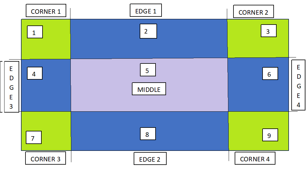
CSS Border Image Slice
The border-image-slice property defines how the image is sliced into regions, which are then used to draw the borders.
The following diagram demonstrates how image is sliced to make border. The image is divided into 9 sections: four corners, four edges, and the center.
The value in the 'border-image-slice' property specifies how far inward from the edges of the image the slicing should occur. It essentially defines the size of the areas that will be used to create the border.
The offset for border-image-slice can be provided in terms of percentage or length units but percentages are highly recommended.
Example
<!DOCTYPE html><html><head><style>
div{
background-color: #f0f0f0;
border: 20px solid transparent;
border-image-source: url(/css/images/scenery2.jpg);
border-image-slice: 25%;
padding: 15px;
width: 50%
}
</style></head><body><div><p>
See how border is set for this div...
</p></div><p> Here is full image for your reference: </p><img src="/css/images/scenery2.jpg" height="160px"></body></html></pre>
CSS Border Image Width
The border-image-width property is used to specify the width of the image to be set as a border.
The border-image-outset property is used to specify gap between element and border-image. This property pushes the border image outside, beyond the border box.
The border-image-repeat property in used to repeating and stretching nature of image around border. By default the border image gets stretched along the sides.
The value repeat for this property, repeats the image specified along the sides of the border until the whole length and width got filled.
It can also take the value as round, apart from stretch and repeat.
div{
background-color: #f0f0f0;
border: 20px solid transparent;
border-image: url('/css/images/border.png') 30 round;
padding: 20px;
}
</style></head><body><div><p>
This is an example of border shorthand property....
</p></div></body></html></pre>
CSS Gradient as Border Images
CSS gradients can also be used to set the border of an element. There are three types of gradients supported: linear, radial and conic.
Leave a Reply